


more help needed with fireplace design, pictures included!
tinker_2006
16 years ago
Related Stories

KITCHEN DESIGNDesign Dilemma: My Kitchen Needs Help!
See how you can update a kitchen with new countertops, light fixtures, paint and hardware
Full Story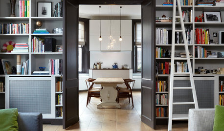
ORGANIZINGGet the Organizing Help You Need (Finally!)
Imagine having your closet whipped into shape by someone else. That’s the power of working with a pro
Full Story
SELLING YOUR HOUSEHelp for Selling Your Home Faster — and Maybe for More
Prep your home properly before you put it on the market. Learn what tasks are worth the money and the best pros for the jobs
Full Story
MOVING10 Rooms That Show You Don’t Need to Move to Get More Space
Daydreaming about moving or expanding but not sure if it’s practical right now? Consider these alternatives
Full Story
HOME OFFICESRoom of the Day: Stately Study Includes a Cozy Family Space
A new fireplace, windows, millwork and furniture make this room hard to leave
Full Story

HOUSEKEEPINGWhen You Need Real Housekeeping Help
Which is scarier, Lifetime's 'Devious Maids' show or that area behind the toilet? If the toilet wins, you'll need these tips
Full Story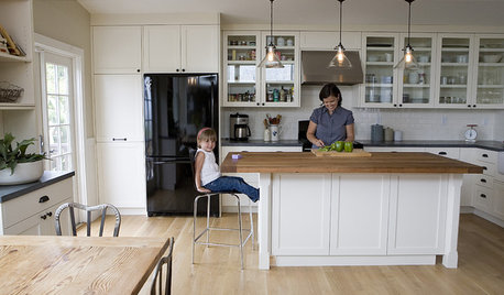
ORGANIZINGDo It for the Kids! A Few Routines Help a Home Run More Smoothly
Not a Naturally Organized person? These tips can help you tackle the onslaught of papers, meals, laundry — and even help you find your keys
Full Story
LIFEYou Said It: ‘Put It Back’ If It Won’t Help Your House, and More Wisdom
Highlights from the week include stopping clutter from getting past the door, fall planting ideas and a grandfather’s gift of love
Full Story
WORKING WITH AN ARCHITECTWho Needs 3D Design? 5 Reasons You Do
Whether you're remodeling or building new, 3D renderings can help you save money and get exactly what you want on your home project
Full StoryMore Discussions


demeron
squirrelheaven
Related Professionals
Arkansas Interior Designers & Decorators · Hagerstown Interior Designers & Decorators · Memphis Furniture & Accessories · Phoenix Furniture & Accessories · Shakopee Furniture & Accessories · Woodstock Furniture & Accessories · Newton Furniture & Accessories · Discovery Bay Furniture & Accessories · Fillmore Furniture & Accessories · San Diego Furniture & Accessories · Richmond Custom Artists · Greenville Lighting · Iowa City Lighting · Chicago Window Treatments · Los Angeles Window Treatmentstxgal06
RNmomof2 zone 5
tinker_2006Original Author
hoosiergirl
squirrelheaven
hoosiergirl
tinker_2006Original Author
squirrelheaven
les917
squirrelheaven
hoosiergirl
squirrelheaven
patches123
squirrelheaven
squirrelheaven
tinker_2006Original Author
hoosiergirl
patches123
squirrelheaven
tinker_2006Original Author
squirrelheaven
squirrelheaven
squirrelheaven
magothyrivergirl
les917
threedgrad
tinker_2006Original Author
lynnski
les917
tinker_2006Original Author
lynnski
squirrelheaven
reeree_natural
squirrelheaven
squirrelheaven
tinker_2006Original Author
hoosiergirl
reeree_natural
hoosiergirl
reeree_natural
squirrelheaven
msrose
reeree_natural
reeree_natural
squirrelheaven
reeree_natural
squirrelheaven
reeree_natural