


Revere Pewter for my dining room
Christie Santercangelo
11 years ago
Sort by:Oldest
Comments (19)
Related Stories
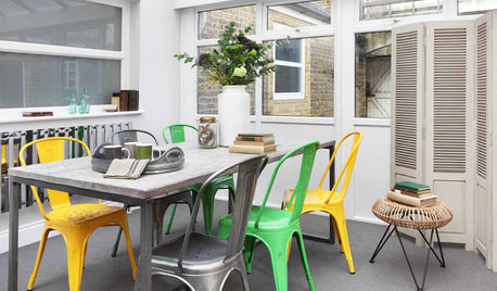
FURNITUREIconic Designs: 10 Modern Dining Chairs to Know
Elevate your dining space with classic chairs by some of the 20th century’s revered designers
Full Story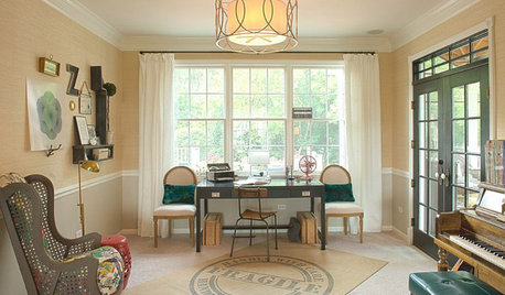
KIDS’ SPACESWho Says a Dining Room Has to Be a Dining Room?
Chucking the builder’s floor plan, a family reassigns rooms to work better for their needs
Full Story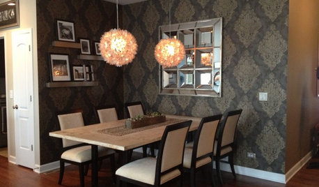
DINING ROOMSInside Houzz: Taking a Dining Space From Plain to Polished
By-the-hour design advice helps a homeowner define a dining area in an open floor plan and give it a decorator look
Full Story
DINING ROOMSGuest Picks: Set Your Table Dutch-Master Style
Make your Thanksgiving feast pop against moody black and rich gold pieces inspired by still-life paintings
Full Story
DECORATING GUIDESColor Guide: How to Work With Charcoal Gray
The most modern neutral, charcoal gray looks great in dining rooms, living rooms and even nurseries. Here's how to use it best
Full Story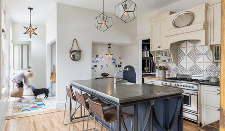
KITCHEN DESIGNKitchen of the Week: Sophisticated Farmhouse Style in Minnesota
A workhorse island with iron detailing and a pewter countertop is just one of the highlights of this creative space
Full Story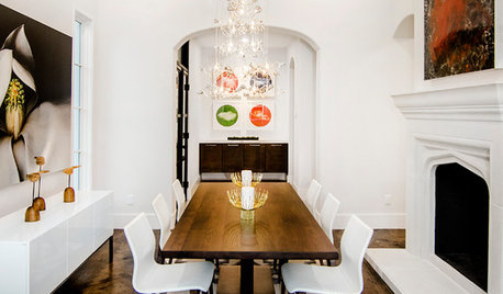
DINING ROOMSNew This Week: Proof the Formal Dining Room Isn’t Dead
Could graphic wallpaper, herringbone-patterned floors, wine cellars and fire features save formal dining rooms from extinction?
Full Story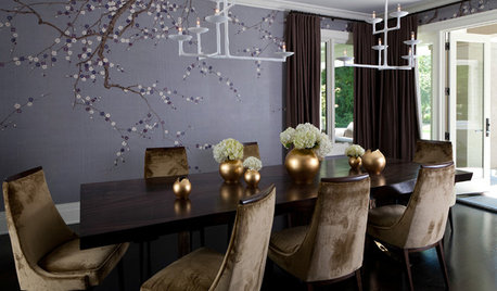
DECORATING GUIDESColor Feast: When to Use Purple in the Dining Room
Decadent and different, purples from lavender to plum can make a dining area a treat for the eyes
Full Story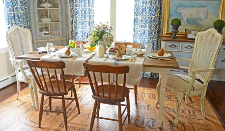
DINING ROOMS8 French Farmhouse Dining Rooms Worth Lingering In
Airily romantic or casual and cozy, these French farmhouse–style spaces encourage the art of leisurely dining
Full Story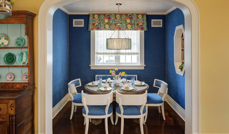
DINING ROOMSRoom of the Day: Dressing a Dining Alcove in Bright Blue
Vibrant upholstered walls and seats plus thoughtful architectural details give a nook in Chicago a happy vibe
Full Story


wi-sailorgirl
lascatx
Related Professionals
Hagerstown Interior Designers & Decorators · Hercules Interior Designers & Decorators · View Park-Windsor Hills Interior Designers & Decorators · Port Charlotte Furniture & Accessories · St. Louis Furniture & Accessories · Chino Hills Furniture & Accessories · Maplewood Furniture & Accessories · Urbandale Furniture & Accessories · Westport Furniture & Accessories · Arcadia Lighting · Rockland Lighting · Berkeley Window Treatments · Gadsden Window Treatments · St. Louis Window Treatments · Westfield Window Treatmentscaminnc
Christie SantercangeloOriginal Author
lascatx
Christie SantercangeloOriginal Author
jterrilynn
Christie SantercangeloOriginal Author
patty_cakes
caminnc
jterrilynn
lascatx
lascatx
msrose
Christie SantercangeloOriginal Author
blondepegasus
Christie SantercangeloOriginal Author
lascatx
jterrilynn