


Starting from scratch with paint colors (incl. photos of house)
Scarlett001
10 years ago
Related Stories
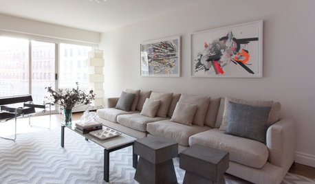
INSIDE HOUZZInside Houzz: Starting From Scratch in a Manhattan Apartment
Even no silverware was no sweat for a Houzz pro designer, who helped a globe-trotting consultant get a fresh design start
Full Story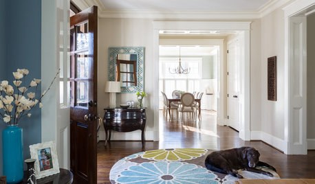
TRADITIONAL HOMESHouzz Tour: Family Gets a Fresh Start in a Happy New Home
Decorating her house from scratch spurs a big career change for this designer
Full Story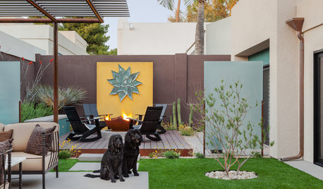
PATIOSCase Study: 8 Tips for Planning a Backyard From Scratch
Turn a blank-slate backyard into a fun and comfy outdoor room with these ideas from a completely overhauled Phoenix patio
Full Story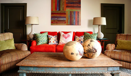
DECORATING GUIDESLessons in Living Comfortably: Embrace the Scratches and Dents
When you celebrate wear and tear, you send a message that your home is designed for relaxation
Full Story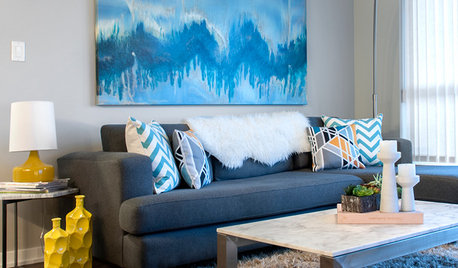
HOUZZ TOURSMy Houzz: Color and Pattern Give a Newlyweds’ Home Zing
Starting from scratch, a British Columbia couple transforms their empty apartment with ready-made pieces and personal photos
Full Story
DECORATING GUIDESHow to Decorate When You're Starting Out or Starting Over
No need to feel overwhelmed. Our step-by-step decorating guide can help you put together a home look you'll love
Full Story
DECORATING GUIDESFrom Queasy Colors to Killer Tables: Your Worst Decorating Mistakes
Houzzers spill the beans about buying blunders, painting problems and DIY disasters
Full Story
COASTAL STYLEOutfit a Beach House From Deck to Drawer Knobs
Make your livin' easy with these hand-picked products, paint colors and materials for a coastal-style getaway
Full Story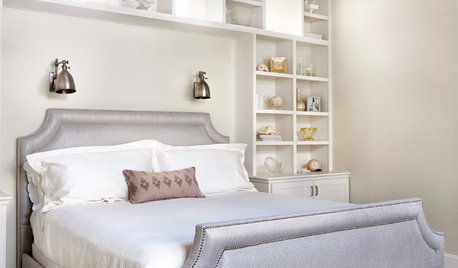
COLOR PALETTESCrisp, Clean White Interiors to Start the New Year Right
Beginning with a blank-slate backdrop gives you infinite design freedom with accent colors, furniture styles and finishes
Full Story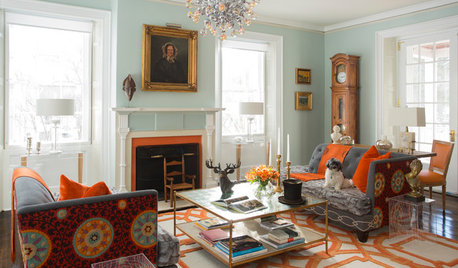
COLORWant More Color in Your Home? Here’s How to Get Started
Lose your fear of dabbling in new hues with these expert words of advice
Full StoryMore Discussions


Scarlett001Original Author
prairiemom61
Related Professionals
Crestview Interior Designers & Decorators · Denver Furniture & Accessories · Franklin Furniture & Accessories · Greenville Furniture & Accessories · Mansfield Furniture & Accessories · Adelanto Furniture & Accessories · Asheville Furniture & Accessories · Carpinteria Furniture & Accessories · Hialeah Gardens Lighting · Venice Lighting · Warwick Lighting · Aurora Window Treatments · Colorado Springs Window Treatments · East Setauket Window Treatments · La Vista Window TreatmentsScarlett001Original Author
yayagal
tuesday_2008
Scarlett001Original Author
Scarlett001Original Author
Scarlett001Original Author
Scarlett001Original Author
Holly- Kay
Scarlett001Original Author
Scarlett001Original Author
dabunch
nosoccermom
Scarlett001Original Author
dabunch
anele_gw
dabunch
anele_gw
Vertise
Scarlett001Original Author
Scarlett001Original Author
anele_gw
Vertise
Scarlett001Original Author
anele_gw
Scarlett001Original Author
Scarlett001Original Author
Scarlett001Original Author
anele_gw
Lori A. Sawaya
Lori A. Sawaya
Vertise
anele_gw
Lori A. Sawaya
anele_gw
Lori A. Sawaya
anele_gw
Vertise
Lori A. Sawaya
Vertise
Vertise
Lori A. Sawaya
Scarlett001Original Author
Vertise
dragon_fly
hlove
Scarlett001Original Author
Scarlett001Original Author
Kooowal