Shop Products
Houzz Logo Print
bbstx

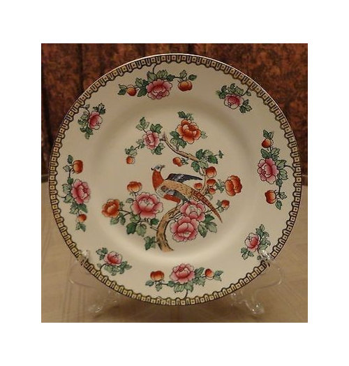
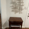
Need help from plate cognoscenti

bbstx
9 years ago

In my guest room, over each bed I'm doing an arrangement similar to the ones on either side of the mirror in this photo.

I already have bird pictures that I swear are the same as the ones in the photo. I also have small gold sconces. Instead of the grouping of 3 plates, I was going to use just one of these plates in each stack, mainly because I already have them

When I did a mock-up on the floor today, my sister thought the plates didn't have the right tone/mood/atmosphere/flavor (it's late. I can't find exactly the right word). She thought the colors in the plates I own are too strong.

Any ideas for plates that would work in this scenario?

btw, below is a link to the full article about the room that is my inspiration. The stack of sconce, bird print, and plate(s) will go over each bed in the guest room.

Here is a link that might be useful: James Farmer inspiration guest room

Comments (26)

  • patty_cakes
    9 years ago

    It's difficult without knowing wall color, bedding color, and what else might be going on in the room. Are you wanting a light palette or more bold, colorful as your plates suggest? Did you like the plates even though your sister didn't 't? I think they're beautiful and would continue to use the brighter colors, in accessories, pillows, etc., but keep the bedding itself neutral, ivory, beige, or tan.

  • User
    9 years ago

    I'm not sure what your question is.

    "Instead of the grouping of 3 plates, I was going to use just one of these plates in each stack, mainly because I already have them."

    One of those plates in each stack of what?

    I think a corbel/sconce, a bird print and one of those plates you have is a perfectly acceptable interpretation of your inspiration look, depending on their placement on the wall, their appearance on the paint color, etc. Frankly, I think the inspiration pic is a little crowded and fussy. And I love your plates!

  • Fun2BHere
    9 years ago

    Sometimes, you have to keep playing around with an arrangement. Here are some ideas to try. What if you change the order and have the picture on the bottom topped by the small sconce/corbel topped by the plate? That would give you some separation between the brighter plate and the more muted picture. Of course, that would only work if the scale of the pieces is right.

    Another option would be to delete the sconce and use one plate above and one plate below each picture which would provide more balance of bright and muted tones.

    Lastly, you might find some plates to bridge the color spectrum between the plates you already own and the pictures. Home Goods has some of the Spode Woodland series in-store right now that might work or check eBay or local thrift stores. If you go in that direction, I would choose all different plates, rather than four of the same pattern.

  • vedazu
    9 years ago

    I'm piling on to kswl's comment: to me, the framed prints are too large, competing with the size of the mirror; the whiskey whatever is completely gratuitous; the blue ginger jar thing on the beside table is much too big and unnecessary; and the lamps themselves are too big for a pair on such a small table. Well, there we go....

  • bbstx
    Original Author
    9 years ago

    The walls are RH silver sage. The bedding is exactly the same as used by James Farmer: Ikea Emmie Ruta duvet folded at the end of the bed, matching sham monogrammed in white, with a white coverlet. The floors are a medium shade of hardwood with an oriental style rug that is a darker shade of silver sage, khaki, and chocolate.

    I would like to stay with a quiet palette.

    I was using the term "stack" to refer to the grouping on the wall. (It was late and my brain was shot last night - not that it is much better this morning!) To me, I see the James Farmer arrangement as a stack: corbel/sconce, bird print, 2 plates, then one plate. My proposed stack was corbel/sconce, bird print, one plate. I have several small plaques of horns. I could add one to the top of each stack.

    I'm considering hanging the "stack" on the wall of the garage utility room to see how it looks on a wall instead of looking at it on the floor.

  • Holly- Kay
    9 years ago

    I love your inspiration room. Yes the lamps are too big for the dresser but that room makes me happy despite it's flaws.

    I think your plates are lovely and I can see them used with success. I would hang everything you have in the order you suggested and keep looking on ebay for other avian plates if you think your current ones don't work once you have them hanging.

    Please post pics when you are finished. I do love that room even though I am usually a Fancy Nancy kind of gal.

  • bbstx
    Original Author
    9 years ago

    Thanks for the comments. I think we may have veered off. I am not doing everything that is in the first photo above. Over each of the twin beds in my guest room, I am doing an arrangement similar to only one side of the mirror .

    I agree that the entire vignette, including mirror, lamps, books, and whiskey barrel looks a little crowded, but yet oddly pleasing. I don't know why this room appeals to me so. Broken down into its elements, I think I would have passed on each thing. But together, they work. Perhaps that is why James Farmer makes his living as a decorator and I'm don't. I don't have "the eye for it." But with help from fellow GW'ers, maybe it won't be so obvious that I don't!

  • LucyStar1
    9 years ago

    The James Farmer bedroom is a muted, woodland theme. Your plates are more of an English chintz look. I think that's what your sister meant. The plates are very pretty and might work. They just won't give you quite the same look as the inspiration room.

  • Bumblebeez SC Zone 7
    9 years ago

    i find that picture quite interesting. It really is lamp overkill, to me, I would never think of putting such large lamps on a table and more stuff in the middle with a similarly sized lamp a few feet away and no table space. But it is attractive.

  • bbstx
    Original Author
    9 years ago

    LucyStar, I think you have articulated the issue succinctly. So, we are back to my initial question...where do I find plates that would help establish a woodland theme?

    Is there some place I should look online - other than ebay? Is my only option to haunt antique stores until I find exactly what I want?

  • My3dogs ME zone 5A
    9 years ago

    Something like the inexpensive game bird plates in the eBay auction linked below may give the look that you want, if you're going to use horns, also.

    They are 8.5" across.

    Here is a link that might be useful: 2 Antique Vintage Game Bird QUAIL DUCK PLATE SET

  • Bumblebeez SC Zone 7
    9 years ago

    Spode woodland is nice and easily available.

  • LucyStar1
    9 years ago

    Here is Spode Woodland:

    Here is a link that might be useful: Replacements

  • Kiwigem
    9 years ago

    I feel the need to understand what you are trying to replicate from your inspiration photo; do you want that woodland mood or are you using it as a springboard for wall art composition?

    If you are going for the mood, I have to agree with your sister. The palette you describe is muted. RH Silver sage is a very soothing color (I've had it in two homes and never tired of it), but I find your plates (while quite pretty) to be very high-energy.

    Now if you are going for a higher-energy mood in the room and you are merely using the inspiration photo as a layout guide, I see no reason why the plates wouldn't work if those punchier colors are used around the room. I would approach that inspiration photo with an editing eye, though. I find some vignettes in that room to be a bit overdone and a guest room is definitely a place where less in more.

  • PRO
    BeverlyFLADeziner
    9 years ago

    For groupings of objects to be successful, there should be a repeating color or image. 1 plate might be a bit weak above the print.

  • User
    9 years ago

    Thanks, I thought you meant stack of plates, which confused me since you were only going to use one.

    I like the proposed configuration over twin beds! Why not try it with the plates you have, and see what it looks like?

  • tomatofreak
    9 years ago

    bbstx, what a coincidence! I pick up solitary pieces of china that appeal to me. I have a platter that matches your plate. I love it - and I'd use it if it picks up or complements something in your room.

    I went looking for a pattern that a friend of mine has, but cannot locate it. However, I did find a bunch of others with a pastoral theme. Among these is a Wedgewood Bunny that I just love. Maybe one will appeal to you. Btw, you can find beautiful pieces for next to nothing in thrift stores. No need to order from expensive online sources - though not all are high-priced.

    Here is a link that might be useful: Wedgewood Bunny & others

  • bbstx
    Original Author
    9 years ago

    I'm trying to recreate the mood of the room. I was hopeful I could do it with objects I already own, but that is looking doubtful.

    beverly27, thanks for the photoshopped picture. You've convinced me that those plates don't give the look I want.

    m3d, those plates are pretty but a little strong for the muted look I'm going for. I looked on ebay yesterday, but I think my search skills need honing. I saw some of the Spode Woodland plates, but I'm concerned that the brown design in the rims may also be too strong.

    While looking on ebay, I found that Boehm did a series of gamebird plates like this one

    Am I getting closer?

  • Holly- Kay
    9 years ago

    Ooooh I do like that plate BBSTX. Beverly is so talented with photoshopping. Maybe she can try this one out?

  • PRO
    BeverlyFLADeziner
    9 years ago

    Here is the image with the new plates

  • Kiwigem
    9 years ago

    The game bird one is definitely more in keeping with the mood you want. Would go nicely with your wall color, too. I think you could find one even better though, in that the composition on the plate is heavy on background and might be a little weighty with your delicate prints. You could make it work, but I bet there is something out there that would blend more easily. I can't wait to see your room!

    This post was edited by Kiwigem on Wed, Oct 8, 14 at 15:55

  • bbstx
    Original Author
    9 years ago

    Thanks, beverly27.

    When you wrote For groupings of objects to be successful, there should be a repeating color or image, did you mean the plate above should be similar to the print below, or did you mean that the grouping should be of similar plates (see first photo using 3 plates in a triangular grouping above bird print)?

    Wow! TF, that was quite the Pinterest board of china! I have 6 of the plates in my original post. I bought them at an auction eons ago. They are not in very good condition. Lots of crazing and discoloration. Figuring out which 2 were good enough to display was going to be a challenge. (So, why do I keep moving these plates if they aren't in good condition? - oh that a question for a different thread on a different day!)

  • voila
    9 years ago

    In the inspiration picture it may be the repetition of equilateral triangles in their layout that makes it pleasing to the eye. See how many triangles you can spot. Do you have room to replicate the design between the twin beds?

  • PRO
    BeverlyFLADeziner
    9 years ago

    See marked up photo. This is why this grouping is successful. Yep it's about the birds, but it's also the repeating colors/tones.

  • bbstx
    Original Author
    9 years ago

    viola, I was just thinking today that I could do some moving around, put a different table between the beds, and do the whole thing - maybe. It is a teeny room, 12 x 15. I currently have an armoire in there for the TV and for guests to have a few drawers to put things in. I'm thinking it is taking up to much space, physically and visually, so I might need to move it out.

    Thanks for the tutorial, beverly27. It is so obvious when you point it out, but I hadn't seen it before.

    This post was edited by bbstx on Wed, Oct 8, 14 at 18:56

  • peegee
    9 years ago

    To add to Beverly's post, balance, scale and weight also play a role with the successful display. For example, not only do the motifs repeat within the dual plates and framed prints, their (light and airy) weights repeat, with the large light background of the prints repeated in the double plates. The top single plates repeat the light background, now in a border - the inverse of the crowning plaque's light open center - their heftier centers helping to visually balance the plaque's weight.