Shop Products
Houzz Logo Print
jockewing

palladian blue, wythe - help me find a blue green!

jockewing
15 years ago

I am desperately wanting to paint my kitchen a sophisticated blue green. I plan on painting my ugly pickled cabinets a rich espresso color with silver pulls, and I have beige tiles on the floor.

I have tried Palladian blue that is so loved here, and I think the color is so vibrant, but it was way too light. I went one up to Wythe Blue. I LOVE this color, but in certain lights (at night with incandescent), it reads as a childish cartoony aqua. It seems so sophisticated on the chip, I can't believe it is behaving this way on the walls. Could it be the interaction I am seeing with the yellow green that is still on half of the wall I haven't painted over yet? I really like this color, but I'm scared of the almost neon aqua look it gives at times.

The Palladian blue strip is so lovely, and I would love to go with Wythe, but who knows. Anyone out there who's used Wythe and has pics? Any other favorite "adult" blue greens?

Comments (31)

  • sarschlos_remodeler
    15 years ago

    I've been sampling so many of these lately it's not even funny. Strangely, these colors look very different in different rooms of my house.

    Glass Slipper is a sophisticated but pale green-blue-gray in my bathroom but a watery blue in my kids' bathroom. (We're using it in the kids' bath, btw)

    I love Quiet Moments, which reads a tad darker than Palladian Blue in my light; Crystalline (in the Affinity colors), and Silver Crest. All are very similar -- they veered more toward the green family than the blue in my house. These might all be too light for your purposes, but should give you color strips as a start point.

  • My3dogs ME zone 5A
    15 years ago

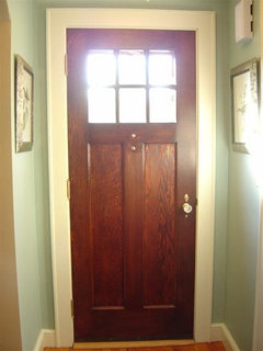
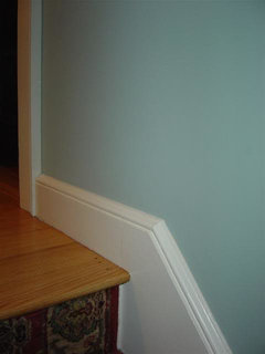
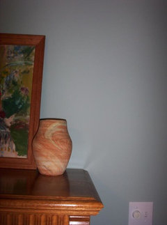
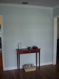
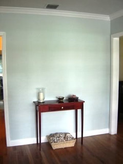
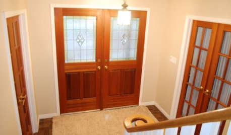
    I used Wythe Blue in my entry and up the stairway to the second floor last January. Palladian was too light for me, too. I had it mixed in Aura paint, and it definitely changes color in different lighting conditions. From personal experience, painting over SW Blonde in my case, I can also say that your view of it IS affected by the surrounding paint. Not to say it'll be perfect for you, but I am enjoying it.

    Here are a couple of pictures of it in different lighting conditions. The green in it comes out in natural light, where the 'aqua' that you mention comes out in incandescent light. Perhaps if I changed to Reveal bulbs (which I normally can't stand) it would bring out the green in it in artificial light. (NOTE - that is an old rug in the dining room, which has been changed now to what you see in the last pic!

    The first two are without lights in my entry, and the other is a the top of my stairs with regular light bulbs. Amazing change, isn't it?

  • Kathleen McGuire
    15 years ago

    Blue green with a little more punch is RL Blue Green or a color from Duron's Historic Charleston Collection is Verdite.
    RL Blue Green
    {{!gwi}}
    Duron Verdite
    {{!gwi}}

  • ttodd
    15 years ago

    Jockewing,
    What color are you using for your trim?

    Whan looking at My3dogs first 2 pics I remembered that I accidentally found out that some of those blues will look more 'subdued' or 'sophisticated' if you use a 'creamier' or more 'bone/tan' colored white instead of pure stark white.

    I confirmed this for myself afterwards by pouring over 3 of my binders of rooms that I really liked and thought were pretty.

  • babs711
    15 years ago

    What about BM Quiet Moments or the shade down from it, Beach Glass? Sometimes people see more blue than green but since you're seeing SO much vibrancy in the other colors, they may work for you. They're very subdued from the gray undertones and might work. They're lovely colors.

  • mommacass
    15 years ago

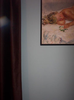
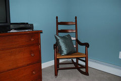
    I painted our master bedroom Wythe blue and I do like it. However, it very often looks green as others have stated. I have posted pics, but keep in mind, my camera is pretty worthless. These pics are reading the blue I see most often. I notice the aqua green more in the evening in lower light.

    Yes, we have a nude painting in our bedroom. When DS21 was younger he said, "Doesn't she get cold, mommy?".

  • jockewing
    Original Author
    15 years ago

    Mamacass, I would have never guessed that to be Wythe Blue!! It looks totally different in your room than it does on my walls. I'm gonna have to start taking pictures and posting because it's so much more helpful when trying to explain to people your questions.

    The Wythe on your walls is EXACTLY the shade I want. Not quite blue, not quite green, a tad grayed, but NOT something you would call gray on first glance, and most importantly, not a cartoony swimming pool aqua!

    I was looking at SW Rain on the strip last night as a possible choice, but next to Wythe, it looks downright blue. Any other suggestions?

    To answer ttodd's question about the trim--all the trim in my house was already painted some shade of white in the most off-brand paint. The builder started to get really cheap in a rush to finish off the house, and he used TERRIBLE paint for the doors and trim. It is some shade of white, but to be honest, it looks to me like the white paint in the home of a smoker. It always looks yellowed and dirty. I hate the color of the trim in my house, and this paint gets scuffed and marked so badly, it honestly looks terrible. I just shudder at the thought of re-painting all that stuff, but I bet if I did, the house would looks so much cleaner and fresher. Any ideas for a white trim color that I can use throughout the house that goes well with everything?

  • stephanie93
    15 years ago

    Take a look at SW Sea Salt and something that is a little more on the gray side would be Behr-Light French Grey

  • Lyban zone 4
    15 years ago

    I have used BM Mount Sainte Anne in a basement Bathroom which does not get any natural light but has a lot of lighting.
    It shows different in both these photos but I really like it.

    {{!gwi}}
    {{gwi:1452032}}

  • jockewing
    Original Author
    15 years ago

    Lyban, thanks for the suggestion. The Mount Saint Anne looks like what I want. Basically I love the West Indies look (without going too obviously "beachy") mixed with some contemporary and traditional pieces. Although I am usually drawn to warm colors, due to room size and lack of natural light, I want the receding qualities of a cooler color. I find that adding the green to the color warms the blue up some and makes it more pleasing. I think the blue-green is good because it is more interesting than the sage type greens, but not as boring as the plain old light blue colors. But, I find the blue greens difficult, as they are either too gray or "baby" blue, or they go too obviously 50's aqua. I want something that has a nice color without being too washed out, but I don't want people to walk in and think "turquoise walls" either.

  • budge1
    15 years ago

    Are you sticking with BM colours? I'd suggest looking at Farrow and Ball. Their colours are a bit more muted and sophisticated than some of the BM colours you've llisted. I've also toned down a colour I liked by adding a bit of black. However, if you do this be sure you mix as much paint as you need at the beginning because you'll never get it the same again (ask me how I know :-)

  • Taralyn
    15 years ago

    Check Covington Blue and Mill Springs Blue by BM - blue-green-gray colors, but more blue.

    terry

  • julienpete
    15 years ago

    We are going with SW Window Pane and SW Sea Salt, they are both greeny-grey which can look bluish in certain lights Both very subtle.

  • runninginplace
    15 years ago

    Quiet Moments views, here we go. As I've rattled about ad nauseum, I mixed QM at 50% and am steadily painting all my public areas in that color. I love it!

    And just to exemplify how many ways one color can look, here is a view of my foyer taken a moment ago-a relatively bright autumn afternoon in the subtropics. No auto correct and this is what it really looks like:

    Same photo, autocorrect (MS Picture editor. Looks almost mint green to me in this view):

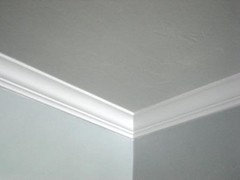
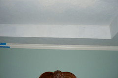
    Detail of a corner of the ceiling-BM Quiet Moments on wall, manual mix on ceiling to coordinate. I was going for complementary but a bit lighter and like it a lot. Well other than the little holiday there in the corner, which I never noticed till I took this picture:

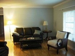
    And finally another picture of my living room painted QM.

    Although, I'm thinking of checking out the Palladian Blue for my bedroom...gotta break my Quiet Moments addiction sometime!

    Seriously though, the color reads as green but with substantial blue tones as well. And the effect is very cooling, which I suppose might be the touches of gray. After over a year on the walls I still love to just sit and look at it; it really is a beautiful shade.

    Ann

  • happytobehome
    15 years ago

    I used one shade deeper on the BM Palladian Blue and Wythe Blue strip in my basement guest room, called Stratton Blue. Because it's in a basement room, it looks a little darker in the picture than it actually is. I had planned on using the Wythe Blue, but wanted more intensity. I really love the Stratton Blue. It is definitely a blue/green shade.

    Hope you find the perfect color!

  • jockewing
    Original Author
    15 years ago

    Omg, your Stratton pics illustrate what is happening to me! In the daylight, my Wythe looks like the top pic, but at night, it turns into the neon aqua like in the lower picture. That is a beautiful shade, but too bright for me!

  • jacie28
    15 years ago

    I just painted by bedroom with SW Quietude, which I absolutely LOVE. My only problem is now what to do with the tray ceiling. I'd like the large flat part to have some complimentary color without looking like I picked two random colors. Would love to hear ceiling suggestions.

    Here is a link that might be useful:

  • happytobehome
    15 years ago

    jockewing - the stratton blue is really not bright or neon aqua. The bottom pic is with a flash and looks much brighter than it actually is. It is really much more subdued, more like the first pic, but not as dark.

  • jockewing
    Original Author
    15 years ago

    OKAY, I think I may have finally, finally found my blue/green. I got a sample pot of Benjamin Moores "Azores" which is one of it's new Affinity colors made for the Aura paint. I must say that little pot really covered a large part of the wall. The Aura is lovely to work with. Usually you have to wait about 20 minutes to see the final color of paint after it has dried a bit on the walls, but with the Aura, you could virtually see the color darkening before your eyes. Within 5 minutes the final color was set.

    Azores looked much more green than blue in the store, but when I got it home and up on the walls, it looked very much like a darker version of Wythe blue or Stratton blue, with a tad more depth and warmth. I still get that Jade-y, ocean-y, tropical feel, but somehow the color is more grounded and not so garish. I promise to finally break out the digital and take pictures after it's up on the wall.

    I think I'm having so much trouble with these colors since I almost always use warm colors. The coolness of this color is throwing me for a loop. It seems to look so odd against whatever white color that the builder put on the trim. I would love to get all the trim and doors redone in a quality paint in the right color. Anyway-I will be getting a quart of the Azores mixed today--the kitchen I have has very little wall space as it's an open floor plan so I really think a quart will be enough. At $18.99 a quart and $56! for a gallon, thank goodness. I hope it's as fun to paint with Aura as I think it's gonna be, and I hope I can get used to the coolness of the color.

    One thing I have noticed-the portion of the kitchen closer to the breakfast area is lit by incandescent, and the wall color there looks much greener and warmer. On the other side of the wall, which is lit by a fluorescent fixture, it goes blue and not as pretty. Are there warm-toned fluorescent bulbs available that might help alleviate this problem?

  • sarschlos_remodeler
    15 years ago

    jockewing -- I have been using BM Aura paint throughout my house in their matte finish, and I love it. It's great to work with -- doesn't drip or spatter, dries quickly so that I can put the second coat on in 2 hrs, cleans up very easily. The thickness of the paint helps my edging look professional (my most-hated aprt of painting). I have been equally pleased with the end result. The surface has a soft powdery texture that I just love. I've most recently been painting our stair railings, and I just can't keep my hands off the handrail -- I just want to touch it all the time it's so soft. I love that I can use a matte finish in bathrooms and kitchens, too. Haven't had to test the scrubbability yet, but I'm assuming that the claims about scrubbability will be as true as the rest of the claims BM makes about the Aura.

    I think it's funny that you want to play up the green. I'm always playing up the gray and blue in my house, but I love cool colors and shy away from warm colors. :)

  • twg7590
    15 years ago

    I used Restoration Hardware Silver Sage in a guest bedroom and it is a gorgeous color that is a silvery greenish blue that changes with the light. I love it.

  • witmom
    15 years ago

    Hijack coming up- Babs, could you tell me about your lamps and bedding? They look wonderful. I'm working on redoing our master right now. They'd be perfect.

  • babs711
    15 years ago

    Hi witmom! I found my bedding a couple of years ago at Steinmart of all places! I had been looking for a while and just randomly came across it before we were even back in our house from Katrina. I don't know the brand though. I think they still have some similar styles there though. The throw pillows were separate pieces.

    The lamps are by Uttermost lighting. I believe they're still on their website. You can probably order them through any lighting company. I ordered them locally after seeing it in a lighting store. I know zgallerie.com had them at one time because I remember seeing the matching floorlamp.

    Hope that helps a bit! Oh, and thanks for your kind words! Made my night!

  • witmom
    15 years ago

    Thanks so much babs711! Funny you mention Steinmart. I am unfamiliar with Steinmart, but we recently relocated to a new city, and they have them here. I wondered what they were all about...I guess now I'll have to check them out. I will definitely try to track that lamp down. Just lovely.

  • babs711
    15 years ago

    You're welcome! I think I'd gone in that day to look for shoes and wandered over to the bedding section and randomly found it! LOL! Good luck!

  • bettycbowen
    15 years ago

    Hi - I have ALL Palladian Blue ceilings except in one bath. The difference in lightbulbs is astonishing. I have one wall with one incandenscent and one CFL, and the CFL side looks true, and the incan looks Green!!! I have no doubt the same would happen with Wythe (love that color too).

    I even have Palladian Blue ceilings in the room that is Gray Wisp, which is the same as Silver Sage. Looking in some directions, you can not tell they are different (the Palladian and Wisp) colors, other times you can - they mingle then change - I love how they interact.

    So, I hope you will try some different lightbulbs before you decide.

  • nami
    15 years ago

    SW Rain and SW Silvermist are beautiful colors too.

    Babs 711 -
    I love your bedroom, i have a question - if I had a similar wall color and bedding - what would
    be a good color for drapes?
    Thanks, Nami

  • paddytc
    15 years ago

    I have Palladian Blue in master bath and wythe in master bedroom. I love both colors. Never have I thought Whythe blue as cartoony. My paint was BM Regal Matte finish.

  • jockewing
    Original Author
    15 years ago

    I wouldn't ever think Wythe would be cartoony either, but I HATE the lighting in my house-it screws up everything and makes it almost impossible to find good paint colors. I wish I could get some recessed fixtures put in. All I really have are incandescent ceiling fans with lights or cheap chandeliers. The incandescent gives everything a yellowish cast--blech!

  • babs711
    15 years ago

    Nami,

    Thank you! Well, to keep things tranquil and serene, if you have white woodwork, you could just go with a soft white or light ivory. I know Pottery Barn has plain, unlined panels that wouldn't be too heavy. I saw them a couple of weeks ago and got them for our dining room. I wanted something that would filter light and not be too heavy looking for the room yet not too sheer. I kind of like things monochromatic in the bedroom but that's just me. You might go to a fabric store and find a nice subtle print. It depends on how dressy you want it to be or how dark. You could also go with the bronzey color of the pillow you see on my bed if you wanted a darker look. I wasn't much help was I?? LOL!