Shop Products
Houzz Logo Print
mtnrdredux_gw

Paint Pandemonium

mtnrdredux_gw
10 years ago

Okay, I give up. Bring on the professionals.

So I did very careful research on grayish-blue-green colors to use with my dark panelled walls in the BH.

I got lots of great suggestions. I chose 19 colors.

Today my DH and DD painted sample boards.

I need to try them in the BH of course, but I thought id just look at them against my cherry wood counters, since it is similar to the panelling in the BH.

Umm. I don't like any of them so far.

::: pulling hair out :::

It occurred to me, duh, that everyone recommending these colors used them against white wood work, in all likelihood. The cherry toned wood pulls red into the paint color and totally messes with it.

Boo hoo. I think I totally messed up. Farrow and Ball does in home color consult, and that is sounding pretty good right now, LOL.

The other thing that occurred to me, and am sure smart people have some term for this, but going with TOO light paint color won't lighten the room ... the very light wall will just make the wood feel EVEN darker.

Comments (21)

  • Holly- Kay
    10 years ago

    I am confused with color too. It truly is the bane of my existence right now. I have dark stained trim but I am going with paint with a high lrv for.my living room. I am considering SW Jersey Cream but I am concerned that the room might look bright screaming yellow instead of the lovely buttery mellow yellow I envision.

    A blue green maybe too contrasting. I just had the breakfast area painted SW Naturel and it looks good with my sapele floors. It is a neutral with a hint of green and sometimes appears silvery, beige, or green but I love it in all lights.

    Ellen Kennon full spectrum paints might be a consideration. She gives a free color consult if you purchase her paints. It may be worth a try!

  • mtnrdredux_gw
    Original Author
    10 years ago

    Holly Kay,

    I knew paint was hard, and I think that was why I wimped out here in CT. Every wall and trim is pretty much from the first fold of the Farrow and Ball color card; all their whites!

    I did in fact order some Ellen Kennon. They havent arrived yet.

    But FnB will come to the home ... has anyone done that? Had FnB out?

    They charge $200 to choose color for up to 4 rooms ... very reasonable.Of course, the entire company really just exists to sell sample paints for a 6,000% mark up to stupid Americans who all want to pretend they live at Downton Abbey. You should see their brochure. I think the normal paint companies would be totally flummoxed; the new FnB brochure is done with PBS period drama lighting, which means you can't see any of the colors at all, but you have a sense that Mr. Carson is about to stroll in with tea service.

    I still love them.

  • lazydaisynot
    10 years ago

    mtnrdredux, I'm no paint pro, but I bet the light in your beach house is completely different from the light in your beautiful CT home. It's so deceptive to evaluate a color away from its actual habitat.

    I agree that a color that's too precious or fresh or light will probably only make the space feel dimmer, but I'd wait to assess the paint boards on-site before deciding to abandon your first round of options.

    I suggested RH Silver Sage, a color that looks sad and blah to me on swatches or boards; but for some reason it worked for us in two rooms with limited light. Somehow, the dulled-down nature of its color (please note the technical terms) seems to make the rooms feel more alive. Of course, this color might not work at all in your beach house.

    For me, it's all about the light -- something that can't be replicated, photographed or described. I'd haul those boards down (er, up?) to the beach house and settle in for a weekend of contemplation before setting sail for a different horizon. You may decide you need to abandon ship; or not. Running out of coastal Maine descriptors here and hesitating to move on to crustaceans, I'll just wish you luck with your quest and add an iconic Seattle suggestion. Keep clam.

  • graywings123
    10 years ago

    When you first posted the question, what came to my mind was a darker blue, such as Van Courtland blue HC-145 or even darker. But I didn't mention it when I saw all the suggestions for the lighter shades. But even a more saturated blue is still going to have the orange-blue fight going on with the cherry wood.

  • francoise47
    10 years ago

    mtndredux,

    I feel your pain because right now I'm trying to find a F & B color for my dining room that goes well with my dark, reddish chestnut trim. (But I don't have as much dark wood as you do.)

    So far, F&B "Off-White" and "Strong White" look like real possibilities. Have you tried them?

    "Strong White" takes on a nice complementary bluish gray cast next to the woodwork. "Off-White" is an interesting and complex color that looks very light in sunlight, but can hold its own against the dark wood. I've also tried "Clunch" -- it is soft and lovely with the wood, but a little boring.

    I've also considered springing for the in-home color consultation. I've practically spent that much on sample pots over the past three years! So I will be interested to hear about your experience if you go that route.

    No matter what, I look forward to seeing your results -- it will be so beautiful, I'm sure!

  • Annie Deighnaugh
    10 years ago

    I agree with lazydaisynot...the light in the room means so much to paint color. I used the same color on the wall in my DR as on the ceiling in my library and yet standing there and looking in the 2 rooms, they look like completely different colors...so much so that the carpenter didn't believe me and took the paint chip from one wall to the other to see.

    Same thing with the new paint in my BR. Even though the wall color in the nook and in the room are different, the way the sunlight hits them, they look the same. It's amazing.

    I know you're anxious, but you need to see the swatches in the room before you decide...just be sure to bring some of the more saturated colors too so you can see what looks best. (I will admit that I like the way the very saturated rust color in my kitchen brings out the graining in the cherry cabinetry....and it feels rich, not dark.)

    And please don't have the color consult, if you choose to do it, in CT...my GF is having all kinds of struggles as she went to Ethan Allen to purchase LR and DR figuring it would be an easy one stop shop with their decorator...instead she's now asked me to help fix the rooms as the fabrics and rugs and color selections look awful in her house and are not what she wanted...regardless of how they looked in the store. If you're going that route, do it in the house...makes all the difference.

  • Holly- Kay
    10 years ago

    Mtn, I spent well over a hundred dollars on sample paints. Both Ellen Kennon and SW colors. It is so frustrating when colors that you love on the paint card looks awful on the wall. I have all of Ellen Kennon's sample cards and she has some very lovely colors but the Tiffany Taupe that I wanted to use in the kitchen looked really bad with my cabs as did the 6 or 7 other colors that I bought of hers and the similar amounts of paint I bought from SW. In the end I am happy with the Naturel in the kitchen/breakfast room but still really worried about painting the lr Jersey Cream because it is a largish room with cathedral ceilings so I am pretty sure the painter will charge and arm and leg to do it. I may just wimp out and go with Naturel for the lr too.

    Good luck in your quest for the perfect paint!

  • alex9179
    10 years ago

    No need to despair, yet! Wait until you're there and see the combinations in person before you throw the samples in the air :)

    You know, you COULD embrace the moodiness :) I find rooms like that very cozy and soothing.

    [Traditional Living Room[(https://www.houzz.com/photos/traditional-living-room-ideas-phbr1-bp~t_718~s_2107) by Boston General Contractors Woodmeister Master Builders

  • mtnrdredux_gw
    Original Author
    10 years ago

    Thanks to all of you who shared my pain!

    Oh goodness, no, it would make zero sense to have the color consult done in the wrong home! FnB would do it for me in the new house, out of their Boston office.

    And yes, as I have said myself, i should not even try the colors here in my CT house. But the stack of sample boards was there, it was only natural to look through them. We did, in several kinds of light, and this morning some are hanging on my dark cherry armoire.

    We will haul all of this with us next weekend, but the 19 colors are all in the same family (in that sense they were really good suggestions!!) and I think I am being too conservative and too grey. It needs more life I think.

    So I put on a fake nose and glasses and slunk back to the paint store this am. Got some truer aqua-y colors, more duck egg. Not quite Tiffany, but you get the idea. I will paint up some of those samples to take, too.

    I think i'd like to learn more about color -- any good books I could read? I just find it really interesting.

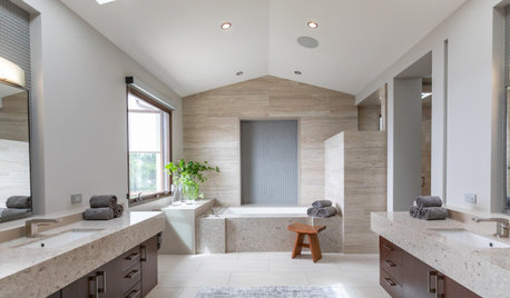
    Here are two images I found that manage to blend some old world elements with a fairly bright, happy, blue. I am leaning this direction, understanding that these rooms are very different from mine but there is some similarity in what I am trying to do:

  • MarinaGal
    10 years ago

    The interaction of paint color with wood undertones is extraordinarily difficult - lesson learned from my own past attempts! The happy blue is a great idea.

    In response to your color question, the book that was recommended to me is Interaction of Color by Josef Albers. Artists use it. I am fascinated by color and how colors play off each other. It's a pricey book but I borrowed one for a while and I also know it's in libraries.....

    I love the hunt for the perfect paint color - it's one of my happy obsessions. :)

  • mtnrdredux_gw
    Original Author
    10 years ago

    Thanks so much, Marinagal. Looks like its now on Amazon in paperback, but i think i will see what they have at the library...

  • suero
    10 years ago

    I don't have a color for you, but I do have a suggestion. If you decide to go cozy, the green of Wedgwood green jasperware will work well with cherry wood. The BM formula for a gallon of flat is
    2752B-1 (base)
    YW 15, OY 2Y12, BB 24, BR 27 (tints)

  • gwlolo
    10 years ago

    I thought this picture of our master bedroom walls could help you a bit. Here is Farrow & Ball in 2 colors, TeresaâÂÂs Green #236 on the right and Pale Powder #204 which is the lighter color on the left- both Estate Emulsion. The pale powder is FnB light undercoat and theresa's green is dark undercoat per FnB recommendation. The wood panel is quite dark it is dark mahogany gel stain. When I took the photo, there was indirect light from the skylight - no flash.


    We did use a color consultant to give us some input.

  • scanmike
    10 years ago

    Hi,

    I forgot your original post but I know greens look very good with cherry wood. It can't be that none of your colors look good. I think you are getting yourself crazy and desperate. I only say that because i just did it and did it in the past also. I literally gave up and painted a color, that I now hate because i wanted to be safe. I was thinking of just going cream because I couldn't make a decision. I just took a break from it and came back more calm. If you think having F&B come, then do so, but that is one expensive paint job.

  • User
    10 years ago

    Can only empathize with you over this dilemma. My color bane is green... we tried 14 shades of green until we came up with a custom color for the main part of our first floor.

    I also agree that the colors recommended so far are nothing like what your house / woodwork needs. They are very hip, very 2013.... your house is at least a century behind. You might want to check out historic colors from your time period. I think a variety of blues, all very clear colors even if faded (no greying out, no coy hovering on the verge of two different colors), will look marvelous in your new beach house. Maybe even a light navy---with white slipcovers, what a wonderful contrast, and nautical :-) You could do a fabulous blue willow printed fabric in your dining room with the next door navy as one of the blues. I love daydreaming about your house!

    adding, OMG! Cannot believe I did not think of this before.... seafaring toile! It can be witty and pretty and blue and white toile is truly a classic.

    This post was edited by kswl on Fri, Sep 6, 13 at 15:18

  • francoise47
    10 years ago

    One of the new F&B colors being introduced this month (Sept. 2013) is "St. Giles Blue". Perhaps it would suit your vision for your beach house? Here it is.
    {{!gwi}}

    Personally, I would not be brave enough to use that color on the walls. I'd probably stay neutral for the walls and use colorful fabric.

  • User
    10 years ago

    Go to Town Toiles... they have this fabulous blue Boston toile:

    {{!gwi}}

    And Fisher Island:
    {{!gwi}}

    San Francisco toile in blue and brown would look fabulous with your woodwork:
    {{!gwi}}

  • luckygal
    10 years ago

    Kswl has certainly introduced a valid point, to choose an inspiration print and have the color mixed to match. IMO that's the easiest way to choose a color as otherwise there are too many thousands of choices. Of course I've never done that but do think about it and may do it at some point.

    The blue Boston toile would look wonderful even if you only used it for pillow covers and you'd have the choice of either the blue background or the cream or grey color for the walls.

  • maggiepie11
    10 years ago

    hi there!

    thought i'd post some pics that may (or may not) be helpful to you as well.

    this is my last kitchen with bordeaux cherry finish cabinets. the paint on the kitchen walls is courtyard shadow (valspar) which is a pale gray-blue. in the background you can see RH silversage in the hallway and family room. that paint was such a chameleon! and then some pics of the family room itself in silver sage. the valances are a pure chocolate brown if that helps visualize your woodwork?

    this first pic is making the colors look more saturated than IRL. the last pic is probably better though it's an odd pic.


    this is probably a more accurate pic of the colors side by side.

    odd sidenote... as much as i love RH Silversage, and i recommend it to everyone... i don't recommend it for you. i hated the brown with it in my family room, but the couch showed up a much warmer color than i expected and just had to sort of go with it. haha then again, i'm not a warm color kinda gal. :)

  • Sueb20
    10 years ago

    Have you looked at greener colors? How about something like Gray Mirage...Prescott Green...or Tea Light? I know you're probably thinking beach house = blue, but that might not work for this room. Oh, or maybe Colony Green? We have it in my DS' bedroom in our beach house, totally different type of room and situation, but I love the color. (All Ben Moore colors.)