


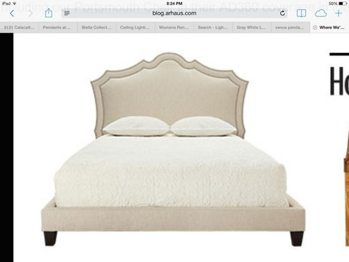
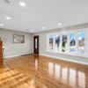
Please help me choose a paint color
chloenkitty
9 years ago
Sort by:Oldest
Comments (33)
Related Stories


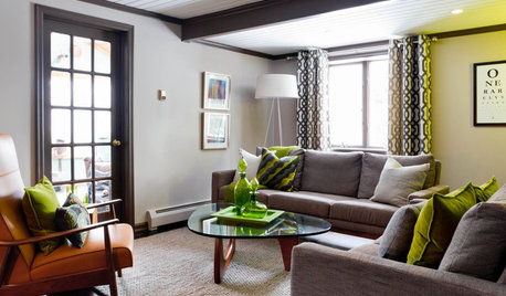
LIVING ROOMSCurtains, Please: See Our Contest Winner's Finished Dream Living Room
Check out the gorgeously designed and furnished new space now that the paint is dry and all the pieces are in place
Full Story
EXTERIORSHelp! What Color Should I Paint My House Exterior?
Real homeowners get real help in choosing paint palettes. Bonus: 3 tips for everyone on picking exterior colors
Full Story
HOME OFFICESQuiet, Please! How to Cut Noise Pollution at Home
Leaf blowers, trucks or noisy neighbors driving you berserk? These sound-reduction strategies can help you hush things up
Full Story
COLORPaint-Picking Help and Secrets From a Color Expert
Advice for wall and trim colors, what to always do before committing and the one paint feature you should completely ignore
Full Story
COLORPick-a-Paint Help: How to Create a Whole-House Color Palette
Don't be daunted. With these strategies, building a cohesive palette for your entire home is less difficult than it seems
Full Story
HOUZZ TOURSMy Houzz: Saturated Colors Help a 1920s Fixer-Upper Flourish
Bright paint and cheerful patterns give this Spanish-style Los Angeles home a thriving new personality
Full Story
KITCHEN DESIGNDesign Dilemma: My Kitchen Needs Help!
See how you can update a kitchen with new countertops, light fixtures, paint and hardware
Full Story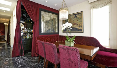
Yes, Please: Parisian Hotel Flair
Bring on the Bling to Recreate the City of Romance at Home
Full Story


chloenkittyOriginal Author
chloenkittyOriginal Author
Related Professionals
Ashwaubenon Interior Designers & Decorators · Ogden Interior Designers & Decorators · Chambersburg Furniture & Accessories · Jacksonville Furniture & Accessories · Duluth Furniture & Accessories · Farmington Furniture & Accessories · Carlsbad Furniture & Accessories · Fallbrook Furniture & Accessories · Zionsville Furniture & Accessories · Tamalpais-Homestead Valley Furniture & Accessories · Baldwin Park Lighting · Laguna Beach Lighting · Pearland Lighting · Venice Lighting · West Des Moines Window TreatmentschloenkittyOriginal Author
tibbrix
mtnrdredux_gw
akl_vdb
tibbrix
maddie260
chloenkittyOriginal Author
chloenkittyOriginal Author
chloenkittyOriginal Author
chloenkittyOriginal Author
tibbrix
chloenkittyOriginal Author
tibbrix
melle_sacto is hot and dry in CA Zone 9/
chloenkittyOriginal Author
junco East Georgia zone 8a
chloenkittyOriginal Author
tibbrix
tibbrix
User
louislinus
Gracie
junco East Georgia zone 8a
Annie Deighnaugh
Lori A. Sawaya
chloenkittyOriginal Author
dakota01
rgps
chloenkittyOriginal Author
tibbrix
cawaps