


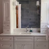
My Kitchen Needs Color
karenfe
13 years ago


Related Stories
KITCHEN DESIGNNeed More Kitchen Storage? Consider Hutch-Style Cabinets
Extend your upper cabinets right down to the countertop for more dish or pantry storage
Full Story
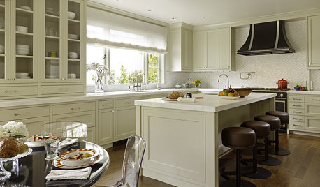
KITCHEN DESIGNKitchen of the Week: Taking Over a Hallway to Add Needed Space
A renovated kitchen’s functional new design is light, bright and full of industrial elements the homeowners love
Full Story
MOST POPULARHow Much Room Do You Need for a Kitchen Island?
Installing an island can enhance your kitchen in many ways, and with good planning, even smaller kitchens can benefit
Full Story
KITCHEN APPLIANCESLove to Cook? You Need a Fan. Find the Right Kind for You
Don't send budget dollars up in smoke when you need new kitchen ventilation. Here are 9 top types to consider
Full Story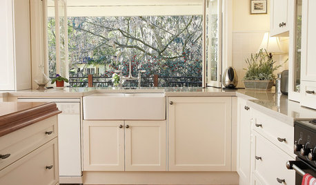
KITCHEN SINKSEverything You Need to Know About Farmhouse Sinks
They’re charming, homey, durable, elegant, functional and nostalgic. Those are just a few of the reasons they’re so popular
Full Story
KITCHEN DESIGNDesign Dilemma: My Kitchen Needs Help!
See how you can update a kitchen with new countertops, light fixtures, paint and hardware
Full Story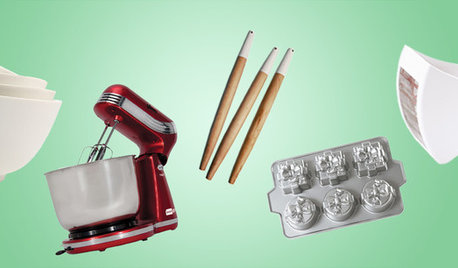
SHOP HOUZZShop Houzz: Everything You Need for Holiday Baking
Be a pro pastry chef in your own kitchen with the help of our newest holiday baking picks
Full Story0
MORE ROOMSYou Don’t Need a Workout Room, Just a Well-Trained Home
See how just the way you set up your TV, workstation or kitchen can help you stay fit this year
Full Story
LIFEDecluttering — How to Get the Help You Need
Don't worry if you can't shed stuff and organize alone; help is at your disposal
Full Story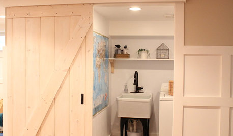
DIY PROJECTSMake Your Own Barn-Style Door — in Any Size You Need
Low ceilings or odd-size doorways are no problem when you fashion a barn door from exterior siding and a closet track
Full StoryMore Discussions


juliekcmo
msrose
Related Professionals
Appleton Interior Designers & Decorators · Hercules Interior Designers & Decorators · Queens Interior Designers & Decorators · View Park-Windsor Hills Interior Designers & Decorators · Wilmington Furniture & Accessories · Fair Lawn Furniture & Accessories · Nixa Furniture & Accessories · Riverton Furniture & Accessories · Clive Furniture & Accessories · Glendale Lighting · Modesto Lighting · Tukwila Lighting · Berkeley Window Treatments · Del City Window Treatments · Salt Lake City Window TreatmentskarenfeOriginal Author
juliekcmo
teacats
kayec28
yayagal
amysrq
Happyladi
bronwynsmom
karenfeOriginal Author
bronwynsmom
Happyladi
susanelewis
lynninnewmexico
homebodymom
msrose
mahatmacat1
susanelewis
karenfeOriginal Author
gigib_08
live_wire_oak
jab65
cpartist
karenfeOriginal Author
lynninnewmexico
scanmike
homebodymom
dianalo
loribee
jimsonburg
msrose
karenfeOriginal Author
mom2sethc
Kathleen McGuire
karenfeOriginal Author
mom2sethc
karenfeOriginal Author
annie4714