


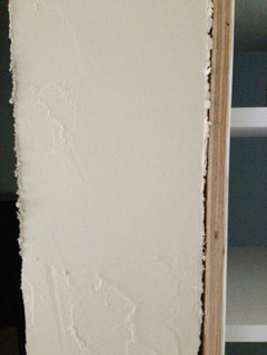
Does SW Divine White have a pink undertone?
msrose
9 years ago
Featured Answer
Comments (22)

Gracie
9 years ago
msrose
9 years agoRelated Professionals
Boise Interior Designers & Decorators · East Hanover Interior Designers & Decorators · Lomita Interior Designers & Decorators · Suisun City Interior Designers & Decorators · Van Wert Interior Designers & Decorators · Wichita Furniture & Accessories · Woodstock Furniture & Accessories · Fort Carson Furniture & Accessories · Pleasant Grove Furniture & Accessories · Kingsburg Furniture & Accessories · Folsom Custom Artists · Camp Springs Lighting · Fremont Window Treatments · Rockford Window Treatments · Salt Lake City Window TreatmentsGracie
9 years ago
sweet_tea_
9 years agomsrose
9 years agosweet_tea_
9 years agomsrose
9 years agomsrose
9 years agosweet_tea_
9 years agomsrose
9 years agosweet_tea_
9 years agomsrose
9 years ago PRO
PROLori A. Sawaya
9 years ago- PRO
Lori A. Sawaya
9 years ago msrose
9 years agomsrose
9 years ago- PRO
Lori A. Sawaya
9 years ago msrose
9 years ago- PRO
Lori A. Sawaya
9 years ago 
aimeegabert
9 years ago PRO
PRODesign2Sell
3 years ago


Related Stories

INSIDE HOUZZHow Much Does a Remodel Cost, and How Long Does It Take?
The 2016 Houzz & Home survey asked 120,000 Houzzers about their renovation projects. Here’s what they said
Full Story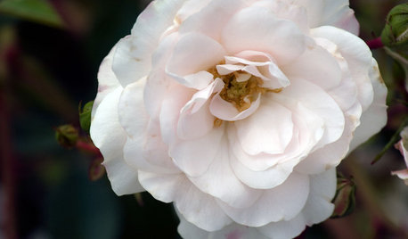
GARDENING GUIDES5 Favorite White Roses for a Purely Beautiful Garden
How does your garden glow? With roses that look like light and smell divine
Full Story
MOST POPULARMust-Try Color Combo: White With Warm Off-White
Avoid going too traditional and too clean by introducing an off-white palette that brings a touch of warmth and elegance
Full Story
COLORBathed in Color: When to Use Pink in the Bath
Even a sophisticated master bath deserves a rosy outlook. Here's how to do pink with a grown-up edge
Full Story
WHITEHow to Pick the Right White Paint
White is white, right? Not quite. See 8 white paint picks for 8 very different effects
Full Story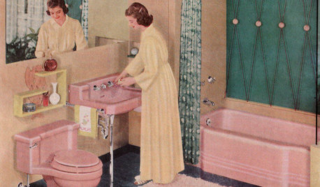
MOST POPULARHomeowners Give the Pink Sink Some Love
When it comes to pastel sinks in a vintage bath, some people love ’em and leave ’em. Would you?
Full Story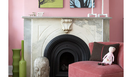
COLORPretty Pink Color Schemes, Subtle to Sensational
How do we love pink? Let us count the ways: soft, sassy, with chartreuse and electric blue and, yes, even red ...
Full Story
DECORATING GUIDESNature’s Color Wisdom: Lessons on Pink From the Great Outdoors
Leave your assumptions about pink at the princess playhouse door. Head outside instead for shades from shocking to subtle
Full Story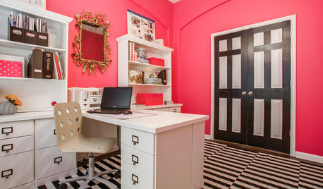
HOME OFFICESRoom of the Day: Proudly Pink in San Antonio
See how a ho-hum beige box became a luscious and energizing workspace worth showing off
Full Story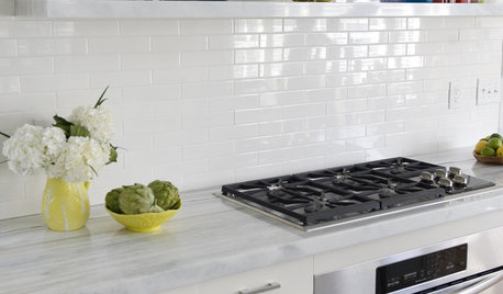
KITCHEN DESIGNWhat to Do if Your Kitchen Is Simply Too White for You
Does your all-white kitchen have you craving a little color? Here are some ways to introduce it
Full StoryMore Discussions


Lori A. Sawaya