


Picking paint for areas with not much natural light
sis2two
9 years ago
Sort by:Oldest
Comments (11)
Related Stories
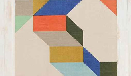
PRODUCT PICKSGuest Picks: Colorful Patterned Area Rugs for All Tastes
From subtly sophisticated to downright swirltastic, these area rugs will please the eye while cushioning the feet
Full Story
DECORATING GUIDESNature’s Color Wisdom: Lessons on Green From the Great Outdoors
Green will grow on you for interiors when you look outside for ideas on how to use it
Full Story
PAINTINGBulletproof Decorating: How to Pick the Right Kind of Paint
Choose a paint with some heft and a little sheen for walls and ceilings with long-lasting good looks. Here are some getting-started tips
Full Story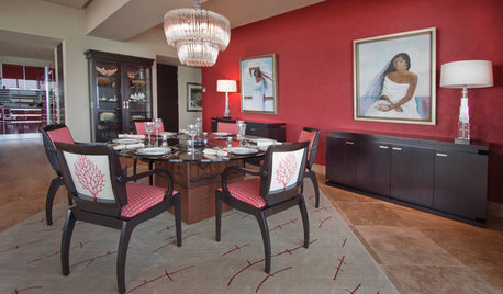
ORANGEPaint Picks: How to Choose the Right Coral
Don't Be Afraid to Try the Eye-Catching Colors of Dawn and Dusk
Full Story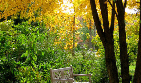
COLORNature’s Color Wisdom: Lessons on Yellow From the Great Outdoors
Let the sunshine in. These ways to use yellow will cheer up your interiors and make Mother Nature proud
Full Story
COLORNature’s Color Wisdom: Lessons on Earth Tones From the Great Outdoors
Look to the land for hues that are grounding, soothing and endlessly versatile
Full Story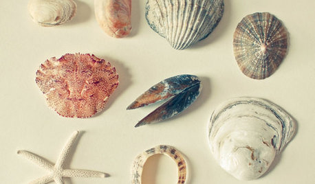
DECORATING GUIDESNature’s Color Wisdom: Lessons on Pink From the Great Outdoors
Leave your assumptions about pink at the princess playhouse door. Head outside instead for shades from shocking to subtle
Full Story
WHITEHow to Pick the Right White Paint
White is white, right? Not quite. See 8 white paint picks for 8 very different effects
Full Story
COLORPick-a-Paint Help: How to Quit Procrastinating on Color Choice
If you're up to your ears in paint chips but no further to pinning down a hue, our new 3-part series is for you
Full Story
COLORPick-a-Paint Help: How to Create a Whole-House Color Palette
Don't be daunted. With these strategies, building a cohesive palette for your entire home is less difficult than it seems
Full StoryMore Discussions


zippity1
sis2twoOriginal Author
Related Professionals
Mansfield Interior Designers & Decorators · Ridgefield Interior Designers & Decorators · Easton Furniture & Accessories · Lebanon Furniture & Accessories · Madison Furniture & Accessories · Rome Furniture & Accessories · Walnut Creek Furniture & Accessories · Golden Glades Furniture & Accessories · Glendale Lighting · Warwick Lighting · York Lighting · Del City Window Treatments · Ojus Window Treatments · Salt Lake City Window Treatments · Winter Garden Window Treatmentsflowerpwr45
Holly- Kay
cawaps
tibbrix
nutsaboutplants
kimberlyrkb
selcier
sis2twoOriginal Author
Boopadaboo