


If anyone has used BM's Harmony could I get your thoughts
sis2two
9 years ago
Sort by:Oldest
Comments (6)
Related Stories
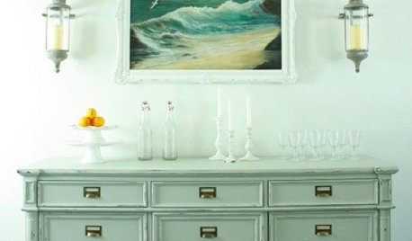
DECORATING GUIDESThe Cure for Houzz Envy: Dining Room Touches Anyone Can Do
Get a decorator-style dining room on the cheap with inexpensive artwork, secondhand furniture and thoughtful accessories
Full Story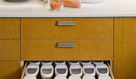
KITCHEN DESIGN6 Clever Kitchen Storage Ideas Anyone Can Use
No pantry, small kitchen, cabinet shortage ... whatever your storage or organizing dilemma, one of these ideas can help
Full Story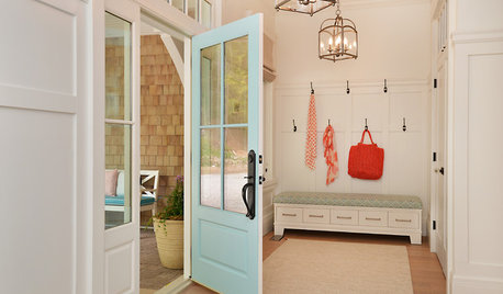
DOORSCould the Inside of Your Front Door Use a New Color?
An entrance interior is an often-overlooked opportunity to bring personality into the home. What will you do with yours?
Full Story
LAUNDRY ROOMSThe Cure for Houzz Envy: Laundry Room Touches Anyone Can Do
Make fluffing and folding more enjoyable by borrowing these ideas from beautifully designed laundry rooms
Full Story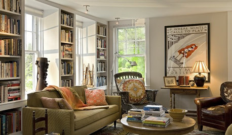
BUDGET DECORATINGThe Cure for Houzz Envy: Living Room Touches Anyone Can Do
Spiff up your living room with very little effort or expense, using ideas borrowed from covetable ones
Full Story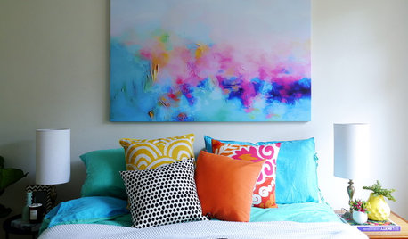
DECORATING GUIDES7 Bedroom Styling Tricks Anyone Can Do
Short on time or money? You can spruce up your bedroom quickly and easily with these tips
Full Story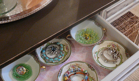
CLOSETSThe Cure for Houzz Envy: Closet Touches Anyone Can Do
These easy and inexpensive moves for more space and better organization are right in fashion
Full Story
LIFECould Techies Get a Floating Home Near California?
International companies would catch a big business break, and the apartments could be cool. But what are the odds of success? Weigh in here
Full Story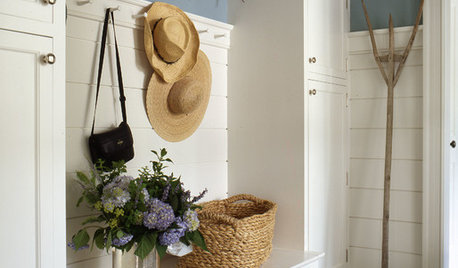
MUDROOMSThe Cure for Houzz Envy: Mudroom Touches Anyone Can Do
Make a utilitarian mudroom snazzier and better organized with these cheap and easy ideas
Full Story
KITCHEN DESIGNThe Cure for Houzz Envy: Kitchen Touches Anyone Can Do
Take your kitchen up a notch even if it will never reach top-of-the-line, with these cheap and easy decorating ideas
Full Story


tibbrix
tibbrix
Related Professionals
Crestview Interior Designers & Decorators · Charleston Furniture & Accessories · Huntersville Furniture & Accessories · Oshkosh Furniture & Accessories · Port Charlotte Furniture & Accessories · Rome Furniture & Accessories · San Diego Furniture & Accessories · Asheville Furniture & Accessories · Ocean Springs Custom Artists · Suitland Lighting · Berkeley Window Treatments · Richardson Window Treatments · San Jose Window Treatments · Sayreville Window Treatments · Oakland Window TreatmentsHolly- Kay
tibbrix
sis2twoOriginal Author
tibbrix