


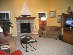
Autumn Cottage Mag, Page 42-43
happyintexas
11 years ago
Featured Answer
Sort by:Oldest
Comments (15)

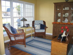
lavender_lass
11 years agoRelated Professionals
Shorewood Interior Designers & Decorators · Liberty Township Interior Designers & Decorators · Skokie Furniture & Accessories · Toledo Furniture & Accessories · Kansas City Furniture & Accessories · San Juan Capistrano Furniture & Accessories · Sudbury Furniture & Accessories · New Hope Furniture & Accessories · Melbourne Custom Artists · Pico Rivera Custom Artists · Lawrence Lighting · Del City Window Treatments · Los Angeles Window Treatments · San Rafael Window Treatments · Bell Window Treatments
Sueb20
11 years ago
tinam61
11 years agospringroz
11 years agoloribee
11 years agokitchendetective
11 years agomom2sethc
11 years agoindygo
11 years agoindygo
11 years agottodd
11 years agohappyintexas
11 years agojuliekcmo
11 years agojennybog
11 years agolynninnewmexico
11 years ago
Related Stories
FURNITUREHouzz Flip: 50 Comfy Chairs Every Dad Will Want to Sit In
Relax into Father’s Day with this collection of inviting recliners and lounge chairs
Full Story
PHOTO FLIP77 Gorgeous Garden Gates
Enjoy these enticing entryways and the magical gardens beyond their doors
Full Story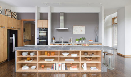
KITCHEN DESIGNHow to Design a Kitchen Island
Size, seating height, all those appliance and storage options ... here's how to clear up the kitchen island confusion
Full Story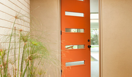
CURB APPEAL77 Front Doors to Welcome You Home
Crossing the threshold is an event with these doors in a gamut of styles
Full Story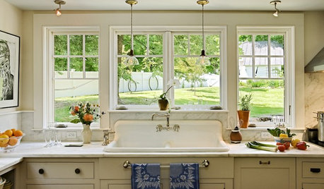
PHOTO FLIP60 Kitchen Sinks With Mesmerizing Views
Check out this parade of views from the kitchen sink and tell us: Which offers the best backdrop for doing the dishes?
Full Story
FEEL-GOOD HOMESimple Pleasures: 10 Ideas for a Buy-Less Month
Save money without feeling pinched by taking advantage of free resources and your own ingenuity
Full Story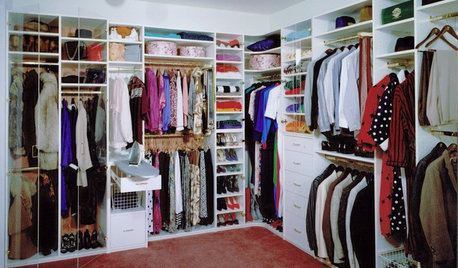
DECLUTTERINGDownsizing Help: How to Edit Your Belongings
Learn what to take and what to toss if you're moving to a smaller home
Full Story
GREEN BUILDINGThe Passive House: What It Is and Why You Should Care
If you don’t understand passive design, you could be throwing money out the window
Full Story
DECORATING GUIDES13 Home Design and Decor Trends to Watch for in 2013
It's predictions ahead as we find out what's on the radar of designers and makers for the coming year
Full Story
PHOTO FLIP71 Dream Bathtub Views
Soak in the sights with this collection of tantalizing tubs and inspiring vistas
Full StoryMore Discussions


happyintexasOriginal Author