


Looking for a 'neutral' smoky blue-green
jockewing
15 years ago
Featured Answer
Sort by:Oldest
Comments (21)

User
15 years agoRelated Professionals
Gloucester City Interior Designers & Decorators · Annandale Furniture & Accessories · Los Angeles Furniture & Accessories · Fillmore Furniture & Accessories · Los Gatos Furniture & Accessories · Urbandale Furniture & Accessories · Indian Creek Furniture & Accessories · Lake Magdalene Furniture & Accessories · Paradise Custom Artists · Seal Beach Custom Artists · Florida City Lighting · Fort Washington Lighting · Laguna Beach Lighting · Red Bank Lighting · Walnut Creek Window Treatmentssquirrelheaven
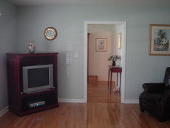
15 years agomahatmacat1
15 years agojockewing
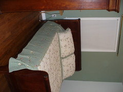
15 years agosarschlos_remodeler
15 years agosquirrelheaven
15 years agomldao
15 years agorunninginplace
15 years agomahatmacat1
15 years agosarschlos_remodeler
15 years agoacomom
15 years ago
amck2
15 years agogeorgiagal
15 years agojockewing
15 years agokitchendetective
15 years ago
Lisa_H OK
15 years agosarschlos_remodeler
15 years agoelizgonz
15 years agorunninginplace
15 years agojockewing
15 years ago
Related Stories
COLORMore Top Paint Picks for 2014: New Greens, Blues and Neutrals
Valspar’s new colors aim to lift spirits and express creativity. Here’s how to use 9 of them in lively ways
Full Story
DECORATING GUIDESCool Color Palettes: Enviable Green and Blue Spaces
Freshen up tired interiors with dewy to inky hues that harmonize even as they help each other stand out
Full Story
COLORBest Ways to Use the Neutral Green Color of 2015
Benjamin Moore’s Color of the Year is soft and natural
Full Story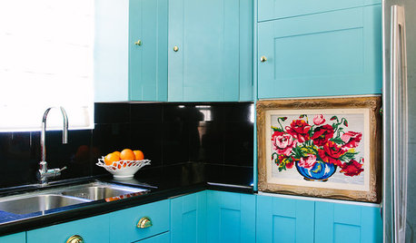
COLORFUL HOMESHouzz Tour: Nixing Neutrals to Create a Colorful Craftsman
L.A. homeowners toss beige and white to make way for vibrant blue, purplish gray and cheery peach
Full Story
COLOR PALETTESSummer Color Combo: Blue and Green
Consider 10 fresh approaches to the tried-and-true pairing
Full Story
COLORGet a Soft Spot for Sea-Glass Green
Soften a room's look by washing its walls in this delightfully airy shade, no sand in your shoes required
Full Story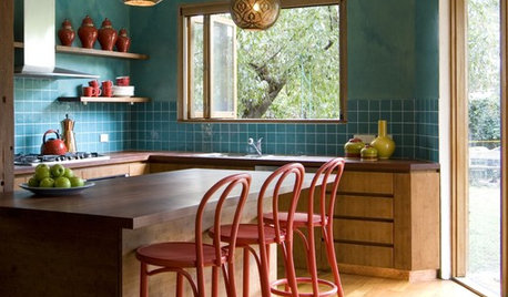
SHOP HOUZZShop Houzz: How to Decorate With Blue Paisley
Cool shades of blue-green work wonders with neutrals and warm hues
Full Story
COLORConsider Giving Your House a Big Bolt of Blue
From fresh, vivid turquoise to power-packed cobalt, blue is a great way to lift a neutral color palette
Full Story
COLORColor of the Week: April Sky Blue
See how to use this soft neutral hue that’s neither gray nor pure blue
Full Story
COLORPatios Look on the (Really) Bright Side With Neon
A little neon goes a long way toward making your patio stand out, with blues, pinks and greens leading the pack
Full StoryMore Discussions


sarschlos_remodeler