


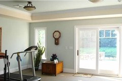
Paint colors; faded green blue grey?
mtnrdredux_gw
10 years ago
Featured Answer
Comments (48)

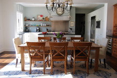
polly929
10 years agoRelated Professionals
Nashville Interior Designers & Decorators · Athens Furniture & Accessories · Denver Furniture & Accessories · Duluth Furniture & Accessories · Los Angeles Furniture & Accessories · San Francisco Furniture & Accessories · Scottsdale Furniture & Accessories · St. Louis Furniture & Accessories · Aliso Viejo Furniture & Accessories · Fountainebleau Furniture & Accessories · Santa Barbara Lighting · Westmont Lighting · La Vista Window Treatments · San Jose Window Treatments · Bell Window Treatmentspatty_cakes
10 years agoRoberta Storer
10 years ago
Annie Deighnaugh
10 years agoAnnie Deighnaugh
10 years agoroarah
10 years agokitchentime
10 years agolynxe
10 years agonancybee_2010
10 years ago
Sueb20
10 years agorosylady
10 years agofunkyart
10 years ago
gsciencechick
10 years agoMarinaGal
10 years ago
mtnrdredux_gw
10 years agoAnnie Deighnaugh
10 years agoSueb20
10 years agoAnnie Deighnaugh
10 years agocaminnc
10 years ago
cyn427 (z. 7, N. VA)
10 years agoscanmike
10 years agomtnrdredux_gw
10 years agoMarinaGal
10 years agosouthernstitcher
10 years agomtnrdredux_gw
10 years agoloribee
10 years agoAnnie Deighnaugh
10 years agoKevinMP
10 years agomtnrdredux_gw
10 years agomtnrdredux_gw
10 years agoeandhl
10 years agoalex9179
10 years agopps7
10 years agomtnrdredux_gw
10 years ago
maire_cate
10 years agomtnrdredux_gw
10 years agogwlolo
10 years agomaire_cate
10 years agoUser
10 years agoscanmike
10 years agochristine40
10 years agomtnrdredux_gw
10 years agoAnnie Deighnaugh
10 years agomtnrdredux_gw
10 years agoUser
10 years agogwlolo
10 years agomtnrdredux_gw
10 years ago


Related Stories
HOUZZ QUIZHouzz Quiz: What Color Should You Paint Your House?
Is white right? Maybe dark blue-gray? Take our quiz to find out which color is best for you and your home
Full Story
CURB APPEAL5 Bright Palettes for Front Doors
Splash bold green, blue, orange or red on your front door, then balance it with a more restrained hue on the rest of the house
Full Story
FOLIAGEGet a Cool Garden Look With Gray and Blue Plants
Looking for plants that calm with color in the heat of summer? Look no further than these 14 soothing beauties
Full Story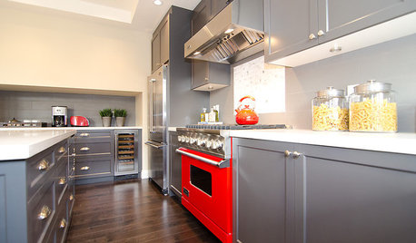
COLORCooking With Color: When to Use Gray in the Kitchen
Try out Trout or shake up some Martini Shaker gray for a neutral-based kitchen that whispers of sophistication
Full Story
MOST POPULARRethinking Beige in a World Gone Gray
Gray, the ‘it’ neutral of recent years, has left beige in the shade. But is it time to revisit this easy-on-the-eyes wall color?
Full Story
DECORATING GUIDESColor of the Week: Decorating With Warm Gray
Tired of tan? Getting gloomy from cool gray? Make warm gray your new go-to neutral
Full Story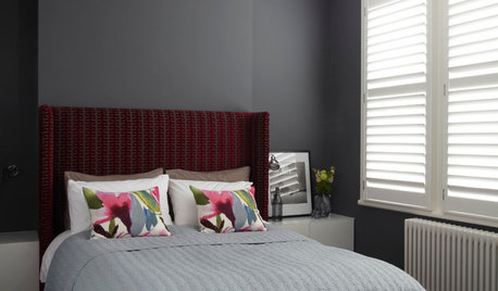
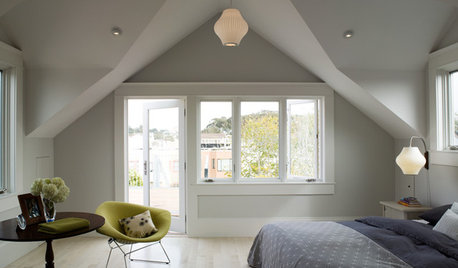
COLORDreaming in Color: 8 Gorgeous Gray Bedrooms
With this versatile hue, you can go dark and bold or slip into something more soothing
Full Story
GRAYChoosing Paint: How To Pick the Right Gray
Which Version of Today's 'It' Neutral Is For You?
Full Story


lazydaisynot