


BR color help please...
Annie Deighnaugh
11 years ago


Featured Answer
Sort by:Oldest
Comments (45)

bleigh
11 years agolast modified: 9 years agopalimpsest
11 years agolast modified: 9 years agoRelated Professionals
View Park-Windsor Hills Interior Designers & Decorators · Washington Interior Designers & Decorators · Medford Furniture & Accessories · Wilmington Furniture & Accessories · Hampton Bays Furniture & Accessories · Irmo Furniture & Accessories · Tucker Furniture & Accessories · Bethlehem Custom Artists · Decatur Custom Artists · Egypt Lake-Leto Lighting · Monrovia Lighting · Pasadena Lighting · Red Bank Lighting · Wasco Lighting · San Jose Window Treatments
Annie Deighnaugh
11 years agolast modified: 9 years agoAnnie Deighnaugh
11 years agolast modified: 9 years agojenniferPA
11 years agolast modified: 9 years agopatty_cakes
11 years agolast modified: 9 years agoAnnie Deighnaugh
11 years agolast modified: 9 years agopatty_cakes
11 years agolast modified: 9 years agoAnnie Deighnaugh
11 years agolast modified: 9 years ago
graywings123
11 years agolast modified: 9 years agofripper
11 years agolast modified: 9 years agolascatx
11 years agolast modified: 9 years agoAnnie Deighnaugh
11 years agolast modified: 9 years agoAnnie Deighnaugh
11 years agolast modified: 9 years ago
Oakley
11 years agolast modified: 9 years agobronwynsmom
11 years agolast modified: 9 years agoAnnie Deighnaugh
11 years agolast modified: 9 years agoAnnie Deighnaugh
11 years agolast modified: 9 years agobronwynsmom
11 years agolast modified: 9 years agoAnnie Deighnaugh
11 years agolast modified: 9 years agobronwynsmom
11 years agolast modified: 9 years agoAnnie Deighnaugh
11 years agolast modified: 9 years agoAnnie Deighnaugh
11 years agolast modified: 9 years agoOakley
11 years agolast modified: 9 years ago
denali2007
11 years agolast modified: 9 years agobronwynsmom
11 years agolast modified: 9 years agoAnnie Deighnaugh
11 years agolast modified: 9 years ago
beckysharp Reinstate SW Unconditionally
11 years agolast modified: 9 years agoAnnie Deighnaugh
11 years agolast modified: 9 years agofunkyart
11 years agolast modified: 9 years agoteacats
11 years agolast modified: 9 years agoAnnie Deighnaugh
11 years agolast modified: 9 years agobronwynsmom
11 years agolast modified: 9 years agoyayagal
11 years agolast modified: 9 years agoAnnie Deighnaugh
11 years agolast modified: 9 years agoAnnie Deighnaugh
11 years agolast modified: 9 years agoAnnie Deighnaugh
10 years agolast modified: 9 years agokrayers
10 years agolast modified: 9 years agoyayagal
10 years agolast modified: 9 years ago
Holly- Kay
10 years agolast modified: 9 years agoAnnie Deighnaugh
10 years agolast modified: 9 years agorosie
10 years agolast modified: 9 years agoAnnie Deighnaugh
10 years agolast modified: 9 years agorosie
10 years agolast modified: 9 years ago


Related Stories

REMODELING GUIDESWisdom to Help Your Relationship Survive a Remodel
Spend less time patching up partnerships and more time spackling and sanding with this insight from a Houzz remodeling survey
Full Story
HOME OFFICESQuiet, Please! How to Cut Noise Pollution at Home
Leaf blowers, trucks or noisy neighbors driving you berserk? These sound-reduction strategies can help you hush things up
Full Story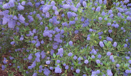
GARDENING GUIDESGreat Design Plant: Ceanothus Pleases With Nectar and Fragrant Blooms
West Coast natives: The blue flowers of drought-tolerant ceanothus draw the eye and help support local wildlife too
Full Story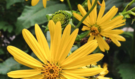
GARDENING GUIDESGreat Design Plant: Silphium Perfoliatum Pleases Wildlife
Cup plant provides structure, cover, food and water to help attract and sustain wildlife in the eastern North American garden
Full Story
SUMMER GARDENINGHouzz Call: Please Show Us Your Summer Garden!
Share pictures of your home and yard this summer — we’d love to feature them in an upcoming story
Full Story
BATHROOM DESIGNUpload of the Day: A Mini Fridge in the Master Bathroom? Yes, Please!
Talk about convenience. Better yet, get it yourself after being inspired by this Texas bath
Full Story
DECORATING GUIDES10 Bedroom Design Ideas to Please Him and Her
Blend colors and styles to create a harmonious sanctuary for two, using these examples and tips
Full Story
DECORATING GUIDESPlease Touch: Texture Makes Rooms Spring to Life
Great design stimulates all the senses, including touch. Check out these great uses of texture, then let your fingers do the walking
Full Story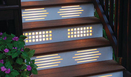
GARDENING AND LANDSCAPINGNo Fall Guys, Please: Ideas for Lighting Your Outdoor Steps
Safety and beauty go hand in hand when you light landscape stairways and steps with just the right mix
Full StorySponsored
Franklin County's Full Service, Turn-Key Construction & Design Company
More Discussions


Annie DeighnaughOriginal Author