


Pop of Color or Whiplash? - Pictures
User
12 years ago
Sort by:Oldest
Comments (56)
Related Stories
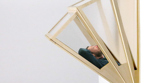
MODERN ARCHITECTUREModern Design Goes Pop
Designers unveil concepts that pop up and out to offer bold new ways of living in urban environments
Full Story
DECORATING GUIDESDandelions Pop Up in Home Décor
Creative wall treatments, textiles and lights are elevating the embattled weed to art
Full Story
MOST POPULAR102 Eye-Popping Powder Rooms
Flip through our collection of beautiful powder rooms on Houzz and fill your eyes with color and style
Full Story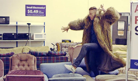
BUDGET DECORATINGPop Culture Watch: Get a Good Rap With Thrift Store Scores
Eight rooms that rock secondhand finds, in an ideabook inspired by rappers taking YouTube by storm
Full Story
DECORATING GUIDESWhy White Is the Ultimate Pop of Color
Forget bursts of orange or splashes of turquoise. Pure white can break up patterns, soften bold decor and a whole lot more
Full Story
DECORATING GUIDESPop Culture Watch: 12 Home Trends from the '80s Are Back
Hold on to your hat (over your humongous hair); interior design elements of the 1980s have shot forward to today, in updated fashion
Full Story
ARCHITECTUREDesign Surprises Amaze in an Eye-Popping Manhattan Penthouse
Mathematics meets fun in a most unusual 7,000-square-foot space topping a landmark New York City building
Full Story
HOUZZ TOURSMy Houzz: Red and Black Pop in a German Penthouse
See how an eye-catching color scheme, international finds and understated charm raise the style factor in this decorator's home
Full Story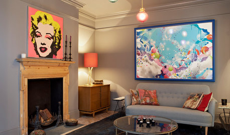
SHOP HOUZZShop Houzz: Pack a Punch With Pop Art Style
Bold colors, subjects and shapes to add energy and humor to your home
Full Story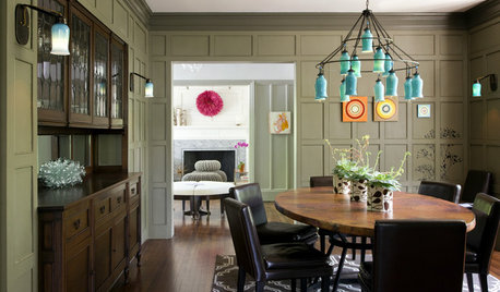
TURQUOISEColor Crush: A Pop of Turquoise
Use blue-green for happy accents and soothing walls in all types of homes
Full Story

UserOriginal Author
UserOriginal Author
Related Professionals
East Hanover Interior Designers & Decorators · Ridgefield Interior Designers & Decorators · Milwaukee Furniture & Accessories · Roswell Furniture & Accessories · Wilmington Furniture & Accessories · San Elizario Furniture & Accessories · Chino Hills Furniture & Accessories · Hawthorne Furniture & Accessories · Nixa Furniture & Accessories · Eugene Custom Artists · Pembroke Custom Artists · Palm Springs Lighting · Walker Lighting · Channahon Lighting · Rockford Window Treatmentsynnej
User
User
UserOriginal Author
nostalgicfarm
katrina_ellen
Lori A. Sawaya
fuzzywuzzer
jterrilynn
ynnej
andee_gw
roarah
My3dogs ME zone 5A
blfenton
User
cindyloo123
rmkitchen
InteriorStylist
rmkitchen
UserOriginal Author
InteriorStylist
rmkitchen
graywings123
jterrilynn
beekeeperswife
UserOriginal Author
dakota01
deeinohio
UserOriginal Author
UserOriginal Author
InteriorStylist
itltrot
live_wire_oak
blfenton
UserOriginal Author
UserOriginal Author
pudgybaby
jockewing
UserOriginal Author
UserOriginal Author
Oakley
Oakley
InteriorStylist
Lori A. Sawaya
UserOriginal Author
InteriorStylist
gr8daygw
gr8daygw