


Input Needed for designing a built-in office (lots of pics)
Valerie Noronha
15 years ago


Sort by:Oldest
Comments (14)
Related Stories
WORKING WITH PROSWorking With Pros: When You Just Need a Little Design Guidance
Save money with a design consultation for the big picture or specific details
Full Story
WORKING WITH AN ARCHITECTWho Needs 3D Design? 5 Reasons You Do
Whether you're remodeling or building new, 3D renderings can help you save money and get exactly what you want on your home project
Full Story
DINING ROOMSDesign Dilemma: My Dining Room Needs Revamping!
Watch a dining-room makeover unfold in the Houzz Questions forum
Full Story
STAIRWAYSNeed More Space? Look Under the Stairs
Use that extra room under a stairway for extra storage, office space or a secret hideaway
Full Story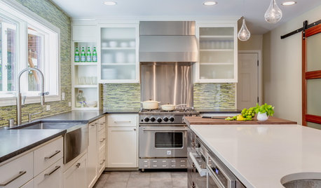
KITCHEN DESIGNKitchen of the Week: Taking Over a Hallway to Add Needed Space
A renovated kitchen’s functional new design is light, bright and full of industrial elements the homeowners love
Full Story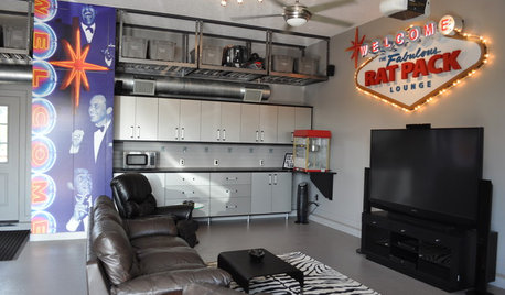
MAN SPACESWhy Men Really Do Need a Cave
Don't dismiss cars, bars and the kegerator — a man space of some kind is important for emotional well-being at home
Full Story
LANDSCAPE DESIGNHow to Design a Great Garden on a Sloped Lot
Get a designer's tips for turning a hillside yard into the beautiful garden you’ve been dreaming of
Full Story
KITCHEN SINKSEverything You Need to Know About Farmhouse Sinks
They’re charming, homey, durable, elegant, functional and nostalgic. Those are just a few of the reasons they’re so popular
Full Story
REMODELING GUIDESGet What You Need From the House You Have
6 ways to rethink your house and get that extra living space you need now
Full Story
ARCHITECTUREDo You Really Need That Hallway?
Get more living room by rethinking the space you devote to simply getting around the house
Full Story


jerseygirl_1
funkyart
Related Professionals
Ashwaubenon Interior Designers & Decorators · New Providence Interior Designers & Decorators · Bend Furniture & Accessories · Columbia Furniture & Accessories · Huntersville Furniture & Accessories · Newton Furniture & Accessories · Fillmore Furniture & Accessories · Los Gatos Furniture & Accessories · Decatur Custom Artists · Seal Beach Custom Artists · Jefferson Valley-Yorktown Lighting · La Jolla Lighting · Romeoville Lighting · El Mirage Window Treatments · Grosse Ile Window Treatmentsfunkyart
les917
teacats
Valerie NoronhaOriginal Author
sarschlos_remodeler
Valerie NoronhaOriginal Author
Valerie NoronhaOriginal Author
sarschlos_remodeler
Valerie NoronhaOriginal Author
sarschlos_remodeler
funkyart
suero