


Help! It's not easy being green!
I should probably have titled this "should I paint my rooms BM Providence Olive?", but I guess I'm looking for some personal experience here. I have been trying to find the right earthy green tone for my east facing living and dining rooms in the new 1925 farmhouse we bought (I recently posted about the antique chandelier for the foyer of the same house, which I'm excited to hang this weekend).
But this paint business has been eating at me for over a week now; I'm down to a handful of (very similar) colors, have tested large swatches on multiple walls, and even painted the entire dining room, only to dislike the color (sometimes; on some walls). The dining room is BM Old Salem Gray, which I feel is too dark and maybe too, hmmm... gray! Imagine that, BM actually named a color accurately for once. I've also tested Olive Branch (full strength on a small posterboard, and at 75% on the wall), Baby Turtle, and Providence Olive.
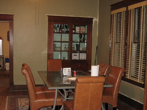
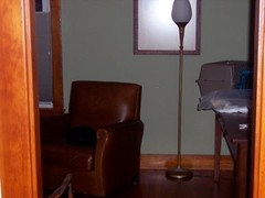
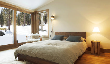
Here is BM Old Salem Gray, without the cutting in.
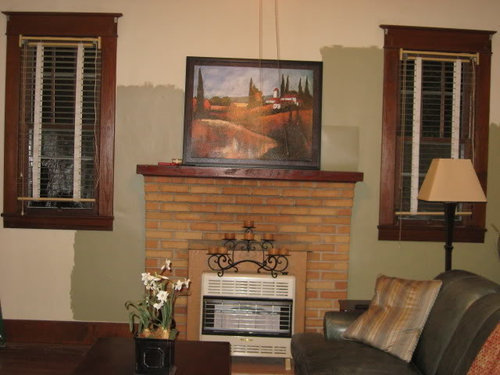
BM Providence Olive on the left, Olive Branch full strength on the square to the right, at 75% on the wall behind it.
The rooms have 10 ft ceilings and a single centered ceiling fan in each (for right now), so the lighting isn't the best. I've tried both regular incandescent and Reveal bulbs on all of these colors and it doesn't help much (actually, I like incandescent better because it seems to bring out more olive green). Baby Turtle looked silvery gray during the daylight, but I like it at night. Olive Branch seems too dark full strength and too green at 75%. Providence Olive seems like the right depth, but I'm not sure it's really green. It seems more gray than Old Salem Gray at times.
So basically, does anyone have an opinion, either from looking at my pictures or from their own experiences with any of these colors? I'm leaning toward Providence Olive, but I have to admit that it doesn't look very "pretty", nor terribly appetizing for a dining room. But I saw it was on a list of top BM colors for several rooms, so it must look good in some houses! And it may take on more green once it's all over; I just don't want to be wrong again. My DH is very supportive, but he is sick of hearing about, seeing, and comparing green samples. Please help me settle on a green!
Comments (35)

dianalo
12 years agoI'd go lighter because this looks a little muddy. With the stained trim, I think it needs a little more contrast. I'd do one more shade down from the Olive Branch....
Related Professionals
Barstow Interior Designers & Decorators · Bloomingdale Interior Designers & Decorators · Minneapolis Furniture & Accessories · Owensboro Furniture & Accessories · Ventura Furniture & Accessories · Ridgewood Furniture & Accessories · Chapel Hill Custom Artists · Ocean Springs Custom Artists · Centreville Lighting · Scottdale Lighting · Tukwila Lighting · Clinton Window Treatments · Edmond Window Treatments · St. Louis Window Treatments · Walnut Creek Window Treatmentsequest17
Original Author12 years agoFuncolors, Camo is on the paint chip down from Olive Branch, isn't it? It looked really muddy on the chip, but that could change on the wall, of course. I'll look into it. I think the trouble I'm having with inspiration pics is that everyone seems to have white trim. My stained trim is rather dark and somewhat reddish, so that changes everything.
Dianalo, I think one step down would be Camo. That's a second recommendation for it, so I'll definitely look for it!
Lucille, thanks for "listening" and echoing back to me. Sometimes we just need to hear ourselves, I think. I'm mostly torn on Providence Olive because I think it might take on a different feel once it's all over the room. I know colors do that, I just don't know how much or to what extent this one might in my space.
lynxe
12 years agoStirring the pot a bit....have you considered Ellen Kennon's Sage? I've not used it, but I do have a paper sample, which has actual paint on it. It's a very earthy green that, in some lights, looks brownish. I don't care for green on walls, but Sage is not a "green" green, which is why I'd considered it.

Sueb20
12 years agoAnother nice, lighter green that I think is similar to these (without looking at my fandeck) is Paris Rain. Might be worth a try. I also am a fan of Camouflage.
User
12 years agoI just had to open this thread, both because of my moniker and because I'm a Kermit gal from way back. :)
First of all, you need not be limited by the colors on the chips or fan deck. You can color match anything as long as you have a sample of it the size of a quarter. I rarely use stock colors for anything. I have custom colors made for almost every client--and then name them after that client. Don't be afraid to do the same. If you have a green in a fabric, wrapping paper, or clothing that you love, match it, get a sample, and try it.
If you had the neutral white woodwork and white fireplace, then you wouldn't be having nearly so much of a "sample crisis". Here's some basic color theory on why you're having issues with your choices here. All of the colors that you have chosen are too washed out and grey to work with the bright orange brick and the dark orange brown floors as team players. They're also a bit too blue. Both issues make the different oranges stand out as much more intensely ORANGE than they would if you chose a green with much more yellow in it. Yellow is the common factor in orange and green, so by choosing wall colors that are more yellow, it harmonizes and tones down the differences between the two and blends them more cohesively. They become chums working together on the same team. The ORANGE becomes more brown with orangey tones, and the OLIVE on the wall becomes a leafy grassy backdrop for you furnishings and art. Conversely, if you want something to make the floors and brick really stand out as ORANGE ORANGE, then choose something in a grey blue. Choosing something like that makes a room feel more energetic rather than relaxed, and it creates the "all-star" phenomena where everything seems to be jumping out at you to try to be the center of attention.
If you want to use muted tones rather than clear ones, try something browned down, rather than greyed down, like Rainforest Dew, Sweet Daphne, Dill Pickle, or Pale Avocado. For something a bit bolder,(and I think more suited to the home's character) Olive Moss, Chamomile, Split Pea, Fresh Olive, or Olive Tree would work. Don't be afraid of the dark! Darker colors lend drama and richness to a space. All you need is the right lighting to make it work well for you.
BTW, I love the fact that you picked up the orange tones in the leather of your chairs. I can see a funky amber glass chandelier over that table with Split Pea walls and Sweet Daphne on the ceiling. What's one more sample can, right? :)
luckygal
12 years ago"Baby Turtle looked silvery gray during the daylight, but I like it at night." Will you be using your DR during the day or mostly at night. I've found I like most colors more at certain times and if I use the room mostly at the time when I like the color it doesn't matter if I like it 'not so much' at other times. Of course I wouldn't use a color I really dislike at any time.
Don't use any color you don't like, especially if it's "not particularly appetizing for a dining room"! That's just a recipe for repainting.
From personal experience some sage greens look almost mint and in future I'd avoid those altho it's in a guest room so I've left it. My other sage is a fantastic color but is one I mixed myself so that's no help to you.
Since monitors are notorious for incorrectly representing colors I really cannot guess at the appearance of your walls however have bookmarked some sage colors you may want to consider.
"Martha Stewart Living Timothy Hay at Home Depot"
"Martha Stewart Araucana Sage"
"SW Svelte Sage" has been popular with many.
"Restoration Hardware Silver Sage" looks more than a bit grey to me but is a well known sage.
"Ellen Kennon Sage" is heading for the mint side IMO but it may be my monitor or the lighting. Similar to my guest bedroom.
luckygal
12 years agoI have "Benjamin Moore Rainforest Dew" mentioned above in my laundry room and half bath but have never considered it a sage. It's a bright yellow green.

jan_in_wisconsin
12 years agoKermit and old house lover here . . . I really like the Providence Olive shade in the picture. I think the color's "muddiness", or whatever you want to call it, works well with your home's old feel, and it brings out the beautiful brick color in a great way. These are things to be celebrated in your gorgeous space.
That said, if you aren't in love with the color, for whatever reason, keep trying. I tend to migrate toward the warmer tones of color, which seem like they would work well in your home too. If you choose another shade of green, you could try something with even warmer, more golden/brownish undertones. Enjoy your wonderful home!
equest17
Original Author12 years agoThanks for all the responses. I'm definitely open to new color options, since these don't seem to be going in the right direction. I don't really want sage, I like the earthier olive shade. My fear is repeating my last olive "mistake", which was the family room in our previous 1970's house. It looked okay sometimes, but we jokingly called it our "whirled peas" room, since it looked like bright mashed peas.
Is this the brighter, yellow-based green people think I should go for (Laura Ashley Olive 4)? I didn't love it the first time, but never got around to repainting. The other problem with a yellow-based green is my leather sofa color. It has a much bluer undertone, so I'm trying to find an olive that cooperates. I could dye the sofa (I bought it on CL for a great deal because of a small dark stain on a seat cushion and always meant to dye it, but haven't had the time). The rust parsons chairs in the dining room are new, the pumkin velvet tufted chairs are old, but I love both and think they play well with any of the greens.
I would like to use a somewhat period appropriate shade, but I'm not slavishly devoted to it. The house was a working farm for three generations and it has lived and evolved with time, so I don't want it to be "stuck" in one era or another. That said, I really love Arts and Crafts and Art Deco, so I'm using that as a general guide. Sherwin Williams has a nice palette of A&C colors, and I was basing my muddy olive shades off of Roycroft Suede and Bunglehouse Gray.
Lynxe, I'm not sure I have a store that can mix Ellen Kennon paints; which ones does she work through?
Sueb, I'll be at BM tomorrow, I'll look for Paris Rain.
GreenDesigns, I definitely like the idea of a brown-based olive instead of a gray or blue olive, so I'll check out your suggestions!
Luckygal, we'll use the room several times during the day. We don't really have an eat-in kitchen, so unless it's just a quick bowl of cereal at the counter, all meals are in the dining room. I definitely want to avoid the mint overtones, and I've tested Svelte Sage and Silver Sage before and don't care for them in this setting. I'll visit Home Depot tomorrow and pick up some Martha Stewart chips.
Jan, thanks for the encouragement. Sometimes I think I like Prov Olive, but other times it goes really gray. If it went brown, I would like that "muddiness". I do like that it sets off the brick and trim. I know that orange toned wood is a bane to many people, but in this setting, I think it's rather attractive. At least it's different from the standard!
Chispa, Georgian seemed very green to me. I'm having a hard time working with my sofa color, so I'm a bit afraid to go that green without something to tone it back to neutral territory.
dianalo
12 years agoBee's BM Wasabi is a very pretty yellow green and it would look lovely with the stained trim. It is more perky than you have shown, but look it up on a BM fan deck and see what you think....
User
12 years agoThe sofa is definitely not playing well with the warm tones you have going on in the rest of your decor choices. Dying it could be a solution to that, but since you'd have to go darker, I'm not sure that black would work. If you used an orangey brown over the grey, you might get a dark brown that wouldn't be too grey or too orange.
Since you are going to HD tomorrow, pick up a chip of Behr Mochachino (740-D-4). It's long been my go to for a browney-green with more yellow than blue undertones. My HD used it in the Thomasville kitchen display with the spice maple cabinets, and you can see how well it works large scale if yours does too.
lynxe
12 years agoequest17, your best bet is to contact her via her web site to find out which store(s) are closest to you. And to ask for samples, of course.
It's interesting that GreenDesigns suggested a browned-down green. That's what the Sage sample looks like, here in our house at least. If you do have a store near you and like the way the paper sample works, you should be able to order a small trial-sized can of paint from Ellen Kennon to test on your walls.
avesmor
12 years agoI really like Olive Branch, but I've regretted using it. It is a very dark color when you get a whole room going. IMO it also has a lot of gray.
My dining room is currently "San Antonio Sage" by SW. I loved it on the chip, but am not loving it in life. It's much closer to Olive Branch than I expected, Even though where it stops and the other walls (more khaki) start, you can barely see a difference. I have no idea how that works.
Here are some I've added to my favorites. I picked these for use with stained wood trim.
Love this bottom color. I emailed the builder a few weeks ago -- I'll let you know if I hear back.
SW Ryegrass:
SW Wheatgrass:

(You can also see wheatgrass on interior walls here.)
Wheatgrass is quickly becoming my favorite color! :)

ctlane
12 years agoI currently have BM Providence Olive in my west facing, wall of windows, living room, so it gets a ton of light and I have to say this color is dead and life sucking. The only reason I haven't changed it is because it involves ladders on stairs for DH. I couldn't watch him the first time up there although it didn't seem to bother him at all. I have a sofa I was trying to coordinate paint with.
equest17
Original Author12 years agoDianalo, "perky" is a good word for Wasabi. I don't think it would work with my sofa, but if I do dye it, maybe that would be the way to go.
Live, yes, I was thinking of dyeing the sofa a brown color. I'm not sure if leather dye completely covers the original color or if I would need to plan on a complementary color (like the orange base you mentioned) to get the right effect.
Lynxe, I've heard great things about EK colors, so maybe this is an opportunity to try it!
Avesmore, I'm seeing the same thing when I get several greens on the wall. I see the difference in the chips, but on the wall there are shadows, light play, etc, that make them seem the same. Have you tried Ryegrass or Wheatgrass with stained trim yet? I would love to see photos.
Ctlane, thanks for the first hand feedback. I can't figure out why Providence Olive is such a popular decorator choice. I figured it was great in new construction with lots of light and white trim, but that sounds like your room and you don't like it!
hayden2
12 years agoWhen I look at your fireplace, your wood trim, and the diningroom chairs, I see golden highlights. The green you've got up doesn't bring out the gold, but rather the golden highlights make the paint look too muddy.
Have you considered a non-green, such as something with warm golden tones, maybe a shade or two lighter than the diningroom chairs? Then perhaps you could use a nice green in some of the accent pieces?
bungalow_house
12 years agoequest, what did you decide? I am contemplating the same colors and I have stained woodwork too. I would love to know what you chose and how it turned out.
equest17
Original Author12 years agoI actually used two slightly different colors in the dining and living rooms. I didn't intend to, but I wasn't sure about the BM Old Salem Gray in the dining room, but I wasn't ready to paint over it, either. So I painted the living room in Baby Turtle (mixed by SW, which is a bit different than the original BM formula). I intended to pick my favorite and paint over the other, but I liked both. The paint colors are definitely different on the chips, but it's so subtle I don't think most people would ever know the two rooms are actually different.
I'm still out of town for the holiday, but I'll post pictures in a day or two when we get back.

Circus Peanut
12 years agoI've got old trim (not as dark as yours, mine's fir) with the Sherwin Williams A&C color Morris Room Green in my study. Love it. It doesn't turn brown or pea-colored, but it's not yellowy; veers blue if anything. You might try a swatch?
Bad moving-day pic:
Circus Peanut
12 years agoErk, that doesn't quite capture it. Here's Morris Room Green again in better light:
birdgardner
12 years agoI'm thinking a warm pale gold would work much better with trim, bricks, furniture - you might find a gold with a hint of green it. I'm sorry I cannot name you any colors.
What are your reasons for favoring green at this point?
equest17
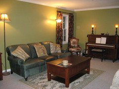
Original Author12 years agoBungalow_house, here are a few photos of my finished living and dining rooms. The dining room is BM Old Salem Gray, the living room is Baby Turtle, color matched by SW.


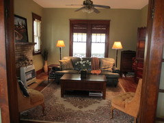
The pics are pretty accurate, but the colors are just a bit more subdued in person (I would say muddier, but that sounds so unattractive ;-). I think the middle pic (second photo of the dining room) is the most accurate IRL, as the others are just a bit washed out.
I had already used a golden tan (SW Camelback) in the foyer and hallway, and I'm going to paint the kitchen cabinets (off the dining room) a dirty ocher yellow, so that's why I wanted a green shade. I'm really happy with it!
nancybee_2010
12 years agoequest, everything looks really nice! Your decor and colors are just perfect for your wonderful old house.
bungalow_house
12 years agoThanks for posting photos, equest. It looks great. There is something about that muddy green :) that belongs in these houses, I think. My couch is a darker version of it. I too am working on some combination of dirty squash yellow and/or butterscotch tan and this green for my kitchen, dining, living rooms and halls and stairs. Seeing your photo really helps.
The Morris Room Green is nice as well!

IdaClaire
12 years agoequest17, lovely color choices! Very refined and soothing.
It's definitely "not easy being green" - or at least it's not easy to find the perfect shade of green. What I once thought was vibrant and cheerful now feels garish to me and I crave softer, more subtle hues. I think you've chosen perfectly for your rooms. Well done!
equest17
Original Author12 years agoThanks for the compliments, everyone. I really love my rooms, and I don't find them dark at all, just subtle as auntjen said. I think I prefer the Old Salem Gray, which is funny because initially I disliked it. I finished the cutting in and lived with it for a week or two, and now it's my favorite.
I do think I'm going to lighten up the proposed draperies and do something besides the dark russet paisley I posted in another discussion. I need thermal drapes given my single pane windows, but I'm planning to hang them high and wide to showcase the molding, and take them down in the summer for a change of pace.
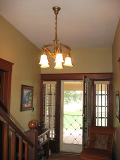
Bungalow_house, if you're looking for a recommendation, I like my SW Camelback for a butterscotch tan/squash yellow. It looks completely different from the last house (with white trim), but it looks very appropriate here. It changes quite a bit with different lighting; it shows the green undertones during the day and more of a peachy/squash color at night, so that may not work for you.
It's not a very accurate photo, but here is a pic of the foyer in Camelback.
bungalow_house
12 years agoHmm. I typed a response, I don't know why it didn't post.
Equest thanks for the camelback photo. That is very much what I had in mind.
I'm glad you said the green is not too dark. That is a concern. I was looking at a light tan/off-white color to hedge my bet, but I don't think that will fit like the arts and crafts kinds of colors.
I am with you on the window treatments too: not too dark, and hide as little of the woodwork as possible. I still have my "temporary" curtains up and I moved here 5 years ago. :)
Love the foyer light fixture!
equest17
Original Author12 years agoBungalow, I'd better add that I like deeper colors in general. I can't stand white (or off-white) walls! So my greens may be too dark for some people. But they seem to fit the space and work with the molding very well. I would say these are medium tones. I have BM Linen White for the ceiling and get gentle eastern light in the windows, so unless you only have north facing windows, I think it would look at least as bright, maybe even lighter in your space.
Thanks for noticing the foyer light! I just got that a month or two ago to replace an inappropriate fixture. It was one of the few things about the bungalow that was not original, and I was so excited to find a great CL deal!

Heidi Zener
7 years agoSo funny! My husband and I are going through the same decision, and it's been going on for a year with swatches all over den. I wanted a color that has the richness of the Downton Abby colors ;( which can look drab. But, every other color is too green. I have Baby Turtle, Providence Olive, Hampshire Grey, Basset Hall Green, Wethersfield Moss, and Victorian Garden. I just told my husband to get a gallon of Providence Olive (to start)......my final choice. It has a richness and aged look that will go with more accents.


lucillle