


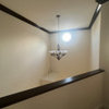
Accent wall - advice needed
teapot100
9 years ago
Related Stories
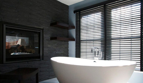
BATHROOM DESIGNDreaming of a Spa Tub at Home? Read This Pro Advice First
Before you float away on visions of jets and bubbles and the steamiest water around, consider these very real spa tub issues
Full Story
DECORATING GUIDESDecorating Advice to Steal From Your Suit
Create a look of confidence that’s tailor made to fit your style by following these 7 key tips
Full Story
TASTEMAKERSBook to Know: Design Advice in Greg Natale’s ‘The Tailored Interior’
The interior designer shares the 9 steps he uses to create cohesive, pleasing rooms
Full Story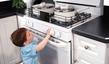
HEALTHY HOMEHow to Childproof Your Home: Expert Advice
Safety strategies, Part 1: Get the lowdown from the pros on which areas of the home need locks, lids, gates and more
Full Story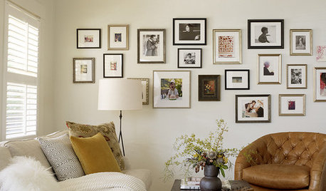
LIFEEdit Your Photo Collection and Display It Best — a Designer's Advice
Learn why formal shots may make better album fodder, unexpected display spaces are sometimes spot-on and much more
Full Story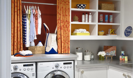
REMODELING GUIDESContractor Tips: Advice for Laundry Room Design
Thinking ahead when installing or moving a washer and dryer can prevent frustration and damage down the road
Full Story
Straight-Up Advice for Corner Spaces
Neglected corners in the home waste valuable space. Here's how to put those overlooked spots to good use
Full Story
DECORATING GUIDES10 Design Tips Learned From the Worst Advice Ever
If these Houzzers’ tales don’t bolster the courage of your design convictions, nothing will
Full Story
KITCHEN DESIGNSmart Investments in Kitchen Cabinetry — a Realtor's Advice
Get expert info on what cabinet features are worth the money, for both you and potential buyers of your home
Full StoryMore Discussions


mclarke
Michael
Related Professionals
La Habra Interior Designers & Decorators · Ridgefield Park Interior Designers & Decorators · Wanaque Interior Designers & Decorators · Washington Interior Designers & Decorators · Franklin Furniture & Accessories · Topeka Furniture & Accessories · Eureka Furniture & Accessories · Hoboken Furniture & Accessories · Naples Furniture & Accessories · North Bellmore Furniture & Accessories · Kendall Lighting · San Francisco Lighting · Sarasota Lighting · La Vista Window Treatments · Patchogue Window TreatmentsAnnie Deighnaugh
theresa2
alex9179
teapot100Original Author
annkh_nd
tomatofreak
mtnrdredux_gw
hoovb zone 9 sunset 23
teapot100Original Author
tomatofreak
teapot100Original Author
Errant_gw
mtnrdredux_gw
tomatofreak
teapot100Original Author
radley
teapot100Original Author