


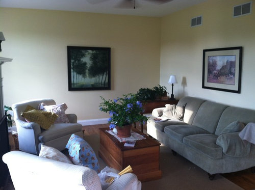
Improving color flow between rooms
demeron
11 years ago
Sort by:Oldest
Comments (14)
Related Stories
GARDENING AND LANDSCAPINGWant More Party Space? 5 Tips to Improve Indoor-Outdoor Flow
Expand your home's entertaining area without adding on by boosting connections between inside and out
Full Story
KITCHEN OF THE WEEKKitchen of the Week: New Function, Flow — and Love — in Milwaukee
A traditional kitchen get an improved layout and updated finishes in a remodel that also yields a surprise
Full Story
KITCHEN MAKEOVERSKitchen of the Week: Rich Materials, Better Flow and a Garden View
Adding an island and bumping out a bay window improve this kitchen’s layout and outdoor connection
Full Story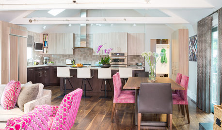
KITCHEN DESIGNLightened-Up Midcentury Kitchen Goes With the Flow
A ranch’s kitchen, dining area and living room are combined in one beautifully unified space, while a mudroom solves a clutter problem
Full Story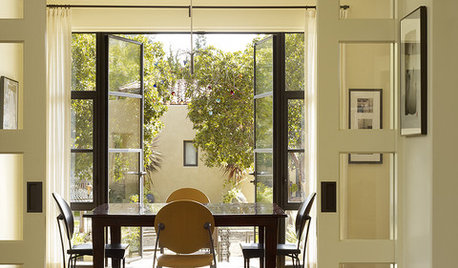
DOORSInterior Glass Doors Shine as Stars of the Flow
If your rooms are cast in a dreary light or the setting is uninspired, give glass doors a more prominent role
Full Story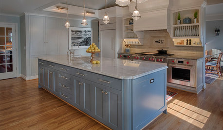
KITCHEN OF THE WEEKKitchen of the Week: European-Style Cabinets and a Better Flow
A Portland couple open up their ranch kitchen to connect with guests and their garden
Full Story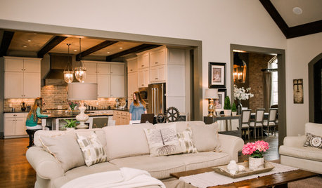
HOUZZ TOURSMy Houzz: Better Flow for Feasts and Family in Alabama
Newly open spaces make this home ideal for entertaining, but intimate areas keep things personal
Full Story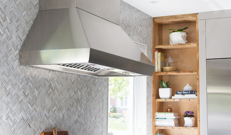
KITCHEN DESIGNKitchen of the Week: Function and Flow Come First
A designer helps a passionate cook and her family plan out every detail for cooking, storage and gathering
Full Story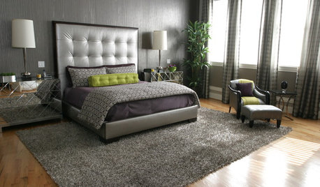
LIFEImprove Your Love Life With a Romance-Ready Bedroom
Frank talk alert: Intimacy and your bedroom setup go hand in hand, says a clinical sexologist. Here's her advice for an alluring design
Full Story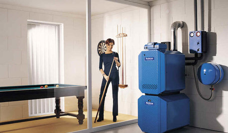
HOUSEKEEPING5 Steps to Improve Your Heating System Now
Increase your heater's efficiency and safety for lower energy bills and greater peace of mind this winter
Full StorySponsored
Industry Leading Interior Designers & Decorators in Franklin County
More Discussions


patty_cakes
Sueb20
Related Professionals
Boise Interior Designers & Decorators · Franklin Furniture & Accessories · Surprise Furniture & Accessories · Millburn Furniture & Accessories · Richfield Furniture & Accessories · North Bellmore Furniture & Accessories · Immokalee Custom Artists · Arcadia Lighting · Camp Springs Lighting · Centreville Lighting · Diamond Bar Lighting · Fort Washington Lighting · Laguna Beach Lighting · Tukwila Lighting · Arden-Arcade Window TreatmentsAnnie Deighnaugh
demeronOriginal Author
sis2two
bostonpam
teacats
trancegemini_wa
bronwynsmom
jenangelcat
User
cloudy_christine
fripper
cloudy_christine