


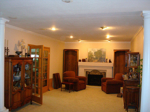
narrowing down the paint colors, again
susanwrites
13 years ago


Sort by:Oldest
Comments (50)
Related Stories
DESIGNER SHOWCASESSan Francisco Decorator Showcase: Happy Days Are Here Again
Creative ideas, bold colors and inventive materials abound under one (very large) roof
Full Story
KITCHEN CABINETSKeeping Cabinet Color on the Down Low
Give just base cabinets a colorful coat for a kitchen sporting character and a spacious look
Full Story
DECORATING GUIDESHouzz Tour: Happy Days Are Here Again in a Miami Apartment
The colors of Biscayne Bay, an owner’s fond memories and the groovy spirit of the 1970s inspire a bright redesign
Full Story
VACATION HOMESHouzz Tour: Glory Days Again for Converted Scottish Lighthouse
A dilapidated lighthouse on the shores of Loch Ness has been beautifully renovated to become 2 stylish vacation rentals
Full Story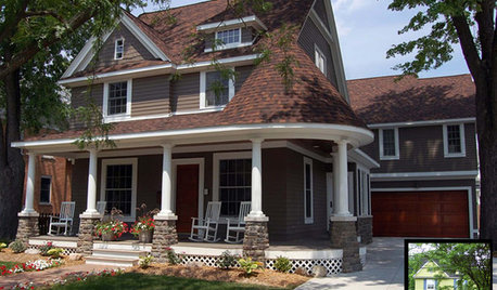
ENTRYWAYS7 Ways to Make the Front Entry Matter Again
Curb appeal: See how designers play down the garage and celebrate the front door
Full Story
COLORPick-a-Paint Help: How to Quit Procrastinating on Color Choice
If you're up to your ears in paint chips but no further to pinning down a hue, our new 3-part series is for you
Full Story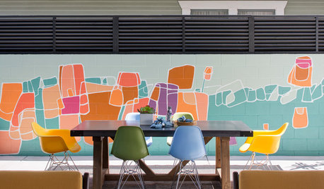
PATIOSPatio Details: Color and Industrial Touches Transform a Narrow Spot
A roll-up garage door connects a San Diego home to the outdoors and its new patio dining area and colorful mural
Full Story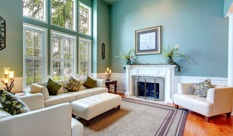
DECORATING GUIDESNeed Peace and Quiet? Muted Colors Tone Things Down
Subtle hues can be perfect for large rooms and to balance out bolder colors in a home
Full Story
BUDGET DECORATING12 Ways to Make Your Home Feel New Again
Treat your furniture, walls, floors and countertops to some TLC, to give them a just-bought look for a fraction of the cost
Full Story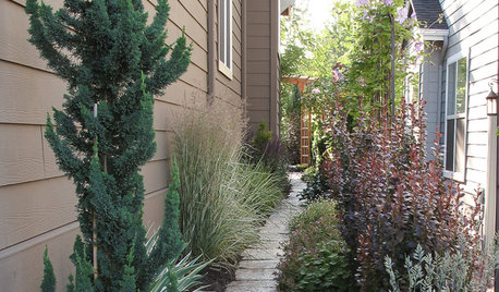
SIDE YARD IDEASNarrow Trees for Tight Garden Spaces
Boost interest in a side yard or another space-challenged area with the fragrance and color of these columnar trees
Full Story
loribee
susanwritesOriginal Author
Related Professionals
Little Egg Harbor Twp Interior Designers & Decorators · Ogden Interior Designers & Decorators · Easton Furniture & Accessories · Spartanburg Furniture & Accessories · Asheville Furniture & Accessories · Hoffman Estates Furniture & Accessories · Park Ridge Furniture & Accessories · Decatur Lighting · Fort Washington Lighting · Lancaster Lighting · Walnut Creek Lighting · Del City Window Treatments · San Jose Window Treatments · Bell Window Treatments · Oakland Window Treatmentsloribee
susanwritesOriginal Author
credomk
dawnp
susanwritesOriginal Author
dawnp
dawnp
User
susanwritesOriginal Author
User
susanwritesOriginal Author
dawnp
dawnp
trinityklm
susanwritesOriginal Author
traceee
Sueb20
susanwritesOriginal Author
susanwritesOriginal Author
tfm1134
bird_lover6
susanwritesOriginal Author
susanwritesOriginal Author
traceee
susanwritesOriginal Author
daisychain01
dawnp
susanwritesOriginal Author
trinityklm
bird_lover6
susanwritesOriginal Author
User
susanwritesOriginal Author
susanwritesOriginal Author
traceee
susanwritesOriginal Author
User
susanwritesOriginal Author
loribee
susanwritesOriginal Author
susanwritesOriginal Author
loribee
User
susanwritesOriginal Author
loribee
susanwritesOriginal Author
eventgal Averill
susanwritesOriginal Author