


Farrow & Ball White
lisa_mocha
14 years ago
Featured Answer
Comments (7)

rococogurl
14 years agoRelated Professionals
Lake Elsinore Interior Designers & Decorators · Tahoe City Interior Designers & Decorators · Milwaukee Furniture & Accessories · Topeka Furniture & Accessories · West Palm Beach Furniture & Accessories · Hilton Head Island Furniture & Accessories · Wellesley Furniture & Accessories · Danville Custom Artists · Pico Rivera Custom Artists · Palm Springs Lighting · South Bend Lighting · Boston Window Treatments · El Sobrante Window Treatments · Fremont Window Treatments · Palm Beach Gardens Window Treatments
mindstorm
14 years agothingsthatinspire
14 years ago
lisa_mocha
14 years agoLinda B
7 years ago
MtnRdRedux
7 years ago
Related Stories
COLOR4 Cool Paint Colors Touted for 2014 — and How to Use Them
Muted but complex, these hues from Farrow & Ball can stand on their own or play supporting roles
Full Story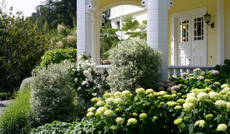
GARDENING AND LANDSCAPINGHave a Ball With Hydrangeas
Even if you don't tinker with the hue by changing the soil, hydrangeas have an entertaining range of uses in all kinds of landscapes
Full Story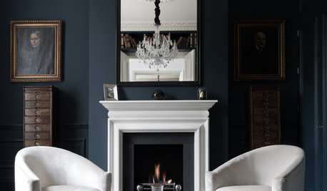
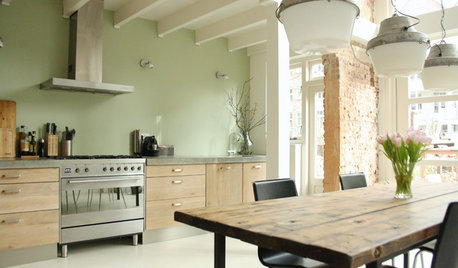
COLORDiscover White’s Surprising Power to Energize Every Room
Using white in different ways gives you limitless options for light, color and creativity
Full Story
DECORATING GUIDESNew Classics: Glo-Ball Lights
These well-rounded lighting winners can be suspended from a ceiling, perched on a pedestal or settled on a tabletop
Full Story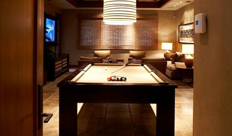
MORE ROOMSHave a Ball With Your Billiard Room
Decadently plush or based in a barn, these stunning billiard rooms show how much fun it is to take style cues from a pool table
Full Story
WHITEHow to Pick the Right White Paint
White is white, right? Not quite. See 8 white paint picks for 8 very different effects
Full Story
COLORColor of the Year: Off-White Is On Trend for 2016
See why four paint brands have chosen a shade of white as their hot hue for the new year
Full Story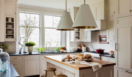
MOST POPULARHouzz Tour: Easygoing and Elegant in White, Cream and Gray
The renovation of an 1860s Massachusetts home creates a sophisticated, serene and comfortable living space
Full Story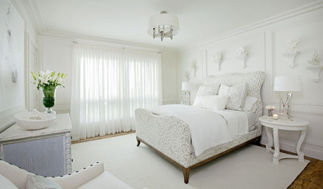
BEDROOMS10 Ways With (Almost) All-White Bedrooms
White rooms need a thoughtful tweak or two to bring on the sweet dreams
Full Story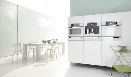
KITCHEN DESIGNWhite Appliances Find the Limelight
White is becoming a clear star across a broad range of kitchen styles and with all manner of appliances
Full Story
ttodd