


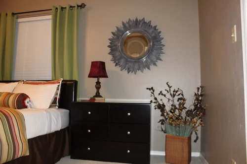
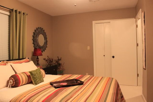
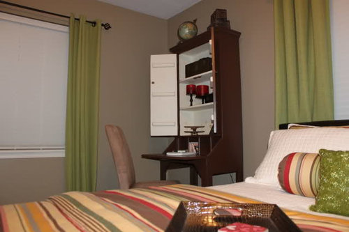
Guest Room...almost done. Maybe? Lots of Pics
itltrot
12 years ago


Sort by:Oldest
Comments (31)
Related Stories
MODERN HOMESHouzz TV: Seattle Family Almost Doubles Its Space Without Adding On
See how 2 work-from-home architects design and build an adaptable space for their family and business
Full Story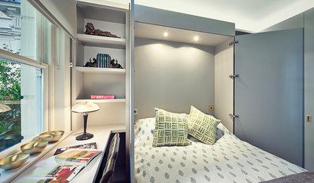
DECORATING GUIDESHow to Turn Almost Any Space Into a Guest Room
The Hardworking Home: Murphy beds, bunk compartments and more can provide sleeping quarters for visitors in rooms you use every day
Full Story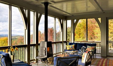
GARDENING AND LANDSCAPINGScreen the Porch for More Living Room (Almost) All Year
Make the Most of Three Seasons With a Personal, Bug-Free Outdoor Oasis
Full Story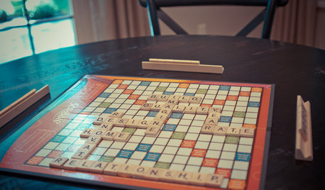
LIFESimple Pleasures: Game Night Done Right
What's that sound? Popcorn popping, friends laughing and maybe, just maybe, a little trash talking
Full Story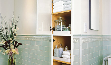
HOUSEKEEPINGGet It Done: Clean Out the Linen Closet
Organized bliss for your bedroom sheets and bathroom towels is just a few hours away
Full Story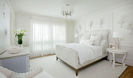
BEDROOMS10 Ways With (Almost) All-White Bedrooms
White rooms need a thoughtful tweak or two to bring on the sweet dreams
Full Story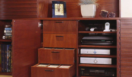
MEDIA ROOMSGet It Done: Organize the Media Cabinet
Ditch the worn-out VHS tapes, save valuable storage space and find hidden gems with this quick weekend spruce-up
Full Story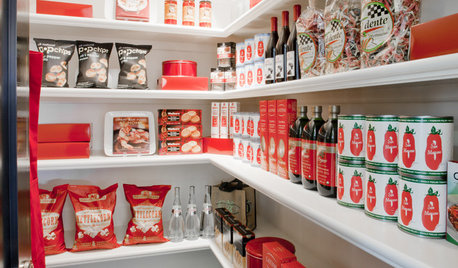
KITCHEN STORAGEGet It Done: How to Clean Out the Pantry
Crumbs, dust bunnies and old cocoa, beware — your pantry time is up
Full Story
HOUSEKEEPINGThree More Magic Words to Help the Housekeeping Get Done
As a follow-up to "How about now?" these three words can help you check more chores off your list
Full Story
DECLUTTERINGGet It Done: Clean Out Your Bedroom Closet
You can do it. Sort, purge, clean — and luxuriate in all the extra space you’ll gain — with this motivating, practical how-to
Full Story


justgotabme
mclarke
Related Professionals
Gloucester City Interior Designers & Decorators · Hercules Interior Designers & Decorators · Washington Furniture & Accessories · Pinehurst Furniture & Accessories · Paradise Custom Artists · Modesto Lighting · South Miami Lighting · Warwick Lighting · York Lighting · Littleton Window Treatments · Rockford Window Treatments · San Rafael Window Treatments · West Des Moines Window Treatments · Grosse Ile Window Treatments · Oakland Window Treatmentsavesmor
itltrotOriginal Author
cindyloo123
Olychick
work_in_progress_08
itltrotOriginal Author
brianadarnell
aloha2009
indygo
abundantblessings
dianalo
erinsean
ratherbesewing
cindyloo123
sashasmommy
susanlynn2012
busybee3
homeagain
GreenDesigns
lizziebethtx
cindyloo123
itltrotOriginal Author
chocolatebunny
jlo58104
itltrotOriginal Author
ideamom
itltrotOriginal Author
InteriorStylist
patty_cakes