Shop Products
Houzz Logo Print
my3dogsii

Country Living-House of the Year 2014:The Ultimate New Old House

I saw this in my Country Living magazine last night. I gasped at the kitchen, but not in a good way.

It's very different from the Southern Living Idea House. This one is in Rhinebeck, New York.

CL says, 'Our design team brings old-fashioned favorites like farmhouse architecture and pretty patterns back into fashion with fresh twists on classic style. '

What do you think?

Here is a link that might be useful: Country Living - House of the Year 2014

Comments (39)

  • nanny2a
    9 years ago

    I gasped, too......it was not at all to my preferences. I am one of those who prefers white kitchens, or if not white, authentic wood tones with light countertops. There wasnâÂÂt much in the house that I liked at all, actually, but did love the exterior design. Perhaps IâÂÂm too old school.

  • homersmom
    9 years ago

    I don't care for it either. If that makes me old and stodgy, so be it.

  • teacats
    9 years ago

    No.

    Just no.

    That kitchen backsplash would make me ill .....

  • ediej1209 AL Zn 7
    9 years ago

    Although all those zigzag stripes might make for interesting photos, I can't imagine living with them day in and day out. Definitely not my "Cuppa"!
    Edie

  • ediej1209 AL Zn 7
    9 years ago

    Although all those zigzag stripes might make for interesting photos, I can't imagine living with them day in and day out. Definitely not my "Cuppa"!
    Edie

  • franksmom_2010
    9 years ago

    I thought the whole thing was hideous inside and out, with the exceptions of the office and the master bedroom, but even those...I didn't care for painting on the bedroom wall, or the "rug" in the office.

    That kitchen...OMG...what were they thinking?!

  • nosoccermom
    9 years ago

    No, that kitchen backsplash is weird, not modern and striking.
    Also, no exhaust hood?

    What I like is that the house seems relatively small, not one of those gigantic McMansions. However, I like the exterior better than the interior.

    DR: Rug is too small.
    MBR: Bed is way too small! Also not loving the walls. Kind of childish.
    Guest room: Like it better than the master.
    LR: Those banquettes are kind of awkward. Like a waiting room.

    Not loving the coral ceilings.

    Like the office and master bathroom.

    Why would there be a full bathroom on the first floor if there's no other bedroom? Or is there, and they just didn't show it on the house tour video?

  • TxMarti
    9 years ago

    CL says, 'Our design team brings old-fashioned favorites like farmhouse architecture and pretty patterns back into fashion with fresh twists on classic style. '

    What do you think?

    I think they should have said 'Our design team brings old-fashioned favorites like farmhouse architecture and pretty patterns back into fashion with freakish twists on classic style."

    I did like the exterior though.

  • tinam61
    9 years ago

    I like the outside. The inside I would do totally different. Didn't like the kitchen decor, but the bones are not bad. The bedrooms and bath were too country for me and I was surprised to see blue and rose in the living room.

    tina

  • bbstx
    9 years ago

    The exterior reminded me of a Jim Walters Home from the 80s. The interior was simply ghastly. In addition to nosoccermom's observations, that rug in the study is the worst idea I've ever seen! Can't you just imagine the tripping hazard you would have every time your pushed your chair back?

  • nosoccermom
    9 years ago

    It would be shredded soon enough, though.

  • mtnrdredux_gw
    9 years ago

    Not good. And funny, I just saw that design team featured somewhere ...NYT or WSJ and I recalled liking their stuff.

    The kitchen island looks very similar to the one I have in CT and the one I had made in our beachhouse. I also have a sink skirt, and of course the bamboo blinds. Uh oh!

    The coral is awful; feels like an old lady powder room. The "dusty rose" with the colonial blue? No, no not again. All they forgot was the geese in bonnets.

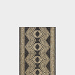
    And yes, the "rug" in the office is totally stupid. In manages to fail both for form and function!

  • allison0704
    9 years ago

    Oh my... the entire house is horrid.

  • homeatlast
    9 years ago

    I'm laughing at the seemingly unanimous reaction to the kitchen -- I can tell you that's it's no better in real life. I was at the Country Living Fair in June where they offered tours of the house. What the magazine doesn't show is that the main floor is essentially open plan, so you see that awful striped tile wall at the back of the house as soon as you walk in the front door. And the "living room" is so tiny, it's pretty much a large alcove off the kitchen. It would have been more practical to flip the location of the dining room and living room, but it looks like they purchased the Cost Plus World Market dining room table first and then found it wouldn't fit in the room that should have been the dining area/room. I found it disappointing because it is lovely from the outside.

  • Fun2BHere
    9 years ago

    There are so many designers doing "new country" and "modern country" and doing it well. Too bad that none of those designers were doing this interior because it's flat out ugly.

  • stolenidentity
    9 years ago

    'Our design team brings old-fashioned favorites like farmhouse architecture and pretty patterns back into fashion with fresh twists on classic style.'

    because you asked What do you think? -

    I think the kitchen is the least of the the issues - the endless wall paper choices are not fresh twists rather they are what I would call "twisted". Not one of those walls meets "pretty pattern" description.

  • Acadiafun
    9 years ago

    The backsplash in the kitchen made my eyes hurt so much that I got an instant headache. It got worse viewing the floral wallpaper......

  • palimpsest
    9 years ago

    Well this unreliable rust bucket was 1971 Motor Trend Car of the Year so the house is in good company. X of the year one year is often the "what were they thinking" of subsequent years.

  • ghostlyvision
    9 years ago

    Were most of the ceilings some shade of pink?

    The kitchen is just awful.

    Too many small 'natural fiber' circle rugs on the office floor to trip on, and with one of the legs of the desk on top of one rug, wouldn't it wobble?

    If this is the future, we'd better all invest in anti-dizzy sunglasses.

    The wrap-around porch was pretty charming but not many redeeming qualities in the interior, in my view.

  • citywoman2012
    9 years ago

    I was just sad after I viewed the inside.
    I kept trying to find one redeeming factor but couldn't.
    I thought most of the furniture looked like yard sale and
    that kitchen possibly, one of the ugliest I have seen.
    That skirt under the sink would have to be washed several times a week if the kitchen was to be a normal used kitchen.

    House of the year? By whose standard.

  • User
    9 years ago

    Hard to believe this wasn't deliberate sabotage. I have a feeling heads will roll for this one (and probably should).

  • Boopadaboo
    9 years ago

    I thought for sure y'all must be exaggerating reading these comments. Nope it is really bad. Wow. What were they thinking. Could it be some kind of joke?

  • deegw
    9 years ago

    I thought the designers might be some ironic hipsters who were trying to make us believe that Grandma decor and 1980's country will be the next big thing.

    Instead, the designers look like people I see in my grocery store so that theory doesn't work. What were they thinking? Or smoking?

    I don't think the tile is terrible but it certainly doesn't go with the rest of the house.

  • rosesstink
    9 years ago

    There is not much I like about this house. The open floor plan is awful, the colors are mostly awful, that backsplash is awful. That rug in the office Is so impractical that I would never hire a designer who even suggested the idea.

    There is a reason I canceled my CL subscription years ago. The reason at the time was month after month of white slipcovered furniture. One month I swore that if the next issue featured white slipcovered furniture yet again I would cancel my subscription. And so I did. I browse through the mag once in a while at the store. I don't think I've bought more than one or two issues in the past 10 years.

  • louislinus
    9 years ago

    That was horrible. I'll take Mary Randolph Carter's house over that any day. At least her house is interesting.

  • 66and76
    9 years ago

    All I can think of to say is, I would never want to live in a house decorated like that.

    The purpose of "houses of the year" in CL and in other magazines is to promote and to sell advertised products provided by big-name manufacturers. In other words, the magazine layout is supposed to tempt consumers to buy the items used by the designers. CL failed this time.

  • teacats
    9 years ago

    Exactly!!! These show houses are meant to sell the products -- and this is one of worst possible designed houses I have seen ...... yes -- CL failed BIG time ....

  • carsonheim
    9 years ago

    craptastic!

  • outsideplaying_gw
    9 years ago

    Big fat 'NO'.

  • nhb22
    9 years ago

    That's a whole bunch of ugly going on with that house!

    Nothing seems to go together.

  • Bumblebeez SC Zone 7
    9 years ago

    Wow, not what I was expecting. I like the outside but all of it is awful inside. Junky, flea market throughout. Horrid indeed.

  • Holly- Kay
    9 years ago

    Whew! I thought the exact thing My3dogs.I couldn't believe my eyes when I opened my CL and saw that house. It, IMO, is only noteworthy due to it's extreme discordance. A big yuck!

  • chispa
    9 years ago

    Many times people complain that the items shown in a Show house are all to-the-trade and not affordable to the masses. It seems this house has gone in the opposite direction and lowered the price point to the Cost Plus World Market level. I would take a guess that they were the major sponsor for the project!

    The mid level design market that falls between low cost Chinese made goods and custom to-the-trade-only goods, seems to have disappeared completely. At least that has been my experience while remodeling and decorating my house the past 4 years.

    That was a strange show house project!

  • crl_
    9 years ago

    Love the exterior. I long for a wrap around porch. I liked the guest bedroom. The master would be okay with me if I could paint over the flowers on the wall. I didn't care for most of the rest of it. The kitchen backsplash is absolutely horrible, as everyone has already noted. But, if I could replace that backsplash, the rest of the kitchen seems just fine to me. Too bad the interior really doesn't live up to the exterior.

  • desertsteph
    9 years ago

    horrid, just horrid. I wouldn't even want to visit there. that kitchen wall would give me a headache in a real short time.

  • patricianat
    9 years ago

    WWTT.

  • mitchdesj
    9 years ago

    The tile treatment in the kitchen could be removed and the rest of the house would be pretty non striking. I think it would be easy for someone to win this house and just remove a few wallpaper treatments to neutralize it a bit.

  • Skypathway1
    9 years ago

    Oh no, what we're they thinking? They are driving away customers for their magazine.

    I have a migraine just looking at those pictures.

  • My3dogs ME zone 5A
    Original Author
    9 years ago

    I've been trying to find comments on it, but so far, all I see are the few at the bottom of this linked blog page. They aren't quite as vocal as we are, and there are 2 who like/love it.

    Here is a link that might be useful: Eclectically Vintage