


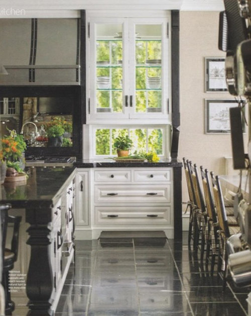
Thoughts On This Kitchen
User
9 years ago


Sort by:Oldest
Comments (16)
Related Stories
KITCHEN DESIGNHow to Choose the Right Depth for Your Kitchen Sink
Avoid an achy back, a sore neck and messy countertops with a sink depth that works for you
Full Story
KITCHEN DESIGNNew This Week: 4 Kitchen Design Ideas You Might Not Have Thought Of
A table on wheels? Exterior siding on interior walls? Consider these unique ideas and more from projects recently uploaded to Houzz
Full Story
HOUZZ TOURSMy Houzz: Thoughtful Updates to an Outdated 1900s Home
Handmade art and DIY touches bring a modern touch to a classic Boston-area home
Full Story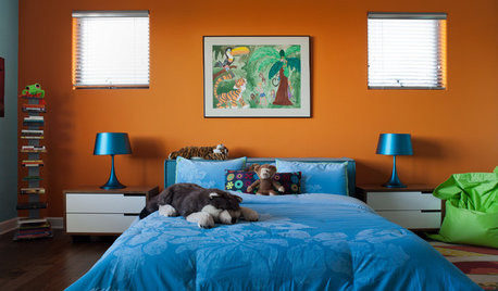
COLOR10 Color Combos You Never Thought Would Work
Orange and blue? Purple and green? Yes and yes. Unlikely pairings can look great if you do them right
Full Story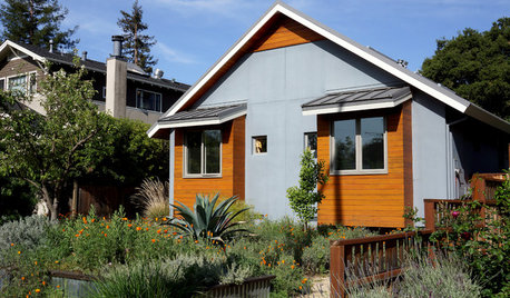
CONTEMPORARY HOMESMy Houzz: Living Simply and Thoughtfully in Northern California
Togetherness and an earth-friendly home are high priorities for a Palo Alto family
Full Story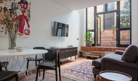
SMALL HOMESHouzz Tour: Thoughtful Design Works Its Magic in a Narrow London Home
Determination and small-space design maneuvers create a bright three-story home in London
Full Story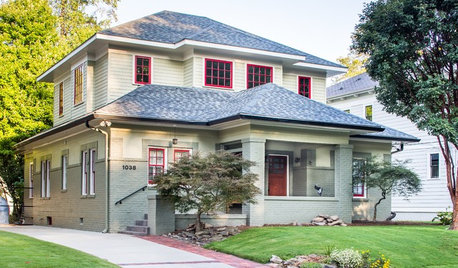
CRAFTSMAN DESIGNHouzz Tour: Thoughtful Renovation Suits Home's Craftsman Neighborhood
A reconfigured floor plan opens up the downstairs in this Atlanta house, while a new second story adds a private oasis
Full Story
ENTERTAINING20 Fabulously Thoughtful Host Gifts
Convey your gratitude (and maybe earn repeat invitations) with these useful gifts that show your host you care
Full Story
HOUZZ TOURSMy Houzz: Thoughtful, Eclectic Style for a Sunny Seattle Apartment
Creative couple builds their first home together piece by piece in a sun-filled rental
Full Story
KITCHEN DESIGNCouple Renovates to Spend More Time in the Kitchen
Artistic mosaic tile, custom cabinetry and a thoughtful layout make the most of this modest-size room
Full StorySponsored
Columbus Area's Luxury Design Build Firm | 17x Best of Houzz Winner!
More Discussions


kitchendetective
patty_cakes
My3dogs ME zone 5A
nosoccermom
peony4
blfenton
Fun2BHere
palimpsest
tomatofreak
nosoccermom
Boopadaboo
UserOriginal Author
sochi
joaniepoanie
stolenidentity
missymoo12