


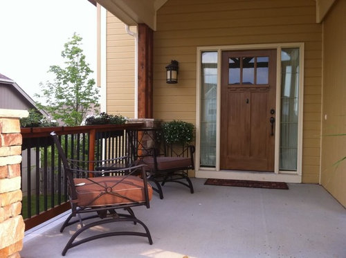
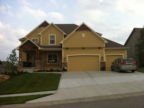
Front door color help
avesmor
12 years ago

Sort by:Oldest
Comments (14)
Related Stories

ENTRYWAYSHelp! What Color Should I Paint My Front Door?
We come to the rescue of three Houzzers, offering color palette options for the front door, trim and siding
Full Story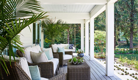
STANDARD MEASUREMENTSThe Right Dimensions for Your Porch
Depth, width, proportion and detailing all contribute to the comfort and functionality of this transitional space
Full Story
UNIVERSAL DESIGNMy Houzz: Universal Design Helps an 8-Year-Old Feel at Home
An innovative sensory room, wide doors and hallways, and other thoughtful design moves make this Canadian home work for the whole family
Full Story
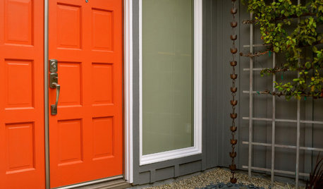
MOST POPULARHow to Choose a Front Door Color
If choosing a door paint isn't an open-and-shut case for you, here's help
Full Story
LIFE12 House-Hunting Tips to Help You Make the Right Choice
Stay organized and focused on your quest for a new home, to make the search easier and avoid surprises later
Full Story
FUN HOUZZDecorated Houses Help Save a Detroit Neighborhood
Art's a start for an inner-city community working to stave off urban blight and kindle a renaissance
Full Story


anele_gw
avesmorOriginal Author
Related Professionals
Jacinto City Interior Designers & Decorators · Memphis Furniture & Accessories · Santa Barbara Furniture & Accessories · Surprise Furniture & Accessories · Wilmington Furniture & Accessories · Park Ridge Furniture & Accessories · Port Chester Furniture & Accessories · North Bellmore Furniture & Accessories · Central Falls Custom Artists · Pico Rivera Custom Artists · Kendall Lighting · Orcutt Lighting · El Sobrante Window Treatments · Oak Park Window Treatments · San Jose Window Treatmentschocolatebunny
dianalo
anele_gw
lizbeth-gardener
laofeng
nini804
annie1971
amykath
avesmorOriginal Author
dianalo
mclarke
yayagal