


What Current Color Schemes will be Dated?
As I am in love with gray and yellow in all forms and see it everywhere, I can't help but think it will be the hunter green and cranberry or Williamsburg blue and mauve of yore past.
Comments (58)

Bumblebeez SC Zone 7
Original Author11 years agoThere are many color schemes that are always perennially popular and never seem to go out of vogue.
Blue and White
Yellow and White
Pink and Greento name a few. The application can be trendy though.

cottonpenny
11 years agoTrue - my mom has a blue and white kitchen from the early 1990s that has aged remarkably well IMO despite the "european style" cabinets (white laminate w mahogany edges).
But the colors of blue, yellow, pink and green are completely different from decade to decade.
Related Professionals
Wareham Interior Designers & Decorators · Fort Wayne Furniture & Accessories · Potomac Furniture & Accessories · San Francisco Furniture & Accessories · Spartanburg Furniture & Accessories · Thousand Oaks Furniture & Accessories · Woodbury Furniture & Accessories · Crofton Furniture & Accessories · Greenwood Village Furniture & Accessories · Irmo Furniture & Accessories · Maplewood Furniture & Accessories · Northbrook Furniture & Accessories · Camp Springs Lighting · Kendall Lighting · Tukwila LightingUser
11 years agoI've always loved the combinations of green/blue and pink/green together, but can remember my mother telling me to take the two colors off when I'd pair them up in the clothes I'd wear. She always said they didn't go. LOL
Fun2BHere
11 years agoI have a BM fan deck from the late 1980's. The colors shown are completely different from my current fan deck, much brighter with less grey in the shades.
francoise47
11 years agoI started seeing a lot of gray in design magazines around 2005.
I caught the gray fever and promptly started painting rooms in my house gray or grayish --
BM Stonington Gray, BM Balboa Mist (a taupe gray), F & B Elephant's Breath.As much as I inherently love the colors I picked,
I am starting to get tired of all the gray.
The new popular combination of gray and yellow still looks fun and fresh.
But maybe the pairing of the yellow with gray shows a longing for something sunnier.
That is to say, even though gray will always be some kind of "classic", it does feel like we are nearing the end of the seven year "color cycle" for gray.This certainly doesn't mean you shouldn't decorate a room in yellow or gray if you love it.
But once we start seeing a color combination "everywhere" the corporate interests who try to urge us to buy new paint, pillows, and accessories will surely start trying to pique our interest in yet another colors combination.
And a new cycle will start....francoise47
11 years agoI started seeing a lot of gray in design magazines around 2005.
I caught the gray fever and promptly started painting rooms in my house gray or grayish --
BM Stonington Gray, BM Balboa Mist (a taupe gray), F & B Elephant's Breath.As much as I inherently love the colors I picked,
I am starting to get tired of all the gray.
The new popular combination of gray and yellow still looks fun and fresh.
But maybe the pairing of the yellow with gray shows a longing for something sunnier.
That is to say, even though gray will always be some kind of "classic", it does feel like we are nearing the end of the seven year "color cycle" for gray.This certainly doesn't mean you shouldn't decorate a room in yellow or gray if you love it.
But once we start seeing a color combination "everywhere" the corporate interests who try to urge us to buy new paint, pillows, and accessories will surely start trying to pique our interest in yet another colors combination.
And a new cycle will start....mary_ruth
11 years agoGray and yellow is an old English standard that is like blue and white, never goes out of style.
What goes out of style is the way you decide to show these colors. Use a sparingly sophisticated style, simple and elegant and it will never go out of style no matter what color (except avocado green and harvest gold, lol!)
 PRO
PRODiane Smith at Walter E. Smithe Furniture
11 years agoI think what's in depends more on who uses the color scheme rather than what the color scheme is.
I'm predicting kelly and especially deep forest greens are starting to trend upward.
My avocado kitchen sink from the 50's is out? Drat!

mtnrdredux_gw
11 years agoAll of them.
Designers and home goods mfrs will see to that. Ever notice that when a color is "in", you can find it in every thing you buy? Tea towels, trivets, KA mixers, off the rack floor and window treatments. Everywhere.
Then, suddenly, it will be impossible to find. So even if you want to follow your own use, the industry will thwart you.
jessicaml
11 years agoI love the green and yellow living room Green Designs posted, since it reminds me of my wedding (only with more bling). I think there's a reason the other schemes in that post never caught on, though! I felt a little sick looking at them.
Schemes I expect are already dated or will soon become so (our children's version of avocado and harvest gold):
chocolate brown with pink
chocolate brown with aqua
gray with orange
beige with beigeGreen seems to be everywhere these days, in various shades (maybe influenced by the 'green' environmental movement?) so I'm waiting for people to get sick of green, too. Green is my favorite color, though, so I'm also dreading the backlash against it and hoping I'm not going to be influenced into thinking my favorite color is 'dated'! Amazing how what we see influences us. I never thought I'd like gray...but after seeing it everywhere, I do now (though I know myself well enough to decorate with warm colors so as not to become suicidal in January). ;)

Annie Deighnaugh
11 years agoI find the more out there color schemes become dated as they are associated with an era whereas the more subdued schemes tend to be more timeless as they don't shout "anything"....like the pink, aqua, and baby blue of the 50s or the lime greens, hot pinks and deep purples of the 70s.
Also, it's not a matter of the color so much as the shade of the color that has the association. As you say sage greens are very popular, but avocado green, not so much.
I can remember growing up when Mom and I would latch onto a color combo and comb high and low for it and struggle to find it in fabrics, only to find that the next year it was everywhere....seemed we were always a year ahead of ourselves.
mtnrdredux is right...DH lost a washcloth somewhere between home and gym and even though it was only about a year or so old, finding a match would be absolutely impossible....the colors have all changed already.

Oakley
11 years agoJessica, I hope the pink/chocolate combo leaves ASAP. Those are two combinations that I simply cannot tolerate for some reason. When my DIL was expecting her daughter, I begged her not to do that color scheme! lol
I do think the sage greens and all grays will go out of style. When I first joined this board everyone was doing green. Now everyone is doing gray. On walls I mean.
I find both to be utterly depressing except the light vintage greens. And I'm one of those who love gray, rainy days!

gr8daygw
11 years agoI remember the taupe era that came in after the heavy saturated jewel tone era. It was in every magazine but I never really saw it catch on so much in everyday homes. It sure was on the cover of ever magazine and in every show house. People really admired it but not too long after that era magazines were telling us that people were feeling color "deprived" and then ushered in colors of all sort. That was when I'm pretty sure anything goes started to blossom and the market was flooded with too much of imported everything with indistinct styles so that making decisions is nearly impossible for some. I'm sure it has been hard for designers to help their clients when no has any idea what they want and there is just too much to choose from and too many options. Back to gray, I really love some of the gray rooms but I know that I could not live with it for long as I love color so much and love when I come home to my house it seems to jump out at me after being in a neutrals all day in the commercial world.
Gray was actually popular at the end of the '80's when paired with strong color accessories. I will never forget a show house that just seemed so sexy with it's gray-taupe walls, white sofas and then clear colors of deep green and dark, dark pink in silk pillows and accessories. It was beautiful. I could live with that!
lynxe
11 years agoI love both the purple and orange and purple and red combos that GreenDesigns posted. In fact, I don't think those rooms go far enough; for example, I'd like the chairs in the first picture better if they were solid purple or had a higher proportion of purple to white. I mentioned loving the idea of purple & red in the same room a while back, but I don't recall the context. It might have been about our living room: I've wanted to use purple in this room, which has some reds and oranges in it, but I haven't quite figured out how to do it, or even whether it would be possible. Barring that, I've been considering repainting a bedroom that has wood floors with a somewhat light orange tone, a piece of art in a gold frame and with purples in it, and dark wood furniture. I'd like to do the walls in a purple.
As for what will be dated, I have no idea. I'm rooting for both neutral, particularly beige and its variants (like what pal and another poster mentioned), and muddy versions of any color to be on their way out though.
loves2read
11 years agoI wonder if you think that colors as a reflection of personality/attitudes mean that people's attitudes are going more positive--even if we are just so tired of being depressed that we will psych ourselves up by punching up the colors around us...
Grey for me is just so flat--sophisticated, yes--but unless there is another strong color to balance the boring I just don't get anything positive from it...but then I love beige which most people view as bland and flat...We bought house in FL recently and thought we would use lot of white in furnishings...but the previous owners used flooring that (to us) just didn't allow that wicker/rattan white furniture to fit in...
and we did not want to spend the money to replace the flooring or add lot of area rugs...
so we went with darker wood tones than we originally thought we would...
two bedrooms have white furniture (one a nice vintage Dixie Aloha set) but their flooring is not that of the main living areas...The color cycles do wax and wane and often depend on what accent feature/theme/motif is hot to trot...Asian influence or Persian, or tropical--
any color combo can work at any time depending on the skill of the person putting it together...even colors that look dated in some settings work in others...jterrilynn
11 years agoWall colors of course will change from those most popular today, like the popular gray. We will see more texture and movement. Much more wall papered accent walls. New colors will be infused into today's existing popular furnishings. I think the next change in popularity will be much more gradual than changes of the past. Think of colors that would go well with yellow and gray or orange. Eclectic may have a longer ride than trends of the past but with star "cool" and star "warm" pops changing in a way to accept some existing trends.

kswl2
11 years agoOur designer surprised me with his fabric choices, all shades of greens and reds. He pointed out to me that every room I liked was either green or red, so he used the two together. We have one blue / white / gold bedroom (for my blue and white china and Christmas plates and everything else is some shade of either red and green or yellow and green. Since they haven't been in, per se, I am hoping they won't go out, either :-)
I like rooms of most any color scheme that are well designed. Colors may go in and out in cycles, but an individual can live with a good design of any color indefinitely. Thank heavens!
rosie
11 years agoI went through a green and red period, Kswl, wonderfully warm and actually very versatile. They can be played out in so many ways. I agree--if it's well designed it'll look good.
Dedtired, my own blue and orange period never has entirely passed. In fact, it's very alive and well right now in slightly gentled versions. I find as I get older that my tolerance for extremely bright, big splashes of color has...dimmed.
Beige, beige, beige. My tastes have never dimmed enough to do any of my own rooms in beige, but I have to admit beige-beige is a combo that never will go out, and shouldn't, in spite of being seen everywhere in homes unjoyously beige-by-default. Done well, it is lovely, far from boring, and--importantly--very emotionally satisfying to some.
Now, unnecessarily conservative, dull, "color" schemes that come off dreary and denervated instead of delicately colored. The biggest example of all of the difference that quality materials and design make. Well, I was going to wish the dull and dreary on their way to the past, but cheap dyes and construction mean the market will always be flooded with them. Between the two, that's actually probably how we got that sickly mauve and blue era. (Cheap dyes plus a comparatively adventurous shift off brown for those who couldn't do turquoise and orange? :)
Jterrilynn, why do you think the next change will be much more gradual than before? Economy problems or something more interesting?
jterrilynn
11 years agoHi Rosie, I think it will be gradual do to the economy. Regardless of who becomes the next president it is naive to think we are not all going to pay for the huge dept we are in. However, I do think (to keep us spending) that new colors will be introduced to go with the popular colors of now. Some of the colors may be complimentary to or different hues and tones of. For example orange may change to russet. Yellows may become dirtier or peachy/yellows. It may be very uncool to have a true orange or true yellow but cool to have a version of. Because of a gradual change people can swap pieces out here and there. Gray walls will be out. I have no idea of what colors will replace it but I'm thinking light muted dirty blue or muted dirty purples or some shades that one could get away with the gradual "tones" changes. I can see more textured wall paper accent walls because it will be a way to have a dramatic change without breaking the bank. And, it will take a bit more time for those who still think of momma's or grandma's wall paper to come around.
Annie Deighnaugh
11 years agoAnd then there are the color schemes I love but never had a chance to try...like the colors of vanilla and coffee ice cream together...

Sueb20
11 years agoFunny that gray and yellow are supposedly in but I'm having a hard time trying to find gray and yellow bed sheets, or even just pillow cases.
I have liked the same colors in decorating for many years and I never picked them because they were popular; they're just the colors I'm always drawn to (reds, greens, golds) and I suppose at the moment they're not too fashionable but I don't really care. I like most colors and I can usually find a way to sneak almost any color into my decor with the possible exception of purple -- love it, but it just doesn't belong in my house. I always thought of myself as a non-blue person but I even tossed a blue chair into the mix last year (as many of you witnessed!) and it worked.
The only time I really pay much attention to trendy colors in decor is when it bombards me at places like Home Goods... And by the time I'm seeing it there, I assume the trend is over!
patty_cakes
11 years agoWhere is everyone seeing the gray/yellow color combo? Is it being used in model homes? I can't even remember seeing it in decorating mags. ;o)
luckygal
11 years agoColor has become a "business" so of course the fads/trends must change frequently. We are deluding ourselves if we think otherwise. Doesn't mean we can't use and keep any color or combo as long as we like. It just won't be "up to the minute" for long.
francoise47
11 years agoCrate and Barrel has done a lot with grey and yellow in the past year:
{{!gwi}}
{{!gwi}}
{{!gwi}}
Canada House and Home kitchen, 2011:
{{!gwi}}
Websites like Decorpad feature many gray and yellow combinations:
{{!gwi}}
And it is all over Pinterest.
http://pinterest.com/stloro/yellow-gray-obsession/
It is a very stimulating combination.
francoise47
11 years agoThe availability of Le Creuset in bright Dijon yellow in 2008 seems to have inspired many stagers for mags to make use of the yellow and gray combination. Here from a Crate and Barrel catalog this past year:
{{!gwi}}
Oakley
11 years agoThe last picture looks like it has brown walls which I like. I would use that but never gray. Maybe in a beach house where I'd add a lot of white.
Sue, I've had those same colors since childhood and all through my adult life. The good thing about jewel tones is you can add just about any color to it.
The color combo that I still like & was popular in the 80s is peach and white/cream. It seemed to fall out of favor pretty fast though. Not sure why. I have peach walls in my bedroom that I don't plan on changing.
francoise47
11 years agoOne more fab yellow and gray image from the past year in Crate and Barrel:
{{!gwi}}
Bumblebeez SC Zone 7
Original Author11 years agoYellow and Gray can be subtle, stainless steel and deep cream cabinets, for example. Pottery Barn fall catalog has a ton of it. It is still, essentially, a yellow/gray combo.
I love those pics, Francoise!
rosie
11 years agoPeach is a lovely, flattering color. So much can go with it, and cream's at the top of my list. I've read that peach is tricky to just roll on walls and have look right, though, which might be a small part of it.
Jterrilynn, I hate the thought that we'll retreat to even less adventurous and happy colors than now, but I'm afraid that may be the case. Regardless of the cause, I expect costs from accelerating climate change extremes to make themselves felt more and more (and more) in our personal and national pocketbooks.
PattyCakes, yellow+gray probably just isn't being marketed in your region.
Luckygal's point that color is a business so overwhelmingly true. What I've fairly recently come to realize is that, no doubt for exactly that reason, unlike in the past, colors of the era just past tend to disappear quickly altogether. I realized it when I expected to pick up items in colors I liked in discount/remaindered shops over the coming year or two, or three, and did not. One "day" yesterday's colors simply disappeared from all stores across my region, to be replaced by a new set. Used to be they sat around somewhere on sale until they were just too dusty or sun damaged to offer any more.
BTW, it may be harder these days, but at least some new options are open to us, and we don't have to let ourselves be jerked around helplessly if we want something else.
palimpsest
11 years agoPeach is great for bathrooms because it is flattering and it also doesn't interfere much with makeup application by skewing the lighting through reflection.
I really don't think that it is the "scheme" that ages so much as the application, although I do agree that combinations do "age" to some extent.
I think what really ages, unless you stick with some real classics is upholstery patterns.
I spend a fair amount of time looking for things that potentially do Not need to be reupholstered for people with limited budgets, and honestly there is a Lot of really ugly upholstery out there. At some point it may have been more acceptable because of Fashion, but my thought is that is was probably always not so great, but people were used to looking at it.
I remember my mother offering to pay to reupholster something for my sister, who then picked out something that was very popular at the time with ducks or something from that period and my mom said "Okay...I *won't pay to reupholster it in THAT". There was a certain amount of name calling at that point with "controlling" being part of the overall free personality profile my sister then provided. And "how did you grow up to have such bad taste?" one of the things my mom hurled back at my sister.
But there was a valid point. I think people get tired of stuff because they were never really that attached to it in the first place, they just did it because it was in Fashion...and that's not really a good reason to spend money unless you are going to spend it every time fashions change.
If you *really like something, it shouldn't matter if it's hot off the press, or not. Of course we all change and mature, but the constant 180s that some people seem to do frustrating and expensive...what people really need to do is examine what They respond to over and over.gmp3
11 years agoI thought gold/green/red was out but it is in full swing in different shades in Pottery Barn. I had lots of it in my old house and I guess I tired of it after 16 years. It still looks pretty to me in other homes.
jessicaml
11 years agoWhen I was 17, I fell in love with a friend's living room. I was still learning about style, liking anything but what my mother liked, whereas this friend was in her 30s with a confident sense of herself and her style. The things I remember most clearly were the rose print sofa, the deep olive green accent wall, and the warm wood armoire (before flat screens). 13 years later, I'd still love to have that living room. My husband recently threw out our worn red and green living room rug. In looking for replacements, I've decided I probably want a very similar new rug (which I'll hopefully be able to find, since it's a traditional style). Dated or not, it's a combination that works for me. I think Pal has a point that the application of a color combo makes a big difference in how it wears...but I really wouldn't care if everyone else hated that rose-print couch.
Annie Deighnaugh
11 years agoand mag covers are designed to snag the passerby or the impulse shopper....

Saypoint zone 6 CT
11 years agoI'm SO glad I didn't jump on the recent gray/limed/belgian trends, because I think they're already on their way out. They're pretty to look at, but I could never imagine living with such a limited color palette. What happens when you bring in your "stuff", such as books, clothing, personal items, gifts? They would all stick out unless you could paint or recover everything in gray or off white.
The brown of the last decade is already going out, but unfortunately, the previous owner of my house went for brown granite and beige cabinets that are difficult to work around.
I have always loved soft greens and cream/gold, and choose my major items and wall colors from those hues. When a trend arrives, I can always find something to update with that works, like off white or cream drum shades, towels that add a current color, or some fresh new pillows that coordinate with my existing colors. In the end, I never tire of my favorites, whatever the trend.
terezosa / terriks
11 years agoYellow and gray is very mainstream now. Kohl's has a few comforter sets in that color combo, like this one:
When I was growing up I really wanted a purple and red bedroom, but I ended up with rust and yellow.
drybean
11 years agoI love gray. I painted every room in our last house some shade of gray, ranging from Gray Mist to Stonington Gray to Revere Pewter to Edgecomb Gray to Perfect Greige. We took to calling our house "Gray Gardens"-lol.
We just sold that house, and I admit I'm a bit tired of the gray. Not sure what we will do for our new house.
I do like the gray for both of my children's rooms. It lends itself very well to either boy or girl rooms, without having to commit to a more overwhelming paint color. I will probably do either Edgecomb Grey or Revere Pewter for both of their rooms again. My DD's room was EG with a pink/white quilt, off white upholstered headboard, and black furniture. It was adorable.
My mom just finally got rid of her country blue and mauve kitchen. Now the country blue is coming back. Lol.monstertickles
11 years agoI'm not a huge fan of yellow at all unless it's paired with white. I hate all the color schemes of the 60's
loves2read
11 years agoWe recently bought smaller 70s home in FL for seasonal living--not on the water but close to the Gulf beaches...
the former owners did a remodel and opened up the kitchen to living areas.They chose a very dark/northern pallet...brown granite, cherry shaker cabinets, laminate flooring with cherry/yellow tones and gray linoleum type tiles in kitchen and front foyer hall...
very dark--more like Chicago condo than FL beach house vibe...
We couldn't afford to change out the flooring with the other changes we made....but I would love to take it out and go with stained concrete slabWe painted all interiors--did BM Barbados Sand in main living areas, kept ceilings (8ft) and trim bright white--used darker tan in master and master bath...used a BM light blue in one bedroom, light gray in husband's office, and light green in other guest room and laundry...
The guest rooms have older carpet that will be changed out hopefully sooner than later...but don't know about main living...
they ran the laminate flooring in two different directions even though rooms are open to each other...
they used a totally different laminate (more driftwood colot/look) in master bedroom/bath which is open to one of the main living areas...
just hodgepodge of colors/finishes...
not unified...
I don't mind some changes but really like my flooring to be unified in areas that open to one another...francoise47
11 years agoNot to flog the horse.... but this just arrived in my email box from West Elm.
Here it is paired with three other "of the moment" looks --
Ikat, moorish, and subway tiles.
Those brilliant designers/marketers at WE know how to push every button simultaneously.Yellow and gray lovers, this is your moment in the sun.
(Let's hope that clawfoot tubs will always be in style.){{!gwi}}
{{!gwi}}
rosie
11 years agoMay push buttons, but not mine. Not that it isn't pretty, but I'm with Saypoint. I love rooms that are very nice but also much lived in. That orientation protects one from being too button-pushed. Between lots of books, gifts on display, framed hand and footprints, favorite old pieces of furniture, paintings, etc., my rooms may have more of one or two colors at any time, but they never have a narrow scheme that CAN be identified as the currently marketed style, or any of the ones now "out" either. I recommend it.
Pal, I had to laugh at your description. Like your mom I was too old for "duck-on-stick," if that was the era, but I've also shared your sister's enthusiasm for...the new enthusiasm too.
Funny the mesmerizing gloss that attaches to absolutely anything if enough people want it. My big lesson (pre-Information Age) was deciding out of nowhere that I really wanted a fish tank, THEN discovering to my surprise that they were hot, hot, hot right then. Huh! Same, come to think of it, for needlepoint before that, in the midst of a needlepoint craze. I was 17 when I purchased a kit on sale (it didn't even come with a boy)! I actually did eventually finish and frame that embroidered horn of plenty and probably should drag it out from wherever it's been this past quarter century or so.
palimpsest
11 years agoI posted this thought in another thread as well, but I really encourage people to look at Architectural Digest online.
NOT so much for the rooms or houses as a whole, which are inaccessible to the vast majority of us, but to see rooms that were created to the taste of the individual client.
You will see very little in the way of current trends or color schemes, and while the rooms may reflect certain trends, they are not dictated by them or finished according to them. There are a lot of "individual" rooms all over the stylistic map, to be seen.
lynxe
11 years agoHaving looked at the pictures people have posted, I can say that I truly detest gray and yellow. Perhaps there is a combo I would like, but I haven't seen it yet.
palimpsest
11 years agoI personally have trouble working with a lot of yellows, but I wanted to post some pictures showing that grey and yellow, as well as Ikat aren't the intellectual property of West Elm or the 201Xs...
Nancy Lancaster's Living Room (1957)

Nancy Lancaster's Bedroom (notice the drapery fabric):
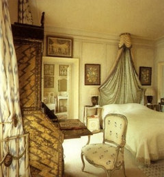
Ditchley, by Nancy Lancaster:

John Fowler (1969? 1977?):


tinam61
11 years agoWell now Pal has inspired me to give AD another try. You would make a good teacher Pal!
tina
patty_cakes
11 years agoThe last color trend I jumped on was the burgundy/green combo and had it for mannnny years. The gray/yellow definitely doesn't do it for me. but maybe it's because i'm not a fan of yellow.
I think I like the neutrals~~olive, khaki, tan/beige/taupe, ivory, white, black, mustard, etc., but leave the 'gray' neutral out of this combo. And as for pastels, that's not happening either.
Not a trend follower, i'll stay neutral. ;o)
palimpsest
11 years agoThat Hall at Ditchley was done in the 1930s most likely, they bought the house in 1933.


GreenDesigns