Shop Products
Houzz Logo Print
arlosmom

Can one paint color do it all?

arlosmom
12 years ago

I have a paint color challenge that I'm hoping all you creative gardenwebbers might be able to help me with. I have a "central core" area of the house with three completely different lighting and trim conditions, and I have no idea if I can find a single paint color that will look good in all three.

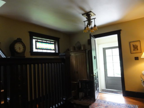
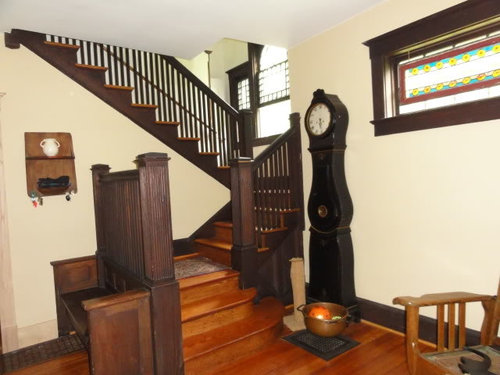
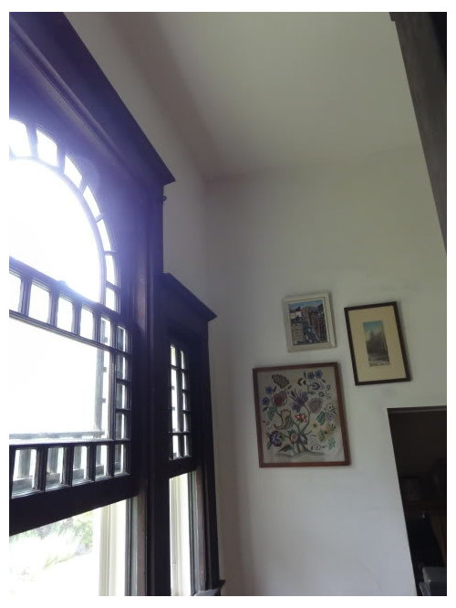
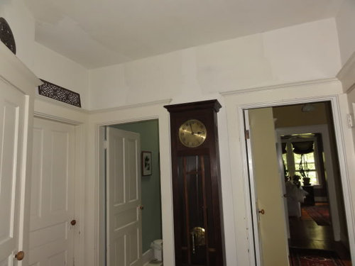
First is the entry hall just inside the front door. It gets little natural light and has dark stained woodwork which will stay dark (100+ year old never-painted chestnut). We plan to replace the large upper panel of the front door with glass which should let in a fair amount of light, but the area will probably still be on the dark side. Here are two photos of the area -- the actual entry area is a little lighter than the one photo and a lot darker than the other (the flash makes the photo look much brighter than the space is):


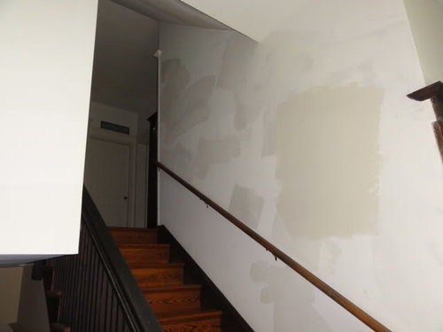
The second area I want to paint is the stairwell leading up from the entry to the second floor. Again, the woodwork is dark, but the stairwell gets lots of natural light from the three windows on the landing:


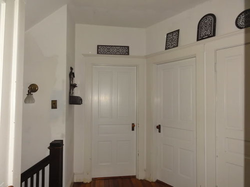
The third area is the hall at the top of the stairs. Theoretically, this hall could get a fair amount of light if we left all of the bedroom doors open, but we don't. We keep most of the doors closed to control cat and dog access. Typically the hall bathroom door (which is pretty light drenched) and our master bedrooms door (medium light) are open and the rest are kept closed. So this isn't a light filled space, but there are 6 doors with surrounding trim and baseboards that are all painted white. This space doesn't really have very much wall space because of all the doors.


My preference would be to pick a single color that works for all three areas and kind of unifies the flow through the space. I don't know if this is realistic or not since the lighting conditions are so different. I don't want to make the dark spaces too dark, yet I know that light colors gets completely washed out. The color that's currently in the front hall is Tobacco Road. It looks pretty blah and nondescript in person, I think because it's too light a color. The other two spaces haven't been painted since before we moved in seven years ago, and probably not for 20 years before that (gross!?)

I was leaning toward a saturated gray, but am open to any/all suggestions. Thanks in advance for your help!!!

Comments (16)

  • sis2two
    12 years ago

    arlosmom--I am having the same issue so am looking forward to the responses. No stained trim but different lighting. Love your home by the way. They really don't build them like that anymore, with such detail and craftsmanship. Your kitchen is one of my all time favorites!

  • User
    12 years ago

    I would use the traditional pale yellow-cream color in the entire area and bring in more lights to the bottom cave.

  • roarah
    12 years ago

    I can not suggest any one color but I love your home it is wonderful and I have loved every room you have shared in the past and I think you will work your magic in this space too. Try a true grey swatch in each section and see how it plays with the different finishes and light. Greys are great in dark and bright rooms so it might very well be a great choice. I also do like yellow-cream with wood work like lazygardens suggests. But I sometimes embrace the darkness of some spaces and run with it instead of trying to fight it with bright colors and thus I think a saturated grey may be perfect too.

  • chispa
    12 years ago

    Use one color for the foyer and upstairs hall. Then you could go 1 or 2 colors darker (on the same paint chip) on the staircase wall. Because of the lighting the colors will appear to be the same and the staircase won't appear washed out.

    In my previous house I switched colors in a dark corner of a room and you could not tell that it was a different color, but produced the desired look.

  • arlosmom
    Original Author
    12 years ago

    sis2two, thanks. We love our house. It's been more work than I could have imagined, but rewarding too. Good luck finding your color!

    lazygardens, lol, "the cave". The entry does have a cave-like feel. We keep a table lamp (with an energy efficient flourescent bulb) on all the time, but it's just a pass-through space. It would feel so wasteful to me to keep lots of lights burning just to make the paint color work. Your light creamy yellow suggestion would look great with our dark trim in the well lit stairwell, but I think it would just be gloomy and dim in our entry. I haven't figured out yet how to embrace "the cave", but that's what I'm hoping to do -- work with it instead of fighting it.

    roarah, I just commented on your house tour post. Your living room gray is absolutely beautiful. I don't know if it would be too dark for my spaces, but that is the color I was thinking about trying. Can you tell me what color you used? The dark woodwork in dark spaces is a challenge.

    chispa, your suggestion has me intrigued. I had actually had the opposite idea in the past -- to try a dark color in the dark hall spaces and a lighter color in the stairwell. But your suggestion of trying to even out the light conditions makes sense. Definitely worth some thought and experimenting.

    Typically, I just plow ahead with paint and if I get it wrong, I just buy another color and try again. So far I've been avoiding paint experiments in the upstairs hall and stairwell because they'll both be hard spaces to paint. I do my interior painting myself and haven't figured out how to tackle the stairwell without injuring myself. I'm hoping to get the paint color right with minimal false starts so I don't have to do it again. : )

    Any other suggestions are most welcome!

  • User
    12 years ago

    For painting the stairwell there are 2 things you can do. One is to put the ladder at the bottom of the steps and then extend a walk board from the steps to the ladder , you then can walk freely back and forth. The other is a ladder leveler. I will attach below for that. It would allow you to place an extension ladder safely on 2 steps. I don't envy you this task. I had a painter in to do ours . After using a walk board to do our whole front porch I am a real fan of that technique. It did take a little getting used to though :)

    What are the colors adjacent to the areas below/above. Do they all go with a grey ? I always like to use the color swatch and pick lighter/darker up and down the swatch. Given how wonderfully the rest of your home looks I am sure this too will be gorgeous. c

    Here is a link that might be useful: ladder leveler

  • mjsee
    12 years ago

    Not a gray--but take a look at Ben Moore's Aura in 'subtle'. I think it will play nicely with the beautiful wood tones you've got going. And pay someone to paint that hallway. I do all my own painting, but paid for my two-story open hallway. it was worth it. Color DOES change a good deal with the light--

    early Summer, afternoon:

    Winter(morning?):

    For a gray--look at 'metropolitan' from the same line. It looks very rich when it's up on a wall.

    good luck!
    melanie

  • robin_DC
    12 years ago

    I love your house. I don't have any specific color suggestions, but do think that a single color can work in multiple settings despite the variances in lighting. I just went through this with my kitchen, dining room, and the hallway leading to/opening up into those rooms. The dining room has more windows than wall space, high celings & two skylights, so it is saturated in light. The kitchen has one side window and gets a small amount of light from the dining room (but not much b/c there are cabinets above the peninsula that separates those rooms). The hallway has no windows at all, and is dark even during the day unless I turn on the overhead fixtures.

    I ended up choosing sherwin williams bagel---which ironically was a color that DH and I had rejected based on the samples that I painted on posterboard. SW croissant, which is the lighter color that we'd chosen based on the posterboard samples (which i'd taped up in each area) looked terrible in the kitchen's lighting when I painted some on the wall, and looked like a dingy gray in the hallway. The more greyish taupe colors that I had in samples also didn't work well (partly b/c they clashed with the warmer color of the living room which opens into the hall).

    So my advice would be to get a lot of samples once you have a general idea of the tone of gray (warm? cool? medium? light?) that you want, and then put them up on the walls in each area, and find one that you like in all three areas. If I'd relied solely on my posterboard samples, I would have had to ask the painter to redo it because Croissant looked absolutely awful when i tested it on the kitchen walls. Given the different lighting in these rooms of my house, bagel looks different in each of the three rooms--darkest in the hallway----but because it is the same color it flows well together.

  • marcolo
    12 years ago

    With that beautiful Craftsman trim, I wouldn't be able to resist doing a period wallpaper in the entry, and then maybe carrying the background color of the paper up the staircase into the second floor hallway.

    {{!gwi}}

    {{!gwi}}

    {{!gwi}}

    {{!gwi}}

  • roarah
    12 years ago

    Hi arlosmom, I used seal grey it is a glidden color I had mixed in BMpaint. I found the card at walmart. I posted a pic on my thread for you of a lighter shade on the same card called granite incase you want to do the two tone idea in your hall like chispa mentions. I think seal altho dark works wonderfully with purple I love your purple in the bedroom really lovely!!! Good luck I know what ever you do It will be wonderful for you have talent!!!

  • allison0704
    12 years ago

    If you're looking for light white-ish color, looks at SW Moderate White. It's used almost totally throughout our home. We also have stained trim. Bright areas, dark hallway, etc.

    Here is a link that might be useful: our home

  • mjsee
    12 years ago

    marcolo--I ADORE that gilt fish on green wallpaper. GAWJUS.

  • teacats
    12 years ago

    Gorgeous house!

    Paint Suggestions:

    1)Restoration Hardware's Silver Sage
    2)BM Coastal Fog 976
    3)BM Brandon Beige 977
    4)BM Raccoon Hollow 978
    5)BM Spice Gold 1040

    and the classic BM Carrington Beige HC-93 (I think -- but it is in the Historical Collection) ....

    Hope this helps ! :) LOVE your house!!!!

  • arlosmom
    Original Author
    12 years ago

    Can I tell you all how much I love Garden Web? Gobs!!! Thanks to you all for taking the time to comment and offer input on my challenge.

    Trailrunner (hi Caroline!), great suggestions, thanks! We actually have a set of those leg levelers. Hopeless romantic that I am, I bought them for my husband for his birthday one year. I've only ever used them outside when we painted our last house. I'll have to check to see how tall our extension ladder is and whether it's too tall for our ceiling height. I love the idea of the walk board. I need to measure to see if our stair landing is deep enough to set the ladder up. In either case, I only need to be able to reach the top foot or so to cut in from a ladder. The rest I'll be able to paint with my roller pole.

    roarah, thanks for the color info. I really really like the color of your living room. mjsee, allison, and teacats, thanks for the color suggestions. I'll look them up in my BM fan decks or make a trek to the BM store to look at the aura colors.

    robin dc, you're right. There is no substitute for just trying our a few actual samples in the various spaces. And even then, a whole wall of color will reflect and read differently than the sample. I've never done the posterboard step for trying out samples, but it's a good idea, especially if it's going to take me a while to decide. That way I won't have to look at all my rejects once I've moved on to the next color idea.

    marcolo, that's a great idea that I hadn't even considered. When we first moved into the house we talked about possibly papering the stairwell and upper hall, but our entry didn't used to be separate from our living room (we had a foursquare with only 3 rooms on the first floor with the living room spanning the entire front of the house...go figure), so we never even thought about papering the entry area. I just ran the idea by DH and he thought it was a really good suggestion. I know Bradbury and Burrows both make arts & crafts wall papers...who else should I look at? This could be an opportunity to do something really fabulous!!! If we're going to go this route, I'll need to pick a wallpaper before I decide on a stairwell/upper hall paint color.

    Hmmm...so much to consider and options to explore. Thanks again.

  • dianalo
    12 years ago

    I'd suggest a pale yellow that is not a creamy one. You want a light perky tone to help with your dark spaces. If you go toward beige, it can look drab in the darker areas.

    If you are adventurous/bold, we have BM's Wales Green and it looks completely different in differing lights. I'd do the shade lower on the strip or go to 50-75% strength if you want to lighten the foyer and it would work in the upper areas as well. In some lights, it is a yellowish green and in bright natural light, it is a greenish yellow. It looks like a freshly made frozen maragarita (lighter than on the rocks, lol) and is a cheerful color that is not too neutral if you want some punch.
    The pale yellow is a safer choice though.... I love how pale yellow looks with stained wood and white trim. It makes antiques really stand out beautifully and seems to make the wood have a rich glow.

  • blfenton
    12 years ago

    I think that wallpaper idea is a great one. Your front entrance is gorgeous so I would really play it up and dress it up.
    When it comes to paint - don;t go up and down on a paint chip because the colours don't necessarily follow. Pick a colour for the lightest area and then have the paint people cut that specific colour by 1/4 or 1/2 for the darker areas. They should have the specific formula for each colour and know how to cut it..(often by adding white but not always just white).

    This idea is only if you want the same colour throughout and want it to read the same with the different lighting situations.