


What is the worst "designed" room you ever saw?
EG3d
11 years ago
Related Stories
DECORATING GUIDES10 Design Tips Learned From the Worst Advice Ever
If these Houzzers’ tales don’t bolster the courage of your design convictions, nothing will
Full Story
DECORATING GUIDESFrom Queasy Colors to Killer Tables: Your Worst Decorating Mistakes
Houzzers spill the beans about buying blunders, painting problems and DIY disasters
Full Story
FURNITURE6 Decades-Old Designs That Look Better Than Ever
After getting a few nips and tucks, some favorites from the ’60s and ’70s have made a stylish comeback
Full Story
DECORATING GUIDESThe Dumbest Decorating Decisions I’ve Ever Made
Caution: Do not try these at home
Full Story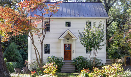
FALL GARDENINGMake This Fall’s Garden the Best Ever
Learn the most important tip for preventing buyer’s remorse, plus get more valuable buying and planting advice
Full Story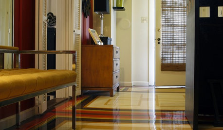
ENTRYWAYSRoom of the Day: The Most Flexible Foyer Ever
With zones for a bicycle, meditation and storage, and a hand-painted concrete floor, this entry mixes practicality and cool good looks
Full Story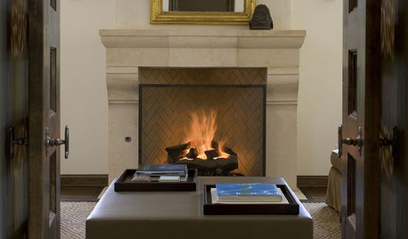
FIREPLACESRumford Fireplaces Are Hotter Than Ever
Higher efficiency and good looks are leading homeowners back to this 18th-century fireplace design
Full Story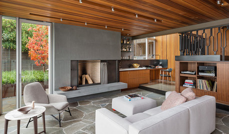
FLOORSHow to Get a Tile Floor Installed
Inventive options and durability make tile a good choice for floors. Here’s what to expect
Full Story
MY HOUZZMy Houzz: A Seattle Bungalow Goes From Flip to Happily-Ever-After Home
Once intended for a quick sale, this 1930s house now bears witness to its remodelers’ love and marriage
Full Story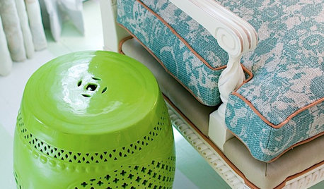
DECORATING GUIDESThe Most Helpful Furniture Piece You May Ever Own
Use it as a table, a seat, a display space, a footrest ... and indoors or out. Meet the ever-versatile Chinese garden stool
Full StoryMore Discussions


4boys2
peaches12345
Related Professionals
Bloomingdale Interior Designers & Decorators · Ridgefield Park Interior Designers & Decorators · Chicago Furniture & Accessories · Frisco Furniture & Accessories · Ventura Furniture & Accessories · Hawthorne Furniture & Accessories · Park Ridge Furniture & Accessories · Richmond Custom Artists · Bellwood Custom Artists · Aurora Lighting · Fort Washington Lighting · Miami Springs Lighting · Modesto Lighting · Berkley Window Treatments · Mount Pleasant Window Treatmentspalimpsest
nancybee_2010
4boys2
palimpsest
emmatux
demeron
palimpsest
Bumblebeez SC Zone 7
Elraes Miller
allison0704
lara9143
rosie
palimpsest
Bumblebeez SC Zone 7
biochem101
gmp3
sameboat
texanjana
EngineerChic
newdawn1895
allison0704
palimpsest
Bumblebeez SC Zone 7
gmp3
4boys2
Bumblebeez SC Zone 7
runninginplace
nancybee_2010
User
rosie
SunnyCottage
mjlb
vsalzmann
EG3dOriginal Author
biochem101
rosie
Bumblebeez SC Zone 7
greatgollymolly
gmp3