


Help I need orange paint color...but I am scared! (Pic Heavy))
haley_comet
14 years ago


Featured Answer
Sort by:Oldest
Comments (68)

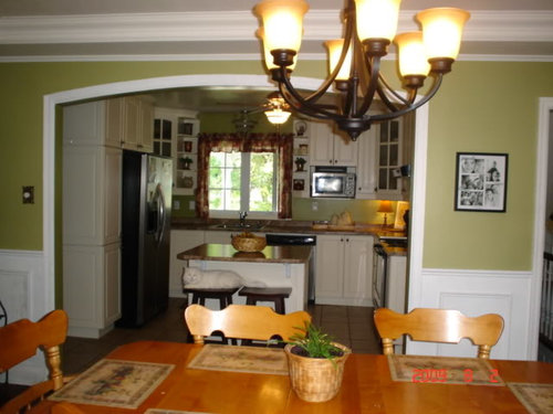
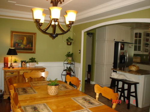
andee_gw
14 years agopeaches12345
14 years agoRelated Professionals
Arkansas Interior Designers & Decorators · Boise Interior Designers & Decorators · East Patchogue Interior Designers & Decorators · Athens Furniture & Accessories · Easton Furniture & Accessories · Jacksonville Furniture & Accessories · Nashville Furniture & Accessories · St. Louis Furniture & Accessories · Thousand Oaks Furniture & Accessories · Hoboken Furniture & Accessories · Kansas City Furniture & Accessories · Warwick Lighting · Wilmington Lighting · Channahon Lighting · La Jolla Window Treatments
Circus Peanut
14 years agohaley_comet
14 years agoteacats
14 years agocharleney
14 years ago
awm03
14 years agoawm03
14 years agoteacats
14 years agonodakgal
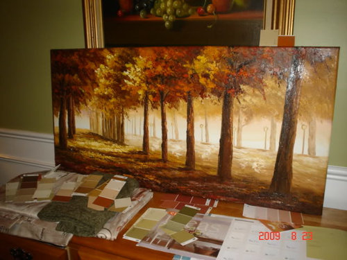
14 years agohaley_comet
14 years agoawm03
14 years agoelle3
14 years agoawm03
14 years agobeachlily z9a
14 years agoawm03
14 years agorepaintingagain
14 years agorepaintingagain
14 years ago
msrose
14 years agohaley_comet
14 years agoawm03
14 years agonewdawn1895
14 years agomoremoremore
14 years agoyogacat
14 years agohaley_comet
14 years agoawm03
14 years agoawm03
14 years agoawm03
14 years agohaley_comet
14 years agoawm03
14 years agohaley_comet
14 years agoawm03
14 years agocam14
14 years agottodd
14 years ago
Kathleen McGuire
14 years agohaley_comet
14 years agoreaderlearner
14 years agocosgrovepj
14 years agokimmieb
14 years ago PRO
PROLori A. Sawaya
14 years agoUser
14 years agohaley_comet
14 years agodeniseandspike
14 years agoawm03
14 years ago- PRO
Lori A. Sawaya
14 years ago cosgrovepj
14 years agohaley_comet
14 years agoUser
14 years agocosgrovepj
14 years ago
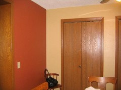
Em Bee
8 years ago


Related Stories

EXTERIORSHelp! What Color Should I Paint My House Exterior?
Real homeowners get real help in choosing paint palettes. Bonus: 3 tips for everyone on picking exterior colors
Full Story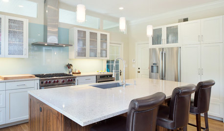
KITCHEN DESIGNModern Storage and Sunshine Scare Away the Monster in a Kansas Kitchen
New windows and all-white cabinetry lighten a kitchen that was once dominated by an oversize range hood and inefficient cabinets
Full Story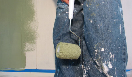
PAINTINGHelp! I Spilled Paint on My Clothes — Now What?
If you’ve spattered paint on your favorite jeans, here’s what to do next
Full Story
ENTRYWAYSHelp! What Color Should I Paint My Front Door?
We come to the rescue of three Houzzers, offering color palette options for the front door, trim and siding
Full Story
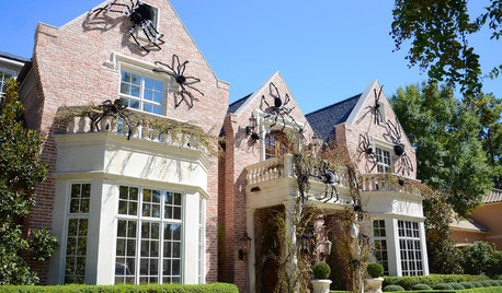
FUN HOUZZSurvey Says: We’re Scared of Being Home Alone — and Spiders
A new Houzz survey reveals that most of us get spooked in an empty house. Find out what’s causing the heebie-jeebies
Full Story

COLORPaint-Picking Help and Secrets From a Color Expert
Advice for wall and trim colors, what to always do before committing and the one paint feature you should completely ignore
Full Story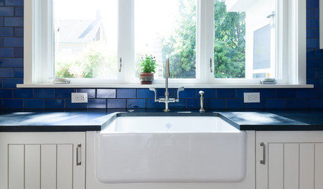
KITCHEN DESIGNKitchen Sinks: Fireclay Brims With Heavy-Duty Character
Cured at fiery temperatures, fireclay makes for farmhouse sinks that just say no to scratches and dents
Full Story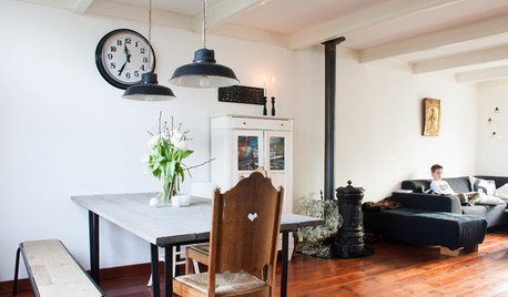
HOUZZ TOURSMy Houzz: Going Heavy on the Metal for Industrial-Style Beauty
Steel and iron pieces mix with antiques and heirlooms in an eclectic Netherlands home
Full Story


mom2reese