


Seasonal color disorder?
indygo
9 years ago
Sort by:Oldest
Comments (13)
Related Stories
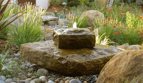
LANDSCAPE DESIGNThe Benefits of Wild Landscape Design
Wildness doesn’t have to mean disorder. Here are some things it brings to the garden and life
Full Story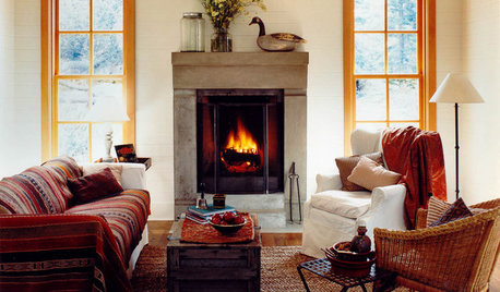
LIFE11 Ways to Cozy Up at Home in Chilly Weather
Feather your nest with extra layers and seasonal arrangements for coziness, comfort and entertainment
Full Story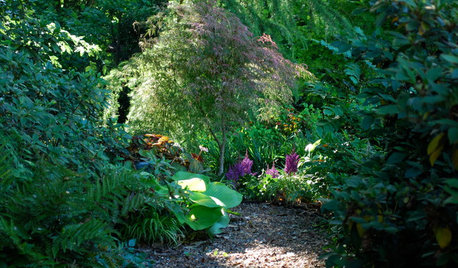
LANDSCAPE DESIGNSet Your Shade Garden Aglow With Light
Invite brightness to the dark corners of your garden for a magical dance you won't want to miss
Full Story
REMODELING GUIDESBoost Your Energy With Natural Light
Abundant natural light saves electrical energy and can lower energy bills, but the best benefit may be to your own energy and spirit
Full Story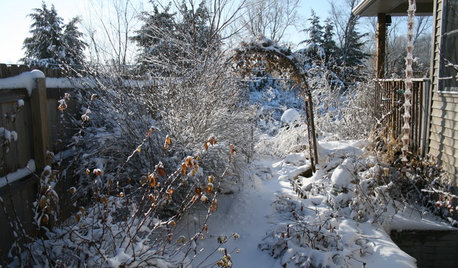
LIFE6 Ways to Beat the Winter Blahs
Snow and dark days dampening your spirits? These ideas will have you looking on the bright side
Full Story
HEALTHY HOMESleep Happier and Healthier in a Toxin-Free Bedroom
Light pollution, toxic bedding, wallpaper that off-gases ... if you're not getting good sleep, these bedroom blights might be to blame
Full Story
LIFE10 Ways to Work Through Grief Triggers During the Holidays
A year after losing her sister, she was facing another holiday. Here’s how one woman learned to find joy again
Full Story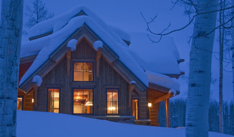
LIFEIs Cabin Fever Real? Share Your Story
Are snow piles across the U.S. leading to masses of irritability and boredom? We want to hear your experience
Full Story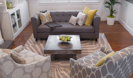
LIVING ROOMSReaders' Choice: The 10 Most Popular Living Rooms of 2012
Every design style gets a shout-out in the most saved living room photos of the past year — see if any elements speak to your own tastes
Full Story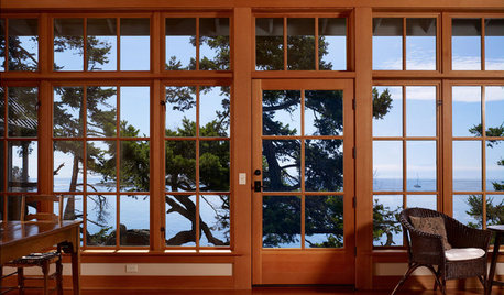
LIGHTINGHouse Hunting? Look Carefully at the Light
Consider windows, skylights and the sun in any potential home, lest you end up facing down the dark
Full StoryMore Discussions


Annie Deighnaugh
palimpsest
Related Professionals
Ogden Interior Designers & Decorators · Carlisle Furniture & Accessories · Evanston Furniture & Accessories · Glenvar Heights Furniture & Accessories · Naples Furniture & Accessories · Northridge Furniture & Accessories · Norwalk Furniture & Accessories · Port Chester Furniture & Accessories · Robbinsdale Furniture & Accessories · Arlington Custom Artists · Hudson Custom Artists · Jefferson Valley-Yorktown Lighting · Santa Barbara Lighting · Phoenix Window Treatments · St. Louis Window Treatmentslynninnewmexico
indygoOriginal Author
Fun2BHere
Lori A. Sawaya
lizzie_grow
peaches12345
indygoOriginal Author
missymoo12
awm03
lynninnewmexico
patty_cakes