


Which purple for the dining room?
beekeeperswife
11 years ago


Sort by:Oldest
Comments (82)
Related Stories
DECORATING GUIDESColor Feast: When to Use Purple in the Dining Room
Decadent and different, purples from lavender to plum can make a dining area a treat for the eyes
Full Story
FURNITUREWhich Dining Table Shape Should You Choose?
Rectangular, oval, round or square: Here are ways to choose your dining table shape (or make the most of the one you already have)
Full Story
KITCHEN ISLANDSWhich Is for You — Kitchen Table or Island?
Learn about size, storage, lighting and other details to choose the right table for your kitchen and your lifestyle
Full StoryCOLOR8 Pink and Purple Rooms Sans Sugar Shock
Little-girl dreams find grown-up expression in rooms that work pink and purple into chic and sophisticated palettes
Full Story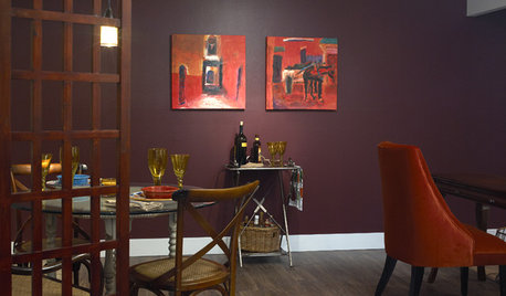
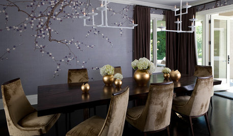
PURPLEEggplant Purple Makes Rooms Rich
Eggplant purple on walls or furniture offers a rewarding payoff: confident, luxurious rooms in homes from traditional to modern
Full Story
DECORATING GUIDESWhich Rooms Get the Oscar?
On the eve of Hollywood’s night of nights, we bring you top films from the past year and their interior twins
Full Story
KITCHEN DESIGNOpen vs. Closed Kitchens — Which Style Works Best for You?
Get the kitchen layout that's right for you with this advice from 3 experts
Full Story
LANDSCAPE DESIGNWhich Pergola Is Right for You?
A covered pergola can increase the time you spend in your outdoor living space. Which covering should you choose?
Full StoryKITCHEN DESIGN12 Great Kitchen Styles — Which One’s for You?
Sometimes you can be surprised by the kitchen style that really calls to you. The proof is in the pictures
Full Story
REMODELING GUIDESWhich Window for Your World?
The view and fresh air from your windows make a huge impact on the experience of being in your house
Full Story


lazydaisynot
lazydaisynot
Related Professionals
Lomita Interior Designers & Decorators · Stanford Interior Designers & Decorators · Washington Interior Designers & Decorators · Kearny Furniture & Accessories · Skokie Furniture & Accessories · Portage Furniture & Accessories · Chaska Furniture & Accessories · Fillmore Furniture & Accessories · Genova Furniture & Accessories · Hoffman Estates Furniture & Accessories · Little Chute Furniture & Accessories · Stamford Furniture & Accessories · Tucker Furniture & Accessories · Palm Springs Lighting · Tampa Lightingmarcolo
beekeeperswifeOriginal Author
likewhatyoudo
Olychick
beekeeperswifeOriginal Author
katrina_ellen
lazydaisynot
cyn427 (z. 7, N. VA)
bird_lover6
colorfast
beekeeperswifeOriginal Author
tuesday_2008
beekeeperswifeOriginal Author
caminnc
les917
colorfast
juliekcmo
beekeeperswifeOriginal Author
Annie Deighnaugh
Annie Deighnaugh
Annie Deighnaugh
lazydaisynot
natebear zone 10B
natebear zone 10B
CeltiaKris
CeltiaKris
graywings123
beekeeperswifeOriginal Author
cyn427 (z. 7, N. VA)
beekeeperswifeOriginal Author
gardenamy
colorfast
starinasgarden
beekeeperswifeOriginal Author
lazydaisynot
graywings123
caminnc
beekeeperswifeOriginal Author
jterrilynn
cyn427 (z. 7, N. VA)
marcolo
graywings123
Irish2
natesgram
beekeeperswifeOriginal Author
User
beekeeperswifeOriginal Author
sameboat