Shop Products
Houzz Logo Print
oldbat2be

Please help me design my family rooom built-ins

oldbat2be
9 years ago

I'm taking forever to get this room together!

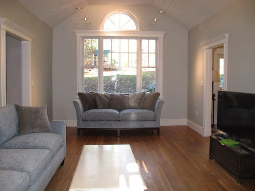
It is 12 wide by 17 long and has a cathedral ceiling. I would like to make it look wider and have wanted to put built in book shelves flanking the sofa by the window. I'm ready to finally start designing these and get them built.

I would like them to be gorgeous with clean lines and know I need your help to get there!!

Area in question:

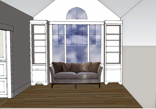
Sketchup V1:

I'm looking for very specific input into how to design these. The sofa is 36" deep and I've made the built-ins 18" deep in the above version. Should they be deeper, more narrow, taller, etc. I'm planning on matching trimwork with what we have in the rest of the room.

Rails and stiles - are at 2". The built-in on the right is almost 2" wider than the one on the left.

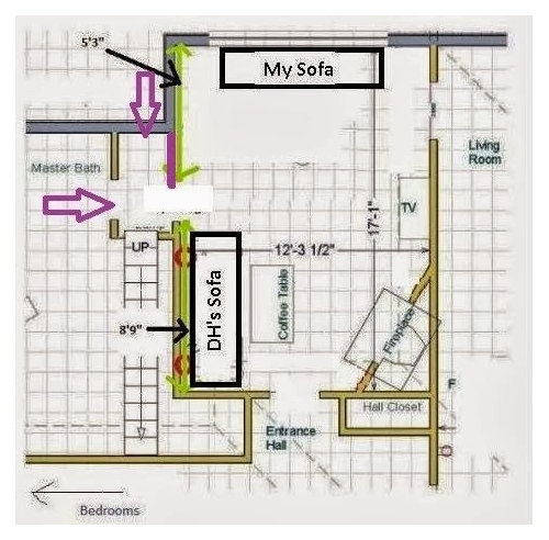
Room layout:

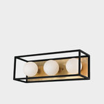
Upper lighting: we have two parallel runs of Tech Lighting k-hellos above, which are challenging to design around. I think I need something with very clean lines to fit in.

For door and drawer fronts, I'm planning on same style used in the linen closet (room on the left). Inset. Maybe without the bead though?

Comments (12)

  • Annie Deighnaugh
    9 years ago

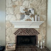
    As you are nesting around the sofa, I'll attach pics of what we did in our library. We made the bottom deeper than the bookshelves above, and we added a slide (made out of leftover marble from our fireplace) so people sitting there have a place to put a drink without end tables. We have a bridge above ours, but you won't need that with your lovely window.

  • Holly- Kay
    9 years ago

    I think the rendering looks great. I think the clean Shaker look in would go wonderfully in your beautiful room.

    I have beading on my kitchen cabs and the top glaze really makes the beading pop. I'm not sure how noticeable beading would be without a wash of glaze. Whatever you do it will be lovely. I am so envious of your beautiful, elegant room!

  • voila
    9 years ago

    2be (can't possibly call you oldbat upon seeing this room), my thoughts were the same as Annie's. Your built-ins could end below the trim of the window, maybe as high as adjoining doors, or split the difference. You want to increase the width, not the height, right? The trim above the window is beautiful and you can end below it to preserve that elegance. I think I would spit the difference to create a stair step effect from the center window to the side entrances, in effect lowering the height to extend the width. I would then extend the base cabinets the full depth possible 36 inches? (due to doorways) to create end tables for your sofa . An alternative would be to extend the full depth possible with twelve inch bookshelves and book shelves 90 degree angles on the end to create a nook.

  • oldbat2be
    Original Author
    9 years ago

    AnnieDeighnaugh - always love seeing your beautiful built-ins:) I haven't forgotten your clever pull-outs! Your bridge ties in the built-ins very nicely.

    Holly-Kay, I remember your kitchen cabinets turned out beautifully, I am going to hunt for pictures. No need to be envious (yet) - maybe I'll be done with this room in 5 years?!!

    voila - You may call me oldbat any time you like, no offense taken! Thank you for the feedback and ideas.

    Here's a shot with the deeper lower cabinets and lower built in height. I also adjusted the vertical stiles to 3". Need to really tackle the trimwork in sketchup to mirror what's in place; that will be a big part of getting this right.

    Note that there will be 4" free on both sides of the sofa.

    I don't think I like the deeper lowers, not sure it is as clean looking as I would like. Yes, I do want to increase the width and it does appear that the lower height does this.

    I will explore your idea of the bookshelves on the inside and front, interesting concept!

    Thanks all and please keep the ideas coming!

  • oldbat2be
    Original Author
    9 years ago

    Mockup number 3: 3" wide stiles and narrow cabinet in 'nook'.

  • oldbat2be
    Original Author
    9 years ago

    Version 4. Now this feels simpler. Proportions of stiles to drawer front = 1/8, 3/4, 1/8 (of full width). These stiles are 3.5" wide.

    Also, cabinet is divided into thirds, which align (at upper 1/3) with the window grids.

  • tuesday_2008
    9 years ago

    I like Sketchup #1 the best! It makes the room look wider (your goal), it doesn't crowd the sofa, looks nice and "airy" - not too chunky.

    I love, love what Annie did in her library, especially those slide outs to serve as end tables, but for some reason the deeper bottoms in YOUR room crowd the sofa.

  • lizbeth-gardener
    9 years ago

    I like sketchup#1 best also-like where my eye goes when the top is same height. Would like to see a mock-up of sketchup #1 with the four shelves in bookcase and the lower section changed to be deeper like Annie's.

    This post was edited by lizbeth-gardener on Sat, Aug 16, 14 at 14:51

  • Boopadaboo
    9 years ago

    I like #3!

  • Holly- Kay
    9 years ago

    Visually, I like the first best though when we had our shelving and cabinetry done in our library our designer stepped the tops down to echo the peaked wall. It worked beautifully because it is a solid wall of cabinets but with your lovely window I think the top of your cabinets look best being the same height as your window.

  • Annie Deighnaugh
    9 years ago

    I think the difference is my lower section is deeper than the bookcase, but not as deep as your sketch. My upper is 12" deep and the lower is 18".

  • oldbat2be
    Original Author
    9 years ago

    Thanks Annie. I will mock that up as well to see how it looks. Also, I would like to include lights flanking the insides as you did. Would you be willing to share locations of your light switches on each?

    In the meantime, here are two 18" deep bookcases, with upper trim running from wall to wall. (I like this). Please note that both adjacent doors have trim similar to what I'm showing on the window/built-ins.

    Right built in is almost 2" wider and has a 3 CM countertop.between lower and upper cabinet.

    tuesday_2008 - thanks and agreed about the deeper lowers.

    lizbeth_gardener - look for this tomorrow morning though I think I'm fairly convinced I don't want a deeper lower :)

    boopadoo - it's a great use of space but I don't think it will give me the clean lines I'm hoping for (as either front or side will be off center).

    holly-kay - Glad you like the higher trim :)

    Any feedback on the width variance and how to disguise?