


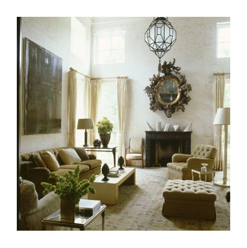
How do you look at a room?
Annie Deighnaugh
9 years ago
Related Stories
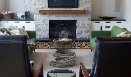
ROOM OF THE DAYRoom of the Day: A New Family Room’s Natural Connection
Stone and wood plus earthy colors link a family room to its woodsy site and create a comfy gathering spot
Full Story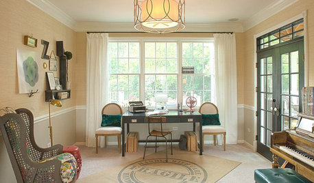
KIDS’ SPACESWho Says a Dining Room Has to Be a Dining Room?
Chucking the builder’s floor plan, a family reassigns rooms to work better for their needs
Full Story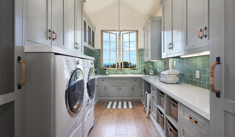
LAUNDRY ROOMSRoom of the Day: The Laundry Room No One Wants to Leave
The Hardworking Home: Ocean views, vaulted ceilings and extensive counter and storage space make this hub a joy to work in
Full Story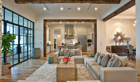
LIVING ROOMSLay Out Your Living Room: Floor Plan Ideas for Rooms Small to Large
Take the guesswork — and backbreaking experimenting — out of furniture arranging with these living room layout concepts
Full Story
TRENDING NOWThe Most Popular New Living Rooms and Family Rooms
Houzzers are gravitating toward chic sectionals, smart built-ins, fabulous fireplaces and stylish comfort
Full Story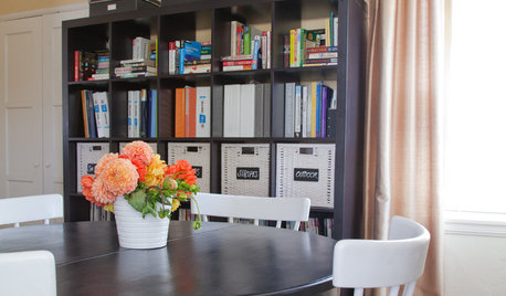
DINING ROOMSRoom of the Day: Putting the Dining Room to Work
With a table for meals and a desk for bringing home the bacon, this dining room earns its keep
Full Story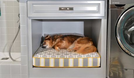
PETSRoom of the Day: Laundry Room Goes to the Dogs
Muddy paws are no problem in this new multipurpose room
Full Story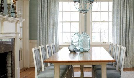
REMODELING GUIDESRoom of the Day: Antiques Help a Dining Room Grow Up
Artfully distressed pieces and elegant colors take a formerly child-focused space into sophisticated territory
Full Story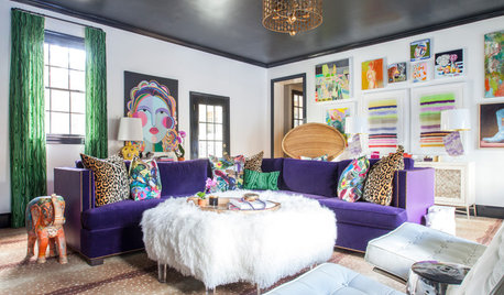
DECORATING GUIDESRoom of the Day: A Family Room That’s Up to the Challenge
An invitation to do a makeover inspires an interior designer to revitalize her family room with bold colors and prints
Full Story
DINING ROOMSRoom of the Day: An Elegant North Carolina Dining Room
Sophistication meets durability and easy-to-clean surfaces in a dramatic style-mixing space
Full StoryMore Discussions


voila
jterrilynn
Related Professionals
Shorewood Interior Designers & Decorators · View Park-Windsor Hills Interior Designers & Decorators · Easton Furniture & Accessories · Englewood Furniture & Accessories · Houston Furniture & Accessories · Lebanon Furniture & Accessories · Fair Lawn Furniture & Accessories · Hampton Bays Furniture & Accessories · Miami Beach Furniture & Accessories · Tucker Furniture & Accessories · Ridgewood Furniture & Accessories · Westmont Lighting · Ridgewood Window Treatments · Shiloh Window Treatments · Baytown Window TreatmentsSuzi AKA DesertDance So CA Zone 9b
Annie DeighnaughOriginal Author
Suzi AKA DesertDance So CA Zone 9b
User
Annie DeighnaughOriginal Author
palimpsest
mtnrdredux_gw
mclarke
User
Annie DeighnaughOriginal Author
patricianat
Annie DeighnaughOriginal Author
Oaktown
loribee
palimpsest
palimpsest
blfenton
Annie DeighnaughOriginal Author
patty_cakes
patty_cakes
palimpsest
jterrilynn
blfenton
Annie DeighnaughOriginal Author
anele_gw
palimpsest
Annie DeighnaughOriginal Author
Annie DeighnaughOriginal Author
blfenton
jterrilynn
anele_gw
Annie DeighnaughOriginal Author
nancybee_2010
User
palimpsest
palimpsest
palimpsest
outsideplaying_gw
anele_gw
User
Annie DeighnaughOriginal Author
Annie DeighnaughOriginal Author
palimpsest
palimpsest
vedazu
edie_thiel
User
vedazu