


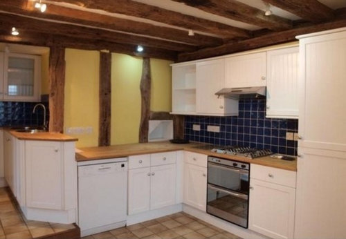
Colour for my dark cottage kitchen to match blue tiles etc
markfleet
11 years ago
Sort by:Oldest
Comments (16)
Related Stories

KITCHEN DESIGNCountertop and Backsplash: Making the Perfect Match
Zero in on a kitchen combo you'll love with these strategies and great countertop-backsplash mixes for inspiration
Full Story
COLOR11 Terrific Paint Color Matches for Wood Details
Pair your wood trim and cabinets with the right shade of wall paint to bring out the beauty in both
Full Story
KITCHEN CABINETSKitchen Confidential: 7 Ways to Mix and Match Cabinet Colors
Can't decide on a specific color or stain for your kitchen cabinets? You don't have to choose just one
Full Story
COLOR9 Dark Wall Colors to Suit Your Mood
Tired of light and airy? Try dark and moody for a change; you may be surprised by the moods these colors inspire
Full Story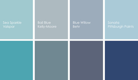
COLORCooking With Color: When to Use Blue in the Kitchen
Keep your cool. We show you when to nosh around navy or try a taste of turquoise so you can stay relaxed while finishing your kitchen
Full Story
COLORNature’s Color Wisdom: Lessons on Blue From the Great Outdoors
Take some cues from the sea and sky to find a blue to match any taste and mood
Full Story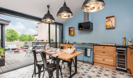
COLORColor of the Week: Watery Blue Is Summer's Best Hue
See how to bring the soothing colors of the sea into your home
Full Story
DECORATING GUIDESColor Guide: How to Use Light Blue
Whether you call it powder, sky or baby blue, this ultratraditional color lends fresh-faced appeal
Full Story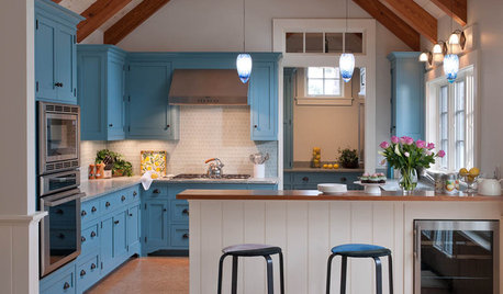
BLUEKitchen of the Week: Beautiful Blue in Martha's Vineyard
Mirroring the beauty of its lakeside setting, this open cottage-style kitchen supports a laid-back lifestyle
Full Story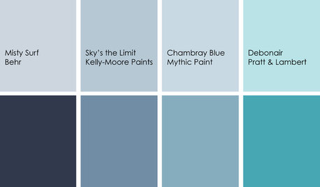
DECORATING GUIDESColor Feast: Yes, You Can Use Blue in the Dining Room
The sky's the limit for beautiful blues in your home's dining spaces; here's how to make it work
Full StoryMore Discussions


markfleetOriginal Author
dedtired
Related Professionals
Mount Vernon Interior Designers & Decorators · Jacinto City Interior Designers & Decorators · Easton Furniture & Accessories · Greenville Furniture & Accessories · Lorton Furniture & Accessories · Carlsbad Furniture & Accessories · Mill Valley Furniture & Accessories · Cahokia Lighting · Greenville Lighting · La Jolla Lighting · Del City Window Treatments · Ojus Window Treatments · Palm Beach Gardens Window Treatments · Rockville Window Treatments · Sacramento Window Treatmentsbronwynsmom
clubcracker
allison0704
teacats
lindac
Annie Deighnaugh
eandhl
mtnrdredux_gw
sochi
markfleetOriginal Author
User
bronwynsmom
bronwynsmom
kitchendetective