Shop Products
Houzz Logo Print
sheesharee

Want to gel stain kitchen cabs. Look ok?

Sheeisback_GW
10 years ago

Hi guys. I’d like to bounce some ideas that I’ve been pondering. I need a change. My cabinets have turned that horrid orange color. If I were giving advice my knee jerk response would be to ‘paint them white’ but I don’t want to for a number of reasons. The main one being I prefer stained wood . The appliances aren’t that old so they need to stay for now.

I’m thinking a rich brown color. I’m leaning gel stain and maybe a glaze. I have products in mind, but to keep this thread simple, I’ll try and focus on the stain color.
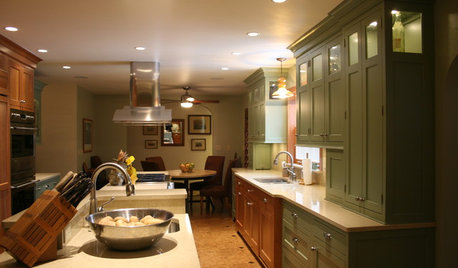
My kitchen and DR.
{{gwi:1773609}}
{{gwi:1708099}}

Close up of counter, cabinets, and floor.
{{gwi:1636255}}

DR side
*note - The hutch is sentimental and I’m not willing to alter it.
{{gwi:1708100}}
{{gwi:1773610}}
*note - There’s a white pantry door on the left wall (not shown) across from the island.
{{gwi:1773611}}

I think this color works with the counters but will this make the kitchen more disjointed with the DR? The wood tones don’t currently match but are similar. I do have a small table in the corner of the DR (see above - holds a computer) and it’s similar to the stain color I’m aiming for. I think it looks fine but it’s a small piece in the room vs. all the cabinets.

Here’s the bottom piece of the table. Looking a wee bit rugged but you get the idea.
{{gwi:1773612}}

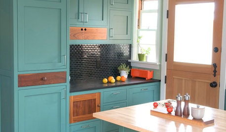
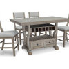
Here are some inspiration pics with cabinet tones I like. These first two photos look really close to the table in my DR.
1 I like the 2nd piece of furniture. - it’s glazed which I like very much. EDIT - 1st piece done in General Finishes gel stain in Candlelite. 2nd piece Java over the Candlelite as a glaze.
{{gwi:1773613}}

2 Fireplace EDIT - General Finishes 50/50 mix of Candlelite and Java gel stains.
{{gwi:1773614}}

3 Looking at the island in this photo with similar countertop.
{{gwi:1773615}}

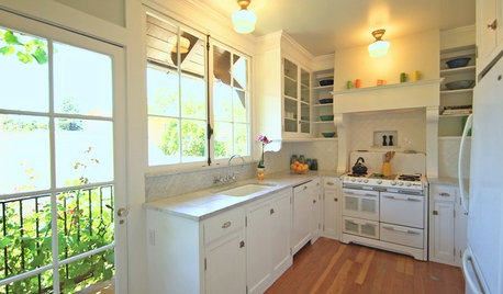
4. The floor and countertop on this one is very similar to mine. I wouldn’t have the slate (?) backsplash so it would be paint or I’ve been tossing the idea of beadboard wallpaper (have some left from another project).
{{gwi:1708105}}

5 Another option - EDIT General Finishes Brown Mahogany gel stain.
{{gwi:1773616}}

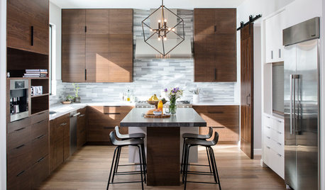
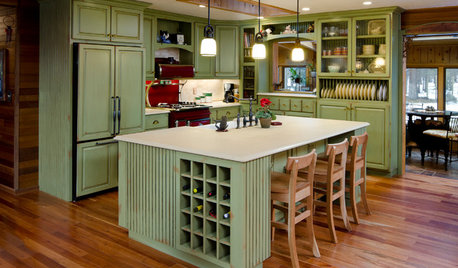
6 Gel stained oak kitchen with similar counters and painted island. I like that the grain shows. I like this one but it’s very brown.
{{gwi:1773617}}


7 I absolutely don’t want them dark opaque or this color.
{{gwi:1773619}}


Other things I’m willing and/or want to change!
-PAINT - I’d probably want to go the lighter/so called ‘neutral’ direction. Getting ahead of myself, BM Shaker Beige works well with the counters and floors but might be too dark. FWIW, I’m planning to paint my LR and foyer/hall this color.
-POSSIBLY PAINT ISLAND INSTEAD OF STAIN
-CHANGE FABRICS - CURTAIN AND CHAIRS
-PAINT STOOLS
-PAINT OR POSSIBLY REPLACE HARDWARE
-CHANGE ARTWORK


Here are some photos showing similar features. Yes, I’m a visual person! (Hoping this helps some of you too!)

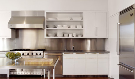
8 I think the lighting makes these cabinets appear a little darker but I wanted to show with a white island.
{{gwi:1773620}}

9 These are too dark and opaque but they too have white appliances.
Mlraff53
{{gwi:1773622}}

10 Again too dark but wanting to show with white in the room.
{{gwi:1773624}}

A few more.
11 Thriftydecorchic
{{gwi:1773625}}

12
{{gwi:1773626}}

13
{{gwi:1773627}}

Can I make this work with the white appliances and the open DR area? If so, do you have any thoughts as to which of the photos to go to for a color guide? I think the cabinets would look much better dark (with other changes - paint, etc.) but IMO too red (or purple) will, for sure, make it look disjointed.

Any thoughts as to what to do with the rest of the kitchen (paint, island, etc.)?

Thanks!

Oh and FWIW, we have dark wood (not matching) in the rest of the house and I think the kitchen looks like the odd ball. Also, I do plan to test whatever stain out but wanted feedback first.


This post was edited by sheesharee on Fri, Aug 16, 13 at 13:10

Comments (89)

  • Sheeisback_GW
    Original Author
    10 years ago
    last modified: 9 years ago

    Oakley - I agree about the green paint having some impact on how I feel about the cabinet color. The seem less icky to me when seeing the white against them.

    Gracie - Oh, ok. I just didn’t think you could apply the gel without even scuffing but to know the finish was off a little is helpful. Thanks!

    Nosoccer - That’s good about the plastic sides because my kitchen has those. I figured it I couldn’t get it to look right I’d cover them with wood.

    Maybe I will beef up the moulding. That would be an inexpensive thing to do that would make a pretty big impact. I could also remove the valance thing in the middle while at it. Wonder if I’d need to stain the crown first before applying a gel stain.

    I do like some transitional stuff but probably lean more toward traditional. I very much like the style of Savvysouthernstyle’s blog but our houses our so different I can’t really decorate mine the same.
    I do like the color of that kitchen but the note of more blue kind of scares me. I’ll check it out more.

    Ah, the counters. *Shee hangs her head* I think they actually have a pink undertone like every other neutral (NOT) thing in my house. Before I learned my brown carpet had a pink undertone I thought it looked like a brown/purple. My counters appear a more cool brown to me and I see that same ‘purpley’ brown. Here’s some shots with the carpet to see the resemblance.
    {{gwi:1773658}}
    {{gwi:1773659}}
    {{gwi:1773661}}
    Here’s a gray (I know gray had different undertones too) lid to show that it’s brown. There is gray in the counter but you have to actually be looking close at the colors to see it. It doesn’t stand out.
    {{gwi:1773663}}

    Ricksample - Wow, what a difference. It looks great! Thanks for posting those photos.

    This post was edited by sheesharee on Tue, Aug 20, 13 at 13:12

  • tuesday_2008
    10 years ago
    last modified: 9 years ago

    Shee don't let slight undertones throw you. If you think about it, most wood tones have SOME red undertones - cherry, red oak, mahogany, even some walnut and chestnut. I love a good rich tone wood with a little red to warm it up. They will all "blend" in the big picture.

    My DD has new Lauzon wood floors that are are dark brown and I really don't like them because they have NO red tone in them. Don't get me wrong, they are pretty in her home, but they have a "dead" brown mouse tone. No warmth.

  • nosoccermom
    10 years ago
    last modified: 9 years ago

    What about a very creamy white for the walls and back splash, kind of like the Rosemary Lane pictures?

  • Sheeisback_GW
    Original Author
    10 years ago
    last modified: 9 years ago

    Tuesday - You're right and I know what you mean about the dead mouse brown. Since Nosoccermom mentioned the gray I was hoping that would help show the counter color better. ?

    Nosoccer -Creamy white for the current cabinets or if they were stained? In the I held up a few samples (BM Linen White, SW Aria Ivory, etc.) and thought they looked really washed out. I'm sure there's a color out there that would work though. The room gets a good amount of light and even more as the day goes on. I just realized Rosemary’s backsplash is white and, after looking again, her walls are green. I'm leery of yellows clashing with the floors/counter.
    Here are two creamy pics.
    {{gwi:1773665}}
    {{gwi:1773667}}

    Rosemary kitchen - Well I think it's green. Maybe it's more blue and the lighting is changing it.
    {{gwi:1773670}}
    {{gwi:1773673}}


    Buuuut, since I had more time to look, I'd like to go back to the BM Healing Aloe. I really like it in that photo! Maybe it could work. A lot of the pictures I’ve been gravitating towards are light blue/gray/green. It’s kind of scary and exciting at the same time, lol. I think I’ll pick up a paint sample.
    More shots of BM Healing Aloe. I like this color (& similar ones) with both light and dark wood.
    {{gwi:1773674}}

    After dinner design blog
    {{gwi:1773675}}
    {{gwi:1773676}}

    Jreed22
    {{gwi:1773677}}
    {{gwi:1773678}}

    I don’t know what color this is but it looks similar to me.
    {{gwi:1773679}}

    I don’t think I’d could handle anything too (bright/clear?) blue, gray, or purple. That should be easy, right? lol

    I also really like Restoration Hardware Silver Sage.
    Unskinnyboppy.com
    {{gwi:1773680}}
    {{gwi:1773681}}

    Here is a closer shot of the rug.
    {{gwi:1773682}}

    I was looking at (dark) sage greens but I think I’d like to go lighter. I like the lightness of the ‘baclksplash’ area if I wouldn’t use a shade of white. I don’t think I want a dark color butting against the counters anymore.

    Should I go with cup pulls or longer pulls like in Rosemary’s pics? If cup pulls, these are 3-1/2” wide.
    {{gwi:1773653}}

    These are 4-7/8".
    {{gwi:1773683}}
    Which ones?
    I figured plain for the knobs.

    We’re for sure going to change the moulding and remove the wood valance. I won’t have a light above the sink anymore. I won't miss it, but hopefully it doesn't look weird.

    Thanks for sticking with me this long!

    This post was edited by sheesharee on Wed, Aug 21, 13 at 3:33

  • Sheeisback_GW
    Original Author
    10 years ago
    last modified: 9 years ago

    Eeee, BM Healing Aloe is looking a too pastel (?!) here.
    {{gwi:1773684}}

    A suggestion that had more gray was BM Sea Haze.
    {{gwi:1773685}}

    Or BM Gray Horse.
    {{gwi:1773686}}

    I know it depends on lighting but what do you think about paint? Am I heading the right direction?

  • tuesday_2008
    10 years ago
    last modified: 9 years ago

    Shee, look at SW Sea Salt also. DD just put it in a bathroom with new Kraftmaid cabinetry (Chestnut, but it has some orange/red tones) and it look awesome. Of course, no natural light.

    When you google Sea Salt, you don't get many pictures of stained wood, but the ones I find look good.

    Scroll through the attached images and see how pretty it looks with the stained bedroom, vanity, and on down the oak flooring.

    Here is a link that might be useful: Sea Salt images

  • nosoccermom
    10 years ago
    last modified: 9 years ago

    I sampled Healing Aloe, and it didn't look like that pastel picture at all. In fact, I discarded it because it turned too gray for my taste.
    I hadn't seen the Rosemary Lane full kitchen, only the creamy backsplash. I'm currently looking for a very creamy white but still at the collecting paint strip stages.

    Could you upload photos on one of these paint viewers and see what you may like?

  • tinam61
    10 years ago
    last modified: 9 years ago

    I like the silver sage and similar colors. Would love to see how that looks in your kitchen. I already gave you my thoughts adding black - which I think would work with the SS colors.

    Thanks for sending me that blog link - I am blog addicted!!

    tina

  • Sheeisback_GW
    Original Author
    10 years ago
    last modified: 9 years ago

    Tuesday - That is a pretty color, thanks. A few pictures look very aqua but I didn't click on them to see if that was the color. I like how it looks in the bathroom! *sigh* Lighting is everything.

    Nosoccer - Here are some I did on BM site. I don't know why the top didn't fill with color since I clicked around the whole area. Place your hand over it. I'm not going to bother to list the names because some of them look nothing like the paint. I tried to go by how the color looked.

    1.
    {{gwi:1773687}}

    2.
    {{gwi:1773687}}

    3.
    {{gwi:1773688}}

    4.
    {{gwi:1773689}}

  • thankurnmo
    10 years ago
    last modified: 9 years ago

    Hi Shee, I like the last one possibly.... I am going to try to link pix of my kitchen with shaker beige. I love the way it looks, but of course, different strokes for differnt folks. I think I have to take new pix because I am unable to find the old ones. In any case, I will try to do this this evening...

  • thankurnmo
    10 years ago
    last modified: 9 years ago

    Well I found it--- the far away pix show shaker beige throughout the kitchen and family room. I dont think I have an updated picture with the shaker beige close up to the cabinets. The one which shows the backsplash is before it was painted. ( It only took me about 2 years give or take to decide on the paint, but in the end I love it so all is well). Scroll down midway

    Here is a link that might be useful: googled shaker beige and lo and behold there's my house

  • Sheeisback_GW
    Original Author
    10 years ago
    last modified: 9 years ago

    Sheilaaus - Oh, that looks really nice! Thank you for posting the link. Hmm....
    This sample in this photos is Shaker Beige. I really need to paint a larger section.
    {{gwi:1773653}}

    I meant to post this mock up too. A little deeper sage.
    5.
    {{gwi:1773690}}

  • anele_gw
    10 years ago
    last modified: 9 years ago

    Shee, I have not read everything, but I am guessing this is far out of the question . . .but I think it the white appliances are not working. It would be interesting to just cover them up to see if you like your cabinets more.

    My kitchen looks similar to yours-- very similar countertop only my cabinets are maple. We also have green walls. Trim is oak. Here are pics, though the table belongs to the PO. We have a similar table but mine is old, old.

    {{gwi:1773609}}

  • Sheeisback_GW
    Original Author
    10 years ago
    last modified: 9 years ago

    Anele - You're right they're not working. I can't replace them right now (too many other things should be done first) and am not sure when I'll be able to. I'm just trying to figure out something I can do in the meantime to make the kitchen work better to my eyes.

    Your kitchen looks good! What color are your walls they look more blue/gray than mine. I like your floors better. I still see orange in mine but comparing the photos, the colors look very similar.

    Maybe it would be best to update the hardware, beef the trim, change the valance fabric, and sit on this until I can replace the appliances. Even if I buy stain samples I can't seem to make up my mind what direction I want to go now. - deeper sage, cream, keep the cabinets, stain them darker.... Even without changing the appliances the changes I just mentioned might be enough to hold me over.

    We're getting read to leave for vacation soon so I won't be able to dive into anything but I'll be tossing all this around!

    This post was edited by sheesharee on Wed, Aug 21, 13 at 16:27

  • lavender_lass
    10 years ago
    last modified: 9 years ago

    Have you considered painting the lower cabinets dark green or black? It would also be nice (if possible) to change some of the uppers to glass or maybe a fabric...bringing in your inspiration pictures. I like the Rosemary Lane kitchen and I think you could do something like that...maybe paint the dining room chairs black? Bring in a similar fabric? Even with the white appliances, I think that would be a great look for your kitchen :)

  • Sheeisback_GW
    Original Author
    10 years ago
    last modified: 9 years ago

    Lavender - I normally have mixed feelings about half the cabinets painted or different colors, the one I posted above is an exception.

    I'm willing to put paint on the island though. A few years back a poster photoshopped it in black and also green. I did like them.

    I'm not opposed to painting the chairs but the style is pretty different from the Rosemary pic. The middle of the rug is also black so I didn't know if that would be too much. I do want to change the chair fabric out.

    The reason I considered doing a (creamy, less glaring!) shade of white for the backsplash or even the island, was an attempt to coordinate the appliances better. I'll most likely have to keep the white for some time and I was hoping there was a way to change the rest to make it work.

  • anele_gw
    10 years ago
    last modified: 9 years ago

    I completely understand about not changing the appliances. There are a million things that I'd love to change in my own house and can't. ETA: And now I noticed that in your very first post, you specifically said you were not changing the appliances, so it was dumb of me to even mention! I apologize.

    I think we can make this work for sure.

    What would it be like to paint the trim to match the wall color (whatever wall color you end up with) or some version of the wall color (lighter/darker)? I don't know if it is open to the rest of the house and would affect things. My kitchen is the only room with that color trim. The rest is more like the stairs (dark), which you can see in the pic.

    I am looking through Houzz photos and trying to analyze why these work.

    This looks way more orange than yours. White accessories:

    Deeper color, wood floor, silver hardware:

    Wall color matches cabinets, white countertop:

    Wood floor, white island, darker, trim matches cabinets (that is why I am thinking maybe blending your trim in with the wall might give it a cleaner appearance)

    Countertop and wall color match

    Floor color matches cabinets, no trim:

    Much darker, but looks like the floor is in the same general color family as yours?

    I say, do nothing until you have a plan. Don't feel like you should ignore the appliances/hope you won't notice. If they are in good condition, there is no reason to change them because there are other options. And, ENJOY your vacation!

    This post was edited by anele on Wed, Aug 21, 13 at 19:27

  • Sueb20
    10 years ago
    last modified: 9 years ago

    I'm reading quickly so now I'm a little confused...are you now considering painting the walls and leaving the cabinets as is? If so, any blue color (Healing Aloe is one of my faves, but it is quite blue) is going to make your cabinets appear more orange, and since you seem to want less orange, I'd recommend that you avoid any blues!

  • Sheeisback_GW
    Original Author
    10 years ago
    last modified: 9 years ago

    I wanted to mention I didn’t do any cream colors on the virtual mock up because none of them looked realistic.

    Anele - Oh, it’s ok really! I know I write a lot. I’m a detailed person. The original post is my ‘edited version’, no kidding. And you weren’t rude when you mentioned the appliances. (note - I didn’t think others who mentioned it were rude either.)

    Paint the trim, hmm… it would be the only room in the house without white trim and you can see other areas of the house depending on where you’re at in the kitchen.
    Ha, at one point today I thought I should paint the walls the color of the cabinets (wasn’t being serious). I wondered how that would look and now I know. : ) I prefer the overall look of the 4th and they also have a white backsplash. I think the other ones work together even if they’re not my style. My floor is more similar to the last photo. Here are some more kitchens with white appliances I saved.
    {{gwi:1773702}}
    {{gwi:1773703}}
    {{gwi:1773704}}

    This one is the most jarring to me.
    {{gwi:1773705}}

    I love the wood with the creams and red in this photo.
    Missmustardseed
    {{gwi:1773706}}

    Sue - I’m bouncing all around as usual. I started the thread planning to gel stain them darker but some people mentioned they didn’t really look orange which got me thinking maybe it would be better to repaint first.

    As for the blue, I know what you mean about the orange. The oak paired with the grayed/green/blue colors look richer to my eye and are more appealing. I know that doesn’t make sense since I’m saying I dislike the orange. It seems to compliment it.

    However, check out his example. This stopped me.
    {{gwi:1773707}}

    Does that paint work with the carpet in the photo? It looks like it’s making it more pink. ?? That same pink tone is in my flooring in the kitchen (their carpet is what my LR carpet looks like in photos) What color does that leave? Pick something with red/pink undertones? What is that doing to the orange tones in the cabinets?

    I’m all over the place with my thoughts but one thing’s for sure, I can change the cabinet color easier than I can replace my floor and counters - which at least they don’t fight each other.

    I found these photos quite shocking so I wanted to post them. Look at the cabinet color difference! I’m not saying I want my walls stark white but what a difference! I’ve noticed my counters look more brown to me without the green against them.
    Before
    {{gwi:1773708}}

    After - Yes, this was the after.
    {{gwi:1773709}}

  • nosoccermom
    10 years ago
    last modified: 9 years ago

    I know what you mean with the cream paints on the online painter not looking like the actual paint at all. How about sampling a creamy white, or maybe even a very light yellow, like Wyndham Cream or Philadelphia Cream?

  • CaroleOH
    10 years ago
    last modified: 9 years ago

    Do you ever read Maria Killam's blog? You should check out her posts on color tones…I've found them very enlightening.

    Based on her philosophy, the issue you're seeing is the yellow tones of the oak against the pink tones of your tile/countertop.

    I think that's what you're seeing - not so much that your cabinets have turned orange, they just look orange against the floor and counter. If you look carefully at the photos where you like the light cabinets, the floors are a warmer tone or a neutral cream tile.

    I think darkening up your cabinets would be a good solution, but in choosing your stain, I'd take into account you need to stay away from an orangey/yellow brown.

    I think your photos showing the gray paint and carpet against your counters really look nice.

    I also like the idea of the bead board in the DR and around your backsplash. Maybe the island in a distressed black if you do black hardware. I don't think you need to go super crazy darkening your cabinets, just changing the tone with one or two light coats of gel stain will make a world of difference.

  • nosoccermom
    10 years ago
    last modified: 9 years ago

    I also like the gray paint samples you used with the online painter. Here's another kitchen reveal with light wall paint.

    Here is a link that might be useful: kitchen reveal

  • awm03
    10 years ago
    last modified: 9 years ago

    re Anele's question about why the first photo (warm beadboard & white antique stove) works: It's because the photographer has a studio light shining on the stove to make it look very white against the warm colored woodwork (made to look even warmer by the yellow incandescent light from the sconce). Think of your wardrobe: most of us would wear a white blouse with tan pants, it's a classic combo. But in a house, you won't get that bright white. Shadows render the white to a light gray or gray white and muddy everything else too.

    Sheesh's kitchen doesn't have great natural light, which I think is one of her problems. Shadow muddies her colors. Also, the floor reflects a gray tone too, further muddying the colors. Finally, the color palette is all the same tone: very little contrast to give the illusion of highlights and shadows, light & dark.

    Sheesh, if you stain the cabinets a darker color, you're going to make a dark kitchen even darker. Maybe you won't mind that, but you need to really think that through.
    Here's mine: reddish brown oak cabs, gray counters, white sink/fridge/oven (not pictured, but white works well here) sage green tile, but a lighter floor & perhaps more sunlight (northern exposure,sun light on work spaces).


    It's too dark in the daytime for many people. It's great at night with the can lights -- the cabs look a rich mahogany color. Could you be happy in a dark kitchen like this?

    Maybe consider just darkening the island color. It would add necessary contrast without sucking the room light. A deep red would add more life to your kitchen, since red & green are opposites on the color wheel, thus are vibrant together. The vibrancy would help with the colors in shadow problem. You wouldn't have to redo your whole color scheme either. Here's a mock-up (and I realize you don't like painted wood):

    I think it could add the oomph you're looking for without a drastic overhaul of the kitchen (and aren't your kitchen colors tied closely to the rest of your house?)

  • awm03
    10 years ago
    last modified: 9 years ago

    Here's a soft black, which is also nice.

  • awm03
    10 years ago
    last modified: 9 years ago

    Here's a soft black, which is also nice.

    {{gwi:1773605}}

  • Sheeisback_GW
    Original Author
    10 years ago
    last modified: 9 years ago

    Tina - Sorry, I missed your post! I’d like to see what SS looks like.

    That end cabinet I keep showing probably isn’t the best example. It looks kind of nice in the photos. For some reason it doesn’t look as garish as the others do to me. Don’t know if it has to do with the color or the grain.

    Nosoccer - I’ll look into those colors. I also have a whole stack of paint samples I need to dig through.
    Hmm, I don’t really like that last kitchen. I think because everything is about the same color.

    Caroleoh - I have read her blog before but think I’ll head back to read more. Yes, the clashing thing is the problem for me. I originally thought it was the cabinet color but it doesn’t look right with the counters.

    Awm - "... very little contrast” Definitely.
    I like your kitchen a lot! I know our floors are different but out of curiosity, what’s your wall color?

    I took all those kitchen photos in the morning but as the day goes on the lighting gets brighter. I have been questioning if I can handle darker cabinets since all the photos usually some lighter element like floor or counters - another reason I considered white for the backsplash and or possibly island. I much prefer a darker tone wood. That pink brown color is throughout the house (carpet/floors). My LR sofa (that’s visible from the kitchen) is a red/maroon paisley. My green bathroom is getting repainted BM Van Duesing Blue to better work with the floor and fabric.

    I'm not an anti paint wood person just would prefer stained kitchen cabinets. Also there's the concern about paint nicks with small kids. We plan to teach them to take care of things but oopsies will happen along the way. I’m not sure if I can handle a bright, all white kitchen (w/ appliances). That would certainly add contrast but . . .

    Thanks for doing those mock ups. The countertop looks much better without the yellow/orange.
    I think if I don’t address the cabinet color, the other changes I make are only going to be temporary fixes until it’s bugging me again.
    I wouldn't have to do the cabinets dark, dark but think I should attempt to change the tone. I could then paint the walls a lighter color - maybe like Shaker at 50% or something. Maybe even a pale shade of gray (YES, I know I typed I don't care for gray in a recent thread! :) I'm not big on it but there are rooms like like with it.) but I don't want the room to look cold.

    Anele - Thank you! I like the black with the counters too.

    Going back to one of my original photos that look the closest to what I have. I think the counters, cabinet color, and floor work well here. It is dark.
    {{gwi:1708105}}

    If the kitchen does end up a dark cave and I can’t stand it I will grab a paint brush. That’s the point I’m at with the color of the cabinets, you know?

    This post was edited by sheesharee on Thu, Aug 22, 13 at 14:03

  • Sheeisback_GW
    Original Author
    10 years ago
    last modified: 9 years ago

    I keep thinking "dark, no contrast, hole."

    Please don't hate me. :) - I'm still going to test gel stain.

    Will someone please ps my cabinets white with a stained (darker) island. As much as it wouldn't be my first choice, that could be the best one in the end.

  • Valerie Noronha
    10 years ago
    last modified: 9 years ago

    I didn't read all the responses, but wanted to give my two cents that staining the cabinets darker will only make the white appliances stick out like sore thumbs; whereas it you painted them white they would disappear. The island could be stained and/or painted a contrasting color for more interest. You can also add stand alone stained furniture in the dining area to mix it up. It doesn't have to be just one or another. Once you starting thinking about replacing appliances it's a slippery slope as you may want to get different sizes and/or replace/modify some cabinets. When you get to that point, I'd recommend swapping out the OTR microwave; perhaps extending your island and adding a cabinet to house it there.

  • awm03
    10 years ago
    last modified: 9 years ago

    Thanks, shee. Here's another view. Hope it helps you to get a feel for your ideas.

    White walls, but there's not much wall space (one door + 3 other entries).

    Used to have a paneled dishwasher for a continuous bank of oak, but the old dw croaked & I didn't want to go through the hassle & expense of ordering/installing a panel. The stainless dw doesn't look bad.

  • CaroleOH
    10 years ago
    last modified: 9 years ago

    Why don't you gel stain your island first? The photo you posted last looks like a color that will go with your countertops and floors. It's a much smaller project and you will get a feel for how it looks with your DR furniture etc. Also, if you do decide to paint the cabinets it might be nice to have the island a darker color vs. painting it white too.

    I think painting your cabinets white is going to open another can of worms because even white is not just white. I would want to choose a white that had the same tone as your appliances or the cabinets will look yellow.

    Once you decide on your cabinets, I'd do the backsplash and paint as "decor" vs. trying to figure out what might go with a cabinet stain that isn't there. You need to have the paint colors in your kitchen against the new stain color to really see what looks best.

    Now, if you decide you want to work with the cabinets as they are then that's another situation in my mind - paint or a backsplash might help neutralize the cabinets against the floor/counter. But if you really don't like your cabinets, I'd tackle that first.

  • Sheeisback_GW
    Original Author
    10 years ago
    last modified: 9 years ago

    Since I mentioned the difference in cabinet color I thought I'd show this photo. I see the whole kitchen like this.
    Yucky.
    {{gwi:1773712}}

    Valinsv - Hey Val. Good points.
    “You can also add stand alone stained furniture in the dining area to mix it up. It doesn't have to be just one or another.” Huh?
    I’d like to do something like that with the microwave when the time comes.

    Awm - Thanks for posting the other photo. I know I already said this but I really like it. Would love to not have the pink issues. And after reading your post I decided to really observe my lighting again. I seriously just didn’t realize the lack of light in here. It’s nothing like my LR that gets glorious sun. Can’t believe I missed that observation.

    Caroleoh - I’d definitely start with the island. Picking a white would be a challenge. I thought just go with a white that’s not as stark but they all have to have some undertone. I don’t know how bothered I’d be if it didn’t exactly match the appliances. I keep reading over and over again similar statements to this,

    “ looking at a lot of images and reading designer opinions, we came to the conclusion it would be best not to compete with the appliances by matching them or even coming close, since they are so stark. We let the cabinets related to each other and let the appliances relate to each other.”
    I've haven't found many examples of whites that were at match to the appliances and the ones I did find didn't mention paint color.

    “I'd do the backsplash and paint as "decor"..” Sorry, I’m not understanding what you mean. Do you just mean it’s easier to figure out the cabinets first and go from there for everything else?

    I spent a little time on Maria’s blog tonight. It’s been a while, she knows her stuff but the way she presents her confidence at times slightly grates on me. It’s definitely the orange/yellow clashing with the pink issue that’s bothering me. Oh, also found it a good read about how light colors don’t usually work in spaces with poor lighting.

    A few white kitchens I do like. - I would want my island stained or painted a dark color.
    {{gwi:1773713}}

    These next two have stainless.
    {{gwi:1773714}}
    {{gwi:1773715}}

    Not saying I want to do this, but since we talked about the whites not matching with appliances I wanted to show this kitchen. I like it and it looks intentional with the floor tying it in instead of ‘alllmost matched but FAIL’. I know the undertones aren’t pink though.
    {{gwi:1773716}}

    I'm rather embarrassed I bounced around so bad in one thread. Working it out. Going to buy some stain, test it out, and go from there. Thanks so much everyone for feedback and dealing with my indecision.

  • Sheeisback_GW
    Original Author
    10 years ago
    last modified: 9 years ago

    A good and timely read for me.

    Some clips. . .
    "I think most of the time, fear of making a mistake that will cost money is the cause of the paralysis. Another reason is an unrealistic desire for perfection. Sometimes we get tripped up by one detail and it prevents us from taking another step forward. "

    "Better may not be perfect but, better is still...better".

    "The unexpected usually makes the space better in the end."

    "Have fun and don't be too serious."

    Here is a link that might be useful: conquering analysis paralysis - decorate fearlessly

  • anele_gw
    10 years ago
    last modified: 9 years ago

    I've been messing with your kitchen using Benjamin Moore. W/o seeing your room IRL, I think the flooring and counter are going to guide your color decisions more than anything else. They really seem to lean toward gray on my monitor, which is why I think we all seemed to prefer gray in your mockup and browns are having a harder time working.

    I still don't have a combo I like, but I think you need to look for:
    (1) a color that will play nicely with gray
    (2) a color you like on your walls that will be about the SAME on your cabinets-- doesn't have to exactly match, but should blend in . . .in other words, your walls/cabinets should be fairly seamless, maybe a little deeper in either the walls or cabinets
    (3) an element of either contrast and/or accent color in your island
    (4) the white appliances will then work well with your white trim and seem 100% intentional

    Now, the other issue is the shades in your lighting. You may find that, once this is done, you don't like the yellow tones as much, in terms of how they fit into your cabinets and flooring. Or, maybe keep this in mind as you choose your colors (think of the yellow as part of your palette). Ditto for your furniture. This is why changing one thing leads to another and is such a pain, IMO!

    Another option is to love it (or like it) as-is. When I was working on your room, my 11 y.o. saw it and thought it was very pretty. She rarely gives compliments about decorating.

  • CaroleOH
    10 years ago
    last modified: 9 years ago

    You got what I meant with my comment to do the backsplash/paint as "decor" - I just meant those two items are easier to figure out after you decide the cabinets. The floor, countertop, appliances and cabinets are all pretty much big ticket items that you don't want to have to replace so pick your cabinet color to go with those items and then finish the kitchen with a paint and backsplash.

    I do like the white cabinets with white appliances that you posted. I have always had stained cabinets in my kitchens, so in this house we moved into 3 years ago, I wanted white cabinets and white trim. Have to say, I love my white kitchen cabinets. They feel so clean and fresh, and I love them.

    Maria is a bit of a hard nose, and she doesn't sugar coat her advice, but honestly, I like that. I'll read something she writes and I'm thinking - really? I don't always agree with her, but a lot of the basics she writes about are really true - especially her backsplash to granite countertop posts. Since I've read those, I cannot believe some of the countertop/backsplash combos I see in Home Decor magazines.

    So, as with anything on the internet, I find I take bits and pieces from what I read and really have come to agree with her on many things!

  • Sheeisback_GW
    Original Author
    10 years ago
    last modified: 9 years ago

    Anele - I agree about the flooring and countering guiding my decisions.

    Color are so hard on the monitor. There are gray flecks in the counters but they don't stand out like the black, white, and dark brown flecks do.

    "You may find that, once this is done, you don't like the yellow tones as much, in terms of how they fit into your cabinets and flooring. Or, maybe keep this in mind as you choose your colors (think of the yellow as part of your palette)." Hmm.. sorry, I'm a little confused. I don't like the yellow tones and think that's the issue with my floors and counters.

    Well the month of Sept. is pretty shot so if I'm going to dive into something it'll have to be done in Oct./Nov. or wait until the new year.

    Deep down I believe painting the cabinets will look best but I feel like is so permanent and it's such a large project if you're going to do it right (staining is too but I feel that it will be less involved). I'm nervous to touch them at all but something must be done. I've tried to like them for quite a few years now and need a change.

    That was very nice of your DD! Tell her thank you.

    Caroleoh - My grandparents had white kitchens for years and I always loved how they looked.

    I agree with what you said about Maria. I can't even think of any examples at the moment but a few things I read last night was her opinion and she boldly was acting like it was fact. It just comes across as quite pompous to me. On the other side, she might not get anything done if she constantly tried to candy coat everything. Take the bits and pieces!

  • anele_gw
    10 years ago
    last modified: 9 years ago

    Shee, re: the yellow tones, I knew you wanted them out of the cabinets, but I was not sure if you were up to changing the lighting and maybe even the dining set. (I have been skimming-- sorry!) I guess what I am asking is, how much do you want to change? Right now, a lot (in the photo, at least), does work really well.

    BTW, you asked about my kitchen paint color and I am not sure, since the PO did it. I am pretty sure we have extra in the garage. I should probably find out so I can keep a record. (I asked them to write down what paint colors they used and they did not . . .and did not have extra for most rooms in the house.) I think they mostly used SW.

    Now, re: the gray . . .when you step back from the counter, is it still mostly brown? Up close, it looks mostly brown to me, but at a distance, I see gray. I see the pink undertones, too, when I put it with pinkish-brown.

    How similar is this floor compared to your floor?

    Thank you so much for posting the conquering paralysis link. It's true--- usually things ARE improved. As much as I dislike my new paint color in my LR, it is still better than the last one. It also inspired me to just get the dumb Dyebrick sample and try it on my fireplace. It can't really be worse than what is there now . . .

  • Sheeisback_GW
    Original Author
    10 years ago
    last modified: 9 years ago

    Anele - At some point I'd like to change almost everything but can't right now. I love how things domino. I haven't painted my LR yet for this reason! In the near future I'll only change the hardware, cabinet finish, paint, fabrics, bar stool color if need be, and art. I'm honestly not bothered by the lighting fixtures. The table we talk about from time to time but who knows when we'll actually replace it. I never thought the chairs looked like they went with the tile top. I did consider a new rug but don't know what size because of the table issue. Plus there's the cost factor. I also think DH won't be down with changing the entire room. I'm surprised he's ok with me altering the cabinet finish as he wanted it left alone before.

    While eating dinner tonight I stared around the kitchen and there was about a 1 foot section near the refrigerator that sort of looked gray. Other than that, walking around, I think it reads a flat, pinky brown. Cold is another word that comes to mind.

    That picture looks like it is more rusty/orange than mine. I think my floor has more darker areas - it actually is a darker brown but it reads a charcoal gray to my eye while not making a close observation. I think it's because there is also a good bit of blue gray in the floor. My floors look closer to the picture I reposted at Thu, Aug 22, 13 at 13:59 -I think my counters look about that color too. Also the first photo I posted with the carpet against my counter you can see the floor colors a little better.

    Are you able to test the dyebrick sample?? I hope it goes well for you! Did I miss threads along the way? I need to catch up on GW. Let me know how it goes and thanks for trying to figure this out with me!

  • Elraes Miller
    10 years ago
    last modified: 9 years ago

    Shee, I didn't answer your question far back about the BS with BB. Am using wood and painting it a shade of white . My bathroom has BB on all walls and behind a pedestal sink which is mounted directly against the wall. In 7 years I have not had any water damage there. A simple cut off saw makes cutting BB very easy and quick.

    I really wanted dark counters to upgrade the kitchen, but after it was done everything was too dark. Plus the backsplash of mixed stone tiles made it even darker. Even with a huge kitchen window and open glass door looking out at the garden. Am going back to a light counter and felt the BB would soften the look. With unfitted furniture painted white (2 simple, old glass china cabinets, will do the glass interiors in BB. I separated the tops from bottom and hung the glass cabinets on the wall for working counters. Am also wrapping the BB around any open wall area, which is really minimal. Don't choke anyone, but my walls are painted a medium shade of brick red and really works toning down yellowed cabinets. That said, I would still like a white kitchen to go with my 50s cottage.

    Am rustic and have the same cabinet hardware you showed, the cup handles. They made a great deal of difference in the looks of the cabinets and room.

    As much as I would like a white kitchen and or lighten up the cabinets (Maple) which are the same color as yours, I just can't seem to go there. I get this final image of someone trying to make something into what it is not. And have years of mucking around changing things on a whim with love ever after. Didn't try this with my husband, it would never have worked. But then I liked him as he was in complete perspective.

    The first oak kitchen pic Anele posted is a great go to for me. They have embraced the oak. But suspect it is more than a rustic kitchen with a good blend of antiques.

    With all written, I like your cabinets and would still paint the island white. BB around the full area would add another texture. My senses tell me it is the dining room that is making this so difficult for you. I know you don't want to change it, but the styles are clashing regardless of color. Perhaps if this were not an open concept you may not see so much oak.

    And I still like your cabinets, they are in such great shape.

  • Elraes Miller
    10 years ago
    last modified: 9 years ago

    Forgot to mention and not sure if anyone else has. But I would remove the dark toe kick and put in whatever wood that will match your cabinets. I find this to be easy to clean when doing my floor.

  • Sheeisback_GW
    Original Author
    10 years ago
    last modified: 9 years ago

    Technicolor - After reading your original post again, I never thought about porch and floor paint but that would make sense. What brand (Ace?) were you talking about? Oh, and wouldn't you still need to sand - at least scuff sand and use a (bonding) primer like Zinsser first?

    *NOTE - Just a general heads up, I don't recommend anyone using SW Porch and Floor paint. Total crap. I supposedly got a 'bad batch' (it never got past tacky and I went above and beyond to do that job right.) and had to redo my stair project which was MISERABLE. They gave me a new gallon of paint and threw in some tape and sandpaper but that still didn't fix my stairs. I was told they were discontinuing the product but I believe it's still available.
    Your kitchen sounds really pretty. And I like red - have a bathroom painted BM Moroccan Red.

    You think bb around my DR side too?

    "My senses tell me it is the dining room that is making this so difficult for you. I know you don't want to change it, but the styles are clashing regardless of color."

    I almost hate to ask, but can you be more specific? I look at it everyday and I'm sure can't 'see' it like someone else.

    I'm assuming it's too formal/stuffy for the kitchen side? I've been trying to get away from that a bit, tho the rug didn't bother me enough to make it a replacing priority right now. I figured I'd have a better chance of stumbling across art I liked first. Even if I had more money, I don't know what I'd pick or replace first. Ha, it's a little tough to change anything if you don't have a clear game plan.

    It's interesting, in the past when I had a project, I'd throw ideas out and go back and forth, back and forth with what I wanted to do and I always have to WAIT, sometimes months, until I figure out what's going to work for me. I wish I knew how to speed the process up.

    I'll post a photo with the new hardware on when it comes.

  • kadydid
    10 years ago
    last modified: 9 years ago

    If you don't want them super dark and you don't want red in them, do not use Brown Mahogany. Just say'n. I went much darker than I had originally planned because it was too red in the earlier stages. (I have gel stained my kitchen)

    I also buy and refinish furniture myself and I have to say, if you don't want it too dark, but you want it brown, like your pictures, the best way to do that on oak (IMHO) is to strip, sand and then carefully gel stain. (regular stain on oak does not come out as even IMHO).

  • kadydid
    10 years ago
    last modified: 9 years ago

    http://ths.gardenweb.com/forums/load/kitchbath/msg051239497863.html

    This was my kitchen experience. And it shows how red it was with the GF Brown Mahogany. If you scroll to the bottom you can see how it ended up. I like it now, but at first it was much darker than I had wanted to go.

  • Sheeisback_GW
    Original Author
    10 years ago
    last modified: 9 years ago

    Kadydid - Thank you so much for linking to your kitchen. It helps to compare and read in detail about the red mahogany.

    I think your kitchen looks really nice! It looks good with the ss appliances and I like the white backsplash too.

    So you're saying I could get a lighter application with gel stain on bare wood?

  • Elraes Miller
    10 years ago
    last modified: 9 years ago

    I need to look at the manuf. of the floor/porch paint. Actually bought this at Restore, lucked out on the quality and never been opened for $5 a gallon. It went on great and was used outside on raw wood lasting 7 years so far with no walking area worn. I'm in snow country, so the area gets a lot of different environments too. Perhaps there is a difference when using it over finished wood. I'll have to ask the ACE guy some more questions and look at their name of paint.

    My comment about the dining room wasn't a negative. It was meant to be a suggestion for looking at the entire area working together. Colors, patterns, etc. which may be added. My decorating is rustic, so don't use me as a given for what I am doing at this end. And the other posters are the decorators, not me.

  • nosoccermom
    10 years ago
    last modified: 9 years ago

    From Apartment Therapy:

  • Sheeisback_GW
    Original Author
    10 years ago
    last modified: 9 years ago

    I didn't realize there were more posts.

    Technicolor - Gotcha. I've been thinking about both areas lately.

    Nosoccer - I like that picture very much. To my surprise, I don't even mind the flooring. What are you currently thinking for my kitchen? Still stain or no stain? Lighter walls and backsplash?

    I so wish my counters were darker or lighter.

    Good news is I have the new hardware on and I think it looks much better. I'll hopefully get some photos tomorrow. The kitchen is currently a wreck!

    The other good news is, after talking more with DH, we'll probably switch out the appliances sooner than what I originally thought (not this year though).

  • TxMarti
    10 years ago
    last modified: 9 years ago

    sheesharee, I don't know if you got my email, but I used Old Masters gel stain, and the color is Special Walnut.

  • RocksAndRoses
    9 years ago
    last modified: 9 years ago

    Here is a great link of the Old Masters colors. I am glad that you mentioned it. There is a store that carries Old Masters products nearby.

    http://www.myoldmasters.com/color-compass.htm

    I googled best gel stain "general finishes" "wood kote" "old masters" and this link was the top of the google list. How cool is that? Never got sent to my own question looking for an answer.....