


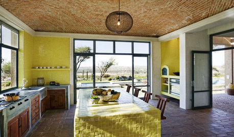
Yellow Kitchen- Help with Color, Please!
2LittleFishies
11 years ago


Sort by:Oldest
Comments (141)
Related Stories


MOST POPULAR7 Ways to Design Your Kitchen to Help You Lose Weight
In his new book, Slim by Design, eating-behavior expert Brian Wansink shows us how to get our kitchens working better
Full Story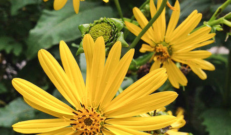
GARDENING GUIDESGreat Design Plant: Silphium Perfoliatum Pleases Wildlife
Cup plant provides structure, cover, food and water to help attract and sustain wildlife in the eastern North American garden
Full Story
SELLING YOUR HOUSE10 Tricks to Help Your Bathroom Sell Your House
As with the kitchen, the bathroom is always a high priority for home buyers. Here’s how to showcase your bathroom so it looks its best
Full Story
SUMMER GARDENINGHouzz Call: Please Show Us Your Summer Garden!
Share pictures of your home and yard this summer — we’d love to feature them in an upcoming story
Full Story
LIVING ROOMSCurtains, Please: See Our Contest Winner's Finished Dream Living Room
Check out the gorgeously designed and furnished new space now that the paint is dry and all the pieces are in place
Full Story
KITCHEN DESIGNKitchen Color: 7 Sensational Yellow Backsplashes
Warm up a white kitchen or add some zing to wood tones with a backsplash that glows
Full Story
LIFEDecluttering — How to Get the Help You Need
Don't worry if you can't shed stuff and organize alone; help is at your disposal
Full Story
HOUZZ TOURSMy Houzz: Saturated Colors Help a 1920s Fixer-Upper Flourish
Bright paint and cheerful patterns give this Spanish-style Los Angeles home a thriving new personality
Full Story


2LittleFishiesOriginal Author
jterrilynn
Related Professionals
Centerville Interior Designers & Decorators · Gloucester City Interior Designers & Decorators · Lorton Furniture & Accessories · Miami Furniture & Accessories · Skokie Furniture & Accessories · St. Louis Furniture & Accessories · Mahwah Furniture & Accessories · Millburn Furniture & Accessories · North Hollywood Furniture & Accessories · Robbinsdale Furniture & Accessories · Tamalpais-Homestead Valley Furniture & Accessories · New Bedford Custom Artists · Palm Desert Lighting · University Lighting · Greensboro Window Treatments2LittleFishiesOriginal Author
marcolo
2LittleFishiesOriginal Author
2LittleFishiesOriginal Author
2LittleFishiesOriginal Author
marcolo
2LittleFishiesOriginal Author
2LittleFishiesOriginal Author
cakelly1226
2LittleFishiesOriginal Author
mtnrdredux_gw
hlove
2LittleFishiesOriginal Author
2LittleFishiesOriginal Author
callie25
allison0704
allison0704
mtnrdredux_gw
2LittleFishiesOriginal Author
2LittleFishiesOriginal Author
2LittleFishiesOriginal Author
jterrilynn
mistychaz
2LittleFishiesOriginal Author
hlove
hlove
yayagal
dawnp
2LittleFishiesOriginal Author
dawnp
2LittleFishiesOriginal Author
patty_cakes
2LittleFishiesOriginal Author
ghostlyvision
marcolo
2LittleFishiesOriginal Author
marcolo
2LittleFishiesOriginal Author
marcolo
2LittleFishiesOriginal Author
Lyban zone 4
2LittleFishiesOriginal Author
WalnutCreek Zone 7b/8a
2LittleFishiesOriginal Author
callie25
2LittleFishiesOriginal Author
marcolo
2LittleFishiesOriginal Author