


Please... which frame looks best on this print?
susanlynn2012
12 years ago
Sort by:Oldest
Comments (28)
Related Stories

KITCHEN DESIGNHouzz Quiz: Which Kitchen Backsplash Material Is Right for You?
With so many options available, see if we can help you narrow down the selection
Full Story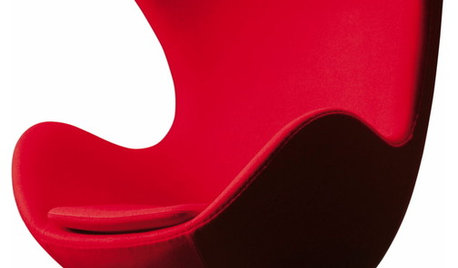
FUN HOUZZHouzz Quiz: Which Midcentury Modern Chair Are You?
Have a seat for a little fun. Better yet, have a seat that has you written all over it
Full Story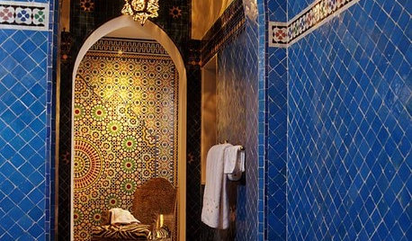
TILEMoor Tile, Please!
Add an exotic touch with Moroccan tiles in everything from intricate patterns and rich colors to subtle, luminous neutrals
Full Story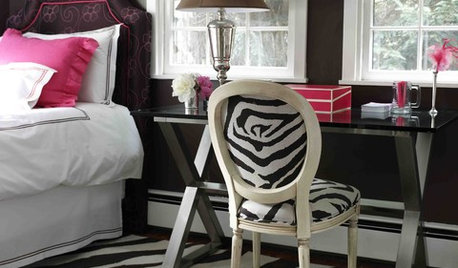
DECORATING GUIDESAnimal Prints: A Love-It-or-Hate-It Look
Some embrace faux furs and animal-print upholstery as classic looks. Others see them as a tacky throwback
Full Story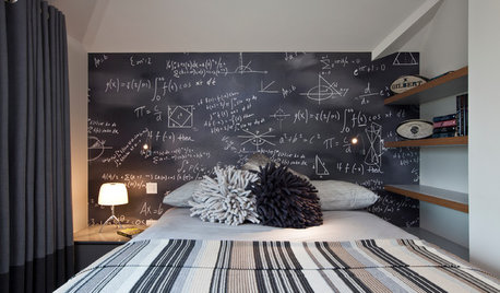
DECORATING GUIDESWhich Rooms Get the Oscar?
On the eve of Hollywood’s night of nights, we bring you top films from the past year and their interior twins
Full StoryKITCHEN DESIGN12 Great Kitchen Styles — Which One’s for You?
Sometimes you can be surprised by the kitchen style that really calls to you. The proof is in the pictures
Full Story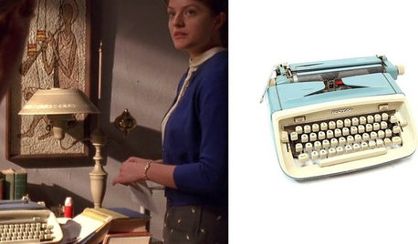
MIDCENTURY STYLEWhich ‘Mad Men’ Prop Would You Like for Your House?
Fancy a pair of Don Draper’s office chairs or Peggy’s blue typewriter? Vintage props from the TV show are up for auction
Full Story
ECLECTIC HOMESHouzz Tour: Comic Book Prints and Vintage Decor Punch Up a Dublin Home
Flowing space and an ever-changing mix of vintage finds are key to this home’s cool, creative look
Full Story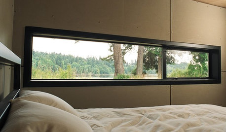
ARCHITECTUREDesign Workshop: Just a Sliver (of Window), Please
Set the right mood, focus a view or highlight architecture with long, narrow windows sited just so on a wall
Full Story


annzgw
susanlynn2012Original Author
Related Professionals
Garden City Interior Designers & Decorators · Shorewood Interior Designers & Decorators · Austin Furniture & Accessories · Bronx Furniture & Accessories · Charleston Furniture & Accessories · Potomac Furniture & Accessories · Roseville Furniture & Accessories · Newton Furniture & Accessories · Ives Estates Furniture & Accessories · Miami Beach Furniture & Accessories · Northridge Furniture & Accessories · Danville Custom Artists · Batavia Lighting · Iowa City Lighting · Palm Springs Lightingsusanlynn2012Original Author
yayagal
kristinekr
Melenie5
Valerie Noronha
susanlynn2012Original Author
amykath
susanlynn2012Original Author
Lyban zone 4
susanlynn2012Original Author
baileyandbella
susanlynn2012Original Author
susanlynn2012Original Author
yayagal
susanlynn2012Original Author
ttodd
graywings123
cyn427 (z. 7, N. VA)
susanlynn2012Original Author
dianalo
susanlynn2012Original Author
susanlynn2012Original Author
susanlynn2012Original Author
susanlynn2012Original Author
Happyladi
susanlynn2012Original Author