

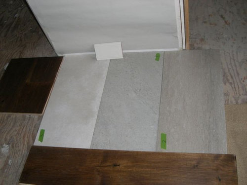
Which tile for entryway?
akl_vdb
9 years ago
Sort by:Oldest
Comments (24)
Related Stories
DECORATING GUIDESWhich Wallcovering Is Right for You?
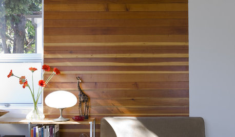
Transform a Space With a Wall of Wood, Paper, Fabric, Maps and More
Full Story
KITCHEN DESIGNHouzz Quiz: Which Kitchen Backsplash Material Is Right for You?
With so many options available, see if we can help you narrow down the selection
Full Story
BATHROOM DESIGNWhich Bathroom Vanity Will Work for You?
Vanities can be smart centerpieces and offer tons of storage. See which design would best suit your bathroom
Full StoryKITCHEN DESIGN12 Great Kitchen Styles — Which One’s for You?
Sometimes you can be surprised by the kitchen style that really calls to you. The proof is in the pictures
Full Story
KITCHEN DESIGNOpen vs. Closed Kitchens — Which Style Works Best for You?
Get the kitchen layout that's right for you with this advice from 3 experts
Full Story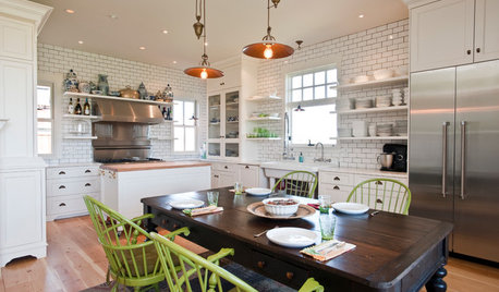
KITCHEN ISLANDSWhich Is for You — Kitchen Table or Island?
Learn about size, storage, lighting and other details to choose the right table for your kitchen and your lifestyle
Full Story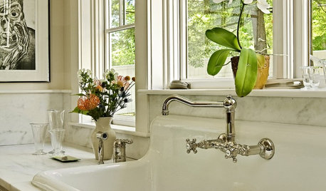
KITCHEN SINKSWhich Faucet Goes With a Farmhouse Sink?
A variety of faucet styles work with the classic farmhouse sink. Here’s how to find the right one for your kitchen
Full Story
You Said It: ‘Which Color Truly Reflects You?’ and Other Quotables
Design advice, inspiration and observations that struck a chord this week
Full Story
PRODUCT PICKSGuest Picks: Accessories for a Stylish, Organized Entryway
Tracked-in mud and lost mittens? Not with these entryway finds, which include kid-friendly options
Full Story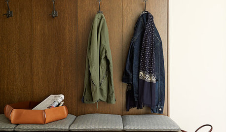
ENTRYWAYSNew This Week: 4 Smart-Storage Entryways
Architects and designers share details on their solutions for organized entryways and mudrooms uploaded recently to Houzz
Full Story


tibbrix
rgps
Related Professionals
Liberty Township Interior Designers & Decorators · Marietta Furniture & Accessories · Oshkosh Furniture & Accessories · Silver Spring Furniture & Accessories · Stuart Furniture & Accessories · Tampa Furniture & Accessories · Carson City Furniture & Accessories · Fort Carson Furniture & Accessories · Park Ridge Furniture & Accessories · Vail Furniture & Accessories · Aurora Lighting · Rockledge Window Treatments · Rockville Window Treatments · Sacramento Window Treatments · Grosse Ile Window Treatmentstibbrix
joaniepoanie
nanny2a
Annie Deighnaugh
justgotabme
mojomom
caminnc
akl_vdbOriginal Author
tibbrix
westleyandbuttercup
justgotabme
pricklypearcactus
Oakley
tibbrix
Olychick
akl_vdbOriginal Author
akl_vdbOriginal Author
akl_vdbOriginal Author
justgotabme
akl_vdbOriginal Author
justgotabme
tibbrix