


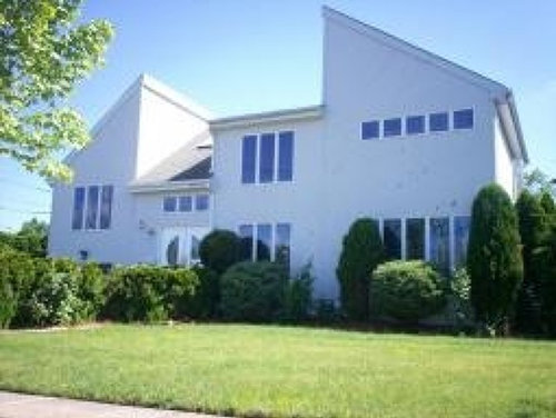
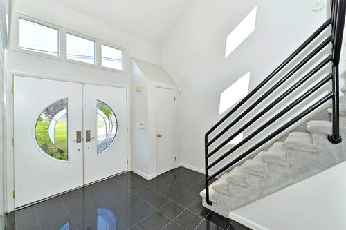
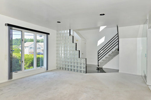
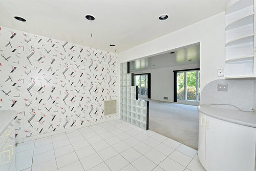
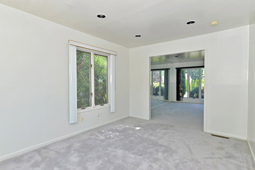
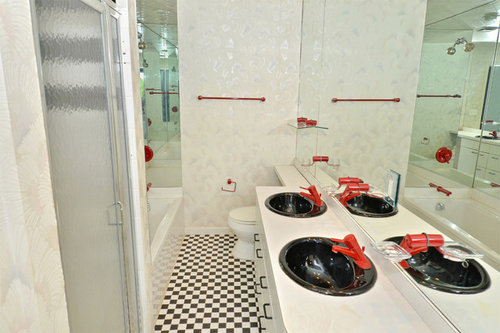
What's black, white (&red) all over?
palimpsest
9 years ago
Sort by:Oldest
Comments (18)
Related Stories
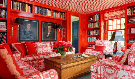
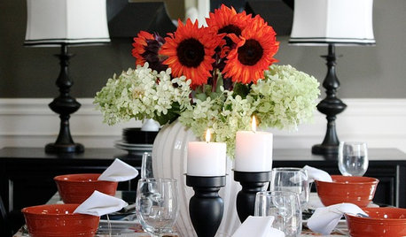
DECORATING GUIDESRoom of the Day: Black, White and Red All Over
Custom fabric, heirlooms, bold color and a beloved collection of books cozy up this farmhouse library
Full Story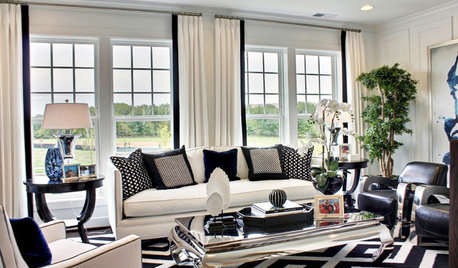
Guest Picks: Black and White and Dramatic All Over
Get a chic and sophisticated look with graphic finds for the home
Full Story0
FALL AND THANKSGIVINGIt's Black and White and Fall All Over in a Holiday-Happy Home
Get inspired for budget-friendly fall decorating by a resourceful stylist's thrifty but sophisticated adornments
Full Story
COLORBlack and White and Found All Over: Zebra Print
Don't Forget, Zebra Pattern is Made With Neutrals — Add it Anywhere!
Full Story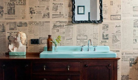
DECORATING GUIDESSo Your Style Is: Black, White and Read All Over
Make headlines at home with newsworthy decor
Full Story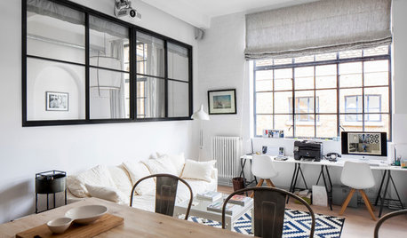
CONTEMPORARY HOMESHouzz Tour: Black, White and Scandinavian-Industrial All Over
A penthouse apartment in a converted schoolhouse gets reconfigured and redecorated to became a restful city sanctuary
Full Story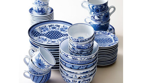
PRODUCT PICKSGuest Picks: Blue and White and Right All Over
Go for a timeless summer color pairing that travels from classic to bohemian without missing a beat
Full Story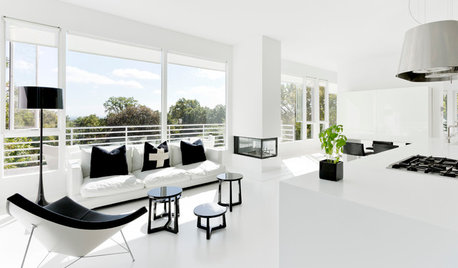
MODERN HOMESMy Houzz: All Right With All-White in a Modern New Jersey Home
A bold monochrome palette with black accents, modern art and treehouse-like views of NYC are stars in this couple’s dramatic home
Full Story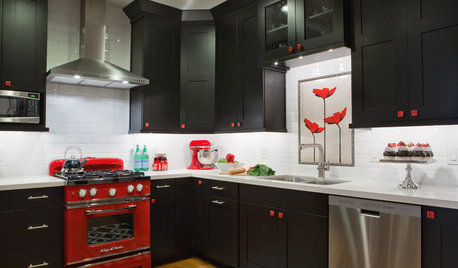
SHOP HOUZZShop Houzz: Black, White and Red Kitchen
Turn up the heat in your kitchen with bold red decor teamed with classic black and white
Full Story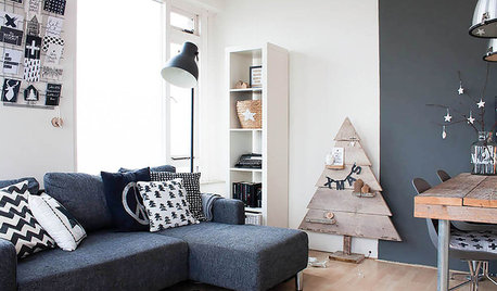
HOUZZ TOURSMy Houzz: Black and White Make a Dutch Apartment All Right
Graphic and creative touches give a 600-square-foot city rental chic style on a modest budget
Full Story


juliekcmo
Fun2BHere
Related Professionals
East Patchogue Interior Designers & Decorators · Rockland Interior Designers & Decorators · Charleston Furniture & Accessories · Franklin Furniture & Accessories · Madison Furniture & Accessories · Redmond Furniture & Accessories · Fort Carson Furniture & Accessories · Park Ridge Furniture & Accessories · Sahuarita Furniture & Accessories · Hudson Custom Artists · Bellwood Custom Artists · Whittier Lighting · East Setauket Window Treatments · Ferndale Window Treatments · Rockville Window Treatmentsteacats
User
robo (z6a)
sixtyohno
BeverlyFLADeziner
palimpsestOriginal Author
Gooster
edie_thiel
teacats
palimpsestOriginal Author
palimpsestOriginal Author
User
awm03
Olychick
Bethpen
pammyfay