


encycolorpedia
Does anyone use a website called encycolorpedia? I stumbled on it today. It gives an insane amount of information about specific colors. Such as:
The color darkorchid with hexadecimal color code #9932cc is a shade of magenta. In the RGB color model #9932cc is comprised of 60% red, 19.61% green and 80% blue. In the HSL color space #9932cc has a hue of 280.13 degrees, 60.63% saturation and 49.8% lightness. This color has an approximate wavelength of 444 nm. This color is also known as: Dark orchid.
There is no indication of who put the site together.
Here is a link that might be useful: encycolorpedia
Comments (15)

Annie Deighnaugh
9 years agoYes, I've used it many times...it can get you brand names that are close to colors from, eg, design seeds.

sundance510
9 years agoI've used it.... but didn't really take the time to figure out HOW I should use it. Ended up with several sample pots that were nowhere close to what I was looking for. Ooops.
Related Professionals
Linton Hall Interior Designers & Decorators · Austin Furniture & Accessories · Milwaukee Furniture & Accessories · Rome Furniture & Accessories · Chino Hills Furniture & Accessories · Fillmore Furniture & Accessories · Fountainebleau Furniture & Accessories · Genova Furniture & Accessories · Chapel Hill Custom Artists · New Bedford Custom Artists · Laguna Niguel Lighting · Feasterville Trevose Window Treatments · Phoenix Window Treatments · South Yarmouth Window Treatments · Taylor Window TreatmentsAnnie Deighnaugh
9 years agoFun colors makes the point that the on line translations of color are inexact at best. The colors listed by brand give you a delta E number...an error term...the smaller, the closer it is to the image color. The larger, the worse a match it is.
sundance510
9 years agoAnnie- that's exactly the lesson I learned. I didn't know what the delta e meant. Live and learn. It's a very cool site once you understand it.
valmooreinphx
9 years agoI love it. It helps me learn about the undertones and he given me a starting point when moving from one paint brand to another.
 PRO
PROLori A. Sawaya
9 years agoFun colors makes the point that the on line translations of color are inexact at best.
Yep. I've corresponded with the creators of the site. The data has been gathered from various resources. The least impressive is taking RGB values from brand's websites with an eyedropper.
Integrity of coversions from one color space to another or one value set to another depends on the quality data you start with. Garbage in equals garbage out applies - big time.
Examples of stuff you have to know from the beginning is what degree observer 2 or 10, etc. Or, what RGB space were the values computed for, Adobe, ProPhoto, etc.
Super edited (and maybe super clumsy) version of what happens with bad starting data: colors either get "clipped" because they don't fit within a particular color space range or they get reduced down to make them fit.
In both cases, it's not the original color any more. It's now something close. And how close is not a matter of anything controlled, rather it's a crap-shoot.
If the results are favorable, it's pure dumb luck that the numbers and stars aligned just right, but the final opinion is often that the method "works".
If results are off, then the final opinion is the method sucks.
What's important to remember at the end of all this is the following:

- PRO
Lori A. Sawaya
9 years agoThe blogosphere defined concept of undertones doesn't fit anywhere within any known color space or values or legitimate color systems. Undertones in these terms is predicated on the purely subjective.
Subjectivity as it pertains to color is emotional based on individual experience rather than fact.
Controlled measurements is how your recognize color fact. Either by a qualified observer (person) or device and last but not least it has to be plottable and repeatable. Repeatable within a set range. That set range is the universally recognized Delta E scale as follows:
0- 1 A normally invisible difference
1 - 2 Very small difference, only obvious to a trained eye
2 - 3.5 Medium difference, also obvious to an untrained eye
3.5 - 5 An obvious difference
> 6 A very obvious difference mclarke
9 years agoWhat a fascinating site.
And Funcolors, thanks for your input. I always enjoy your posts.
Funcolors -- I have a question for you. The Delta E scale mentions "trained eye" and "untrained eye".
Do you think -- and I'm just asking for your subjective opinion here -- that some people are born with a stronger ability to discern color differences than others? Do you think it's like music, where some people seem to have a "natural talent" that (of course) can be developed and enhanced by training?
And what would "color training" be?
This post was edited by mclarke on Thu, Jul 3, 14 at 6:56
Annie Deighnaugh
9 years agoI take it as a starting point, not an ending point. If you have a pic and have no idea where to start, this can help. It can give you a sense of color ranges and variations, it can help you decide to go with one brand over another or where to start looking. And even at that, an exact match to what's on line can appear very different in the room.
For example, here's a pretty design seed.

Note when design-seeds are created, the colors pulled are done by eye, not by computer. However, once those colors are selected, on the web site, you can scroll over them in the "see similar colors" box and get the hex code. For example, the dark taupe above is hex code is #9c8a86. Plug this into encycolorpedia and you get the panel at the bottom of the post. Scroll down and you will get a large table showing you brands and names of colors that are close.
Valspar Cadet Gray

Benjamin Moore Wet Concrete

PPG Gray Violet

SW Poised Taupe

(All of the above are from my perfect color, so they are trying to match as well so another layer of potential error.) But using this, you can see that the shades of taupe can read quite differently....some more red, more gray, more green... and once you get it up on the wall, it can appear quite different from that too. And, depending what else you have going on in the room, you may want the color to lean in one direction or another. So as I said, it's a starting point....an inspiration...a color direction...but certainly no definitive answer to what's best for you and your application.

This post was edited by AnnieDeighnaugh on Thu, Jul 3, 14 at 6:59
- PRO
Lori A. Sawaya
9 years agoA trained eye or qualified observer means the ability to accurately discern and articulate color differences based on the three core dimensions of color, hue / value / chroma. Because all formal color systems and colors spaces - in one way or another - hinge on hue/value/chroma.
Although healthy, normal color vision is necessary the phrase a "trained eye" doesn't really have anything to do with an eyeball. It's more about understanding color fundamentals and being able to speak to them - that's what the color training would be.
If you have human eyeballs, and we'll assume everyone here does, then you have the same ability as anybody else to see and process the sensations and experiences of color.
Provided there are no vision impairments. About 8% of men and 1% of women do have some degree of impairment. That statistic is often twisted into women being "better with color" than men. And that's total b.s.
Women can see an extra wavelength of red and that's widely accredited to evolutionary survival with females typically taxed with food/feeding tasks.
Just because there are more men with vision impairments than women and it is believed that women can see an extra wavelength in the red area of the spectrum, it doesn't boil down to women being "better with color" than men.
Similarly, designers, artists, painters, color experts, etc. do not have super human color seeing abilities. Again, we'll assume all the designers, artists, painters and color experts we know are human. Which means they too have human eyeballs like the rest of us.
Often you'll read or hear someone wax poetic about being able to see color in some extraordinary way. Highly, highly, highly unlikely.
Instead, it's more a matter color inarticulate vs. color articulate.
Color articulate is (usually) a result of experience, study, and practice that over time develops into an overall knowledge and and ability to communicate color concepts. Either verbally or thru some artistically expressive channel, like illustration, watercolors, etc.
The healthy, color articulate human who can successfully speak to hue/value/chroma have "trained eyes" and would probably easily meet the requirements for a "qualified observer".
It's important for people who feel that they aren't 'good with color' to know that physiologically, they have the very same tools to be successful with color as any professional. It's just they simply don't know as much about it compared to a pro.
Annie Deighnaugh
9 years agoThere is some evidence that language affects our ability to distinguish colors...or at least certain colors. So while the structure of the human eye may be the same, the brain's interpretation of what those wave lengths of light mean may not be. I don't know if, past a certain age, we can be trained to distinguish between certain colors. I know, for example, that past a certain age, we are unable to distinguish between certain sounds.
All we know of reality is our perception of it, be it our colors or anything else. And if you know quantum mechanics, simply observing something can affect its reality.
- PRO
Lori A. Sawaya
9 years agoJust because someone may not have the language to articulate different sensations of color, doesn't necessarily mean they didn't experience the sensation at all.
Just means they can't articulate it. Language of color is a byproduct of the experience of color.
Color theories exist because humans are driven to articulate the sensory experience of color.
Annie Deighnaugh
9 years agoThere are radical variations in the way languages carve up the spectrum of visible light; for example, green and blue are distinct colors in English but are considered shades of the same color in many languages. And it turns out that the colors that our language routinely obliges us to treat as distinct can refine our purely visual sensitivity to certain color differences in reality, so that our brains are trained to exaggerate the distance between shades of color if these have different names in our language. As strange as it may sound, our experience of a Chagall painting actually depends to some extent on whether our language has a word for blue.
--Guy Deutscher, NYT, "Does Your Language Shape How You Think?"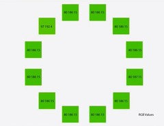
- PRO
Lori A. Sawaya
9 years agoSeveral issues not only with what he says, but how he phrases it. Overall, I disagree more than I agree with that paragraph.


williamsem