


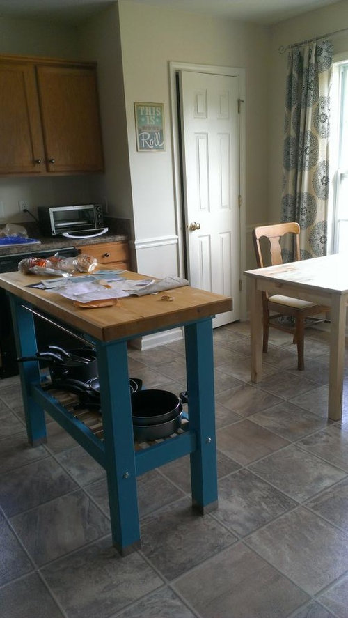
A color puzzle! I'm stuck...
sundance510
9 years ago


Sort by:Oldest
Comments (26)
Related Stories
BATHROOM DESIGNHow to Pick a Shower Niche That's Not Stuck in a Rut
Forget "standard." When you're designing a niche, the shelves and spacing have to work for your individual needs
Full Story
WINTER GARDENING6 Reasons I’m Not Looking Forward to Spring
Not kicking up your heels anticipating rushes of spring color and garden catalogs? You’re not alone
Full Story
KITCHEN DESIGNSingle-Wall Galley Kitchens Catch the 'I'
I-shape kitchen layouts take a streamlined, flexible approach and can be easy on the wallet too
Full Story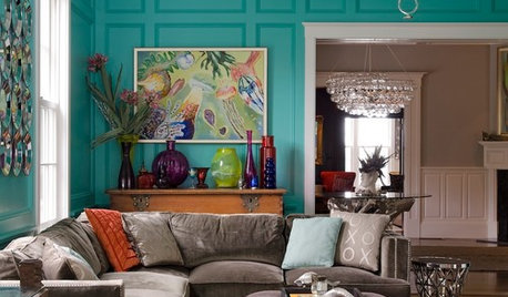
COLORSpeed-Dial Color Selection to Get the Best Result
You’ve belabored your color decisions and are still stuck. Here is how to evaluate your space and make choices that are right for you
Full Story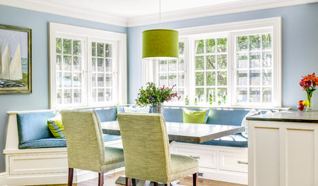
DECORATING GUIDESThe Dumbest Decorating Decisions I’ve Ever Made
Caution: Do not try these at home
Full Story
EXTERIORSHelp! What Color Should I Paint My House Exterior?
Real homeowners get real help in choosing paint palettes. Bonus: 3 tips for everyone on picking exterior colors
Full Story
LIFEThe Polite House: Do I Have to Display Decor Given to Me as a Gift?
Etiquette columnist Lizzie Post tackles the challenge of accepting and displaying home decor gifts from frequent visitors
Full Story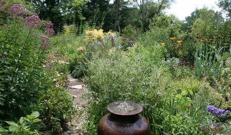
GARDENING GUIDESHow I Learned to Be an Imperfect Gardener
Letting go can lead to a deeper level of gardening and a richer relationship with the landscape. Here's how one nature lover did it
Full Story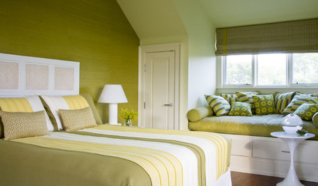
DECORATING GUIDESI'll Have the Same: How to Design With Monochromatic Color
Indulge the eye, offer a break from visual chaos and make decorating easier with single-color rooms in any shade you like
Full Story
ingeorgia
yayagal
Related Professionals
Centerville Interior Designers & Decorators · Lomita Interior Designers & Decorators · Austin Furniture & Accessories · Bend Furniture & Accessories · Evanston Furniture & Accessories · Framingham Furniture & Accessories · Peachtree City Furniture & Accessories · Shakopee Furniture & Accessories · Gages Lake Furniture & Accessories · Palmetto Bay Furniture & Accessories · Decatur Custom Artists · Decatur Lighting · Florida City Lighting · Red Bank Lighting · San Francisco Lightingtomatofreak
Fun2BHere
busybee3
voila
stolenidentity
sundance510Original Author
emmarene9
tomatofreak
teacats
sundance510Original Author
voila
sundance510Original Author
Vertise
voila
Annie Deighnaugh
sundance510Original Author
Holly- Kay
msrose
theresa2
voila
edeevee
sundance510Original Author
edeevee
Fluffeebiskits1