


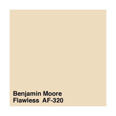
Does anyone know of a color very close to Powell Buff with no und
sis2two
9 years ago
Featured Answer
Sort by:Oldest
Comments (18)

patricianat
9 years agosis2two
9 years agoRelated Professionals
Lomita Interior Designers & Decorators · Mount Sinai Interior Designers & Decorators · Whitman Interior Designers & Decorators · Reno Furniture & Accessories · Tampa Furniture & Accessories · Naples Furniture & Accessories · Carpinteria Furniture & Accessories · Folsom Custom Artists · Paradise Custom Artists · Southchase Custom Artists · Iowa City Lighting · Romeoville Lighting · Scottdale Lighting · Del City Window Treatments · Mount Sinai Window Treatments
Annie Deighnaugh
9 years agoteacats
9 years agosis2two
9 years ago
tibbrix
9 years ago
Holly- Kay
9 years agosis2two
9 years agotibbrix
9 years agozippity1
9 years agosis2two
9 years agotibbrix
9 years agosis2two
9 years ago
Lyban zone 4
9 years agoUser
9 years agopatricianat
9 years agoUser
9 years ago
Related Stories
ENTERTAININGSimple Pleasures: Movie Night for Film Buffs
In a world of rising cinema costs ... at a time when gathering comes naturally ... small screens are hitting the big time
Full Story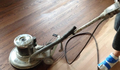
GREAT HOME PROJECTSWhat to Know Before Refinishing Your Floors
Learn costs and other important details about renewing a hardwood floor — and the one mistake you should avoid
Full Story
PETSWhat You Need to Know Before Buying Chicks
Ordering chicks for your backyard coop? Easy. But caring for them requires planning and foresight. Here's what to do
Full Story
COMMUNITY15 Ways to Make Your Neighborhood Better
Does your community lack ... well, a sense of community? Here's how to strengthen that neighborly spirit
Full Story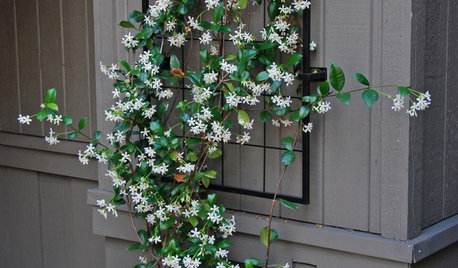
FEEL-GOOD HOMESimple Pleasures: Scent and Memory
Fragrant jasmine, fresh-brewed coffee, baking bread. Scents can evoke memories and bring sensory pleasure to our homes
Full Story
REMODELING GUIDESPocket Doors and Sliding Walls for a More Flexible Space
Large sliding doors allow you to divide open areas or close off rooms when you want to block sound, hide a mess or create privacy
Full Story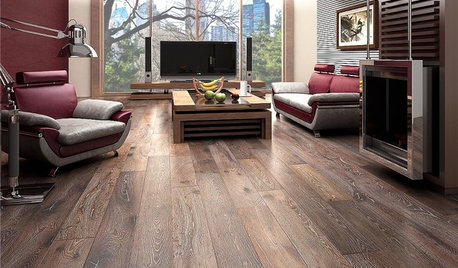
REMODELING GUIDESWhen to Use Engineered Wood Floors
See why an engineered wood floor could be your best choice (and no one will know but you)
Full Story
TRIMTrim Color Tips: Get Your White Trim Right
Set off wood tones, highlight architectural features, go minimalist ... white trim is anything but standard when you know how to use it
Full Story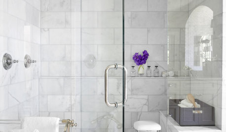
REMODELING GUIDESWhy Marble Might Be Wrong for Your Bathroom
You love its beauty and instant high-quality appeal, but bathroom marble has its drawbacks. Here's what to know before you buy
Full Story
HOUSEKEEPINGHow to Clean Marble Countertops and Tile
Acidic solutions can damage your marble surfaces. Here’s how to keep marble looking clean and amazing
Full Story


sis2twoOriginal Author