


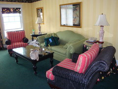
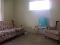
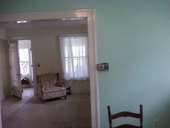
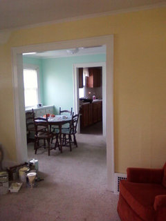
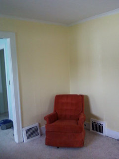
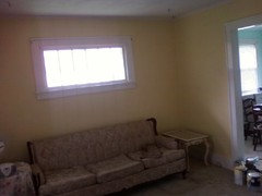
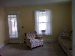
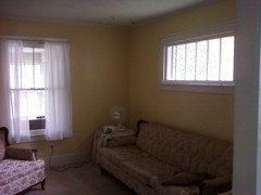
Choosing a yellow for a living room
cardwellave
13 years ago
Featured Answer
Sort by:Oldest
Comments (22)

yayagal
13 years agodawnp
13 years agoRelated Professionals
Mount Vernon Interior Designers & Decorators · East Hanover Interior Designers & Decorators · Fountain Hills Interior Designers & Decorators · Brooklyn Furniture & Accessories · Marietta Furniture & Accessories · Roseville Furniture & Accessories · Fargo Furniture & Accessories · Discovery Bay Furniture & Accessories · Short Hills Furniture & Accessories · Indian Creek Furniture & Accessories · Centreville Lighting · Modesto Lighting · York Lighting · Berkley Window Treatments · Littleton Window Treatmentscardwellave
13 years agocardwellave
13 years agolaurenk88_pa
13 years agocardwellave
13 years ago
justgotabme
13 years agoloribee
13 years agobarb5
13 years agosusanj8
13 years agosuzluvsflowers
13 years agoHappyladi
13 years agoscanmike
13 years ago
bac717
13 years agomom270
13 years agocardwellave
13 years agoboo0713
13 years agocardwellave
13 years agotuesday_2008
13 years agoboo0713
13 years agoUser
13 years ago

Related Stories
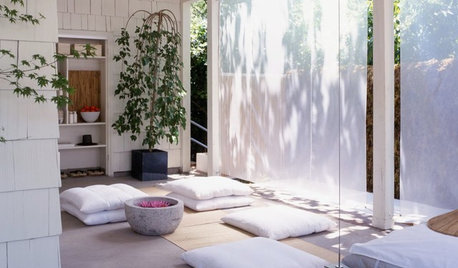
DREAM SPACESIf You Could Choose One Dream Space ...
Yoga room, wine cellar, infinity pool or tricked-out garage — which of these luxurious rooms would be at the top of your list?
Full Story
COLOR5 Tips for Choosing a Primary Outdoor Color
Strengthen your style statement by carrying color choices from your home to all the parts of your property that surround it
Full Story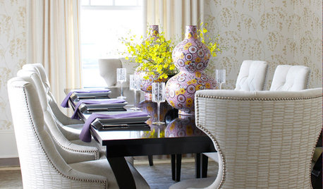
DINING ROOMSSmart Shopper: How to Choose a Dining Chair
Before you go for that gorgeous velvet nap or slender sculptural seat, check out our guide to successful chair buying
Full Story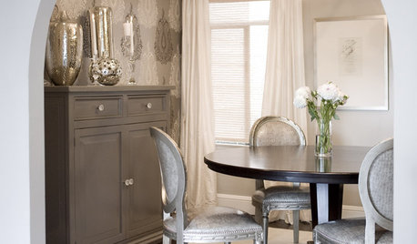
GRAYChoosing Color: Give Me More Gray Days
Layer On the Grays for a Sophisticated Look in Any Room
Full Story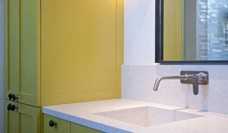
BATHROOM DESIGNRoom of the Day: Hello, Yellow!
Color-loving clients choose a sunny hue for their new bathroom
Full Story
COLORHow to Choose the Right Exterior Color
Explore each color in our guide to pick a hue for your home's face that you'll be happy with for years to come
Full Story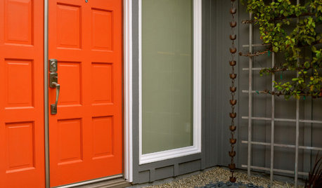
MOST POPULARHow to Choose a Front Door Color
If choosing a door paint isn't an open-and-shut case for you, here's help
Full Story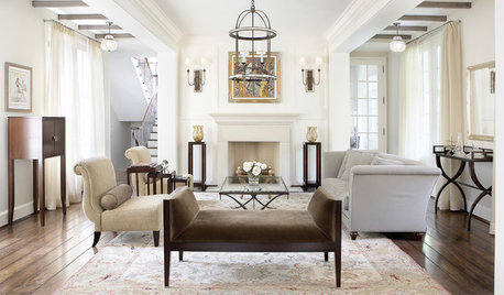
LIVING ROOMSHow to Choose Traditional Living Room Furniture
Stick with structured, classic pieces to create a timeless yet livable layout
Full StoryEXTERIORS5 Easy Tips for Choosing Your Exterior Paint Palette
Make your home the talk of the neighborhood — in a good way — with an exterior paint scheme that pops
Full Story
COLORHow to Choose a Paint Color
Designers offer tips for examining your closet, memories and daily life to find the right paint colors for your home
Full Story


suzluvsflowers