


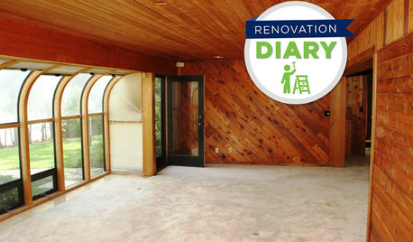
The well designed house (plan)
This topic was mentioned by stinky-gardener on the 7 deadly sins thread and I thought it deserved it's own thread. I know there are many knowledgeable people here who will have something to say about the essentials of the well designed house and houseplan.
Architecture is one of my favorite subjects and IMO many of the houses designed today do not fit people's lifestyles but are designed for lives people would like to have. Many are ostentatious and not to human scale which makes them uncomfortable to live in. There are often threads on home decor forums asking how to make a 600 square foot room with a 20-something foot ceiling cosy! Not easy to do.
Here are some of the mistakes IMO often made in modern architecture:
~wasted space such as in hallways and overly large rooms. With housing costs the way they are who can afford wasted space?
~sight lines such as what one sees from the front door - it shouldn't be the kitchen sink or a bathroom door
~how the house is sited on the lot - with many spec houses especially the house plan is not appropriate for the lot elevation and it seldom works well. I really dislike the developments where all the houses have huge garages facing the street. Looks as if it's a garage with a small house attached. I know the reasons but there must be a better way.
Become acquainted with the "golden ratio" which is a way of determining dimensions which are humanly pleasing. Can be applied to anything in a house - room sizes, windows, doors, even the house footprint itself.
One of my favorite books is "A Pattern Language by Christopher Alexander, et al" which studies design problems as they relate to human nature.
So what would your advise be to someone in the planning stages of a new home?
Comments (56)

mclarke
11 years ago"One of my favorite books is "A Pattern Language by Christopher Alexander, et al" which studies design problems as they relate to human nature."
That is an amazing book! Wisdom and grace on every page.
sable_ca
11 years agoThank you for introducing this topic! Christopher Alexander's name rang a vague bell, so I called DS2, who is a planner, and whose professional passion is the use of both indoor and outdoor space to ease and make comfortable human life. He said that C.A. is his idol, that he has some of the books, and that other friends in the profession are also fervent admirers. I asked him if he learned about Alexander while doing his Master's degree, and he said that no, all the profs were modernists and bauhausians. He and a couple of other grad students discovered C.A. on their own, and would read and discuss him.
So I ordered The Nature of Order and among the reviews found this: "Alexander is like a moth circling around fascinating problems. Even when he does not give a solution, his circling in fact identifies the problem, and by approaching it, he gives nontrivial hints towards the eventual solution."
Some advice to new builders: Leave areas for quiet, private space. If possible, keep kitchen appliances and the kitchen mess out of the line of sight from the living area - but this may be my own hang-up. I like being in my kitchen by myself. Build in plenty of bookcases and storage areas. Take into consideration where today's TVs should go, realizing that many people watch a fair amount of television - this is in keeping with Magnaverde's rule that we should design for the way we actually live.
Design with ergonomics in mind. I had the shock of my life when I fell and broke my leg last year and was wheelchair-bound in a knee-to-toe cast, and discovered that our home is very unfriendly to disabilities! I had not thought of that before.
Related Professionals
Wareham Interior Designers & Decorators · Washington Interior Designers & Decorators · Whitman Interior Designers & Decorators · Eagan Furniture & Accessories · San Diego Furniture & Accessories · Surprise Furniture & Accessories · Fargo Furniture & Accessories · Genova Furniture & Accessories · Paradise Custom Artists · Green Bay Lighting · North Tustin Window Treatments · Rolling Meadows Window Treatments · San Rafael Window Treatments · Seattle Window Treatments · Brownsville Window Treatmentsliriodendron
11 years agoI adore that book and am often recommending it over on the Kitchen Forum where ill-planned cooking layouts and multiple redundant eating spaces are thick on the ground.
I have two copies, one very battered and stained that's my "loaner" and another for my own use. I finally gave in a bought a second-hand to lend out since it was the book most likely to NOT be returned. I often have to pester people to give it back so I can loan it again.
I recently checked Amazon and discovered that the thing has gotten practically cheap - it used to be $50-60 a copy.
No excuses, now: get a copy and read it! Once you get the hang of its layout - broken into inter-related mostly very short chapters in descending order of magnitude and certaintude - I think anyone thinking deeply about spaces (interior, exterior and community-scale) will be enchanted.
He is the (openly acknowledged) inspiration of the vastly more famous Susan Susanka of the Not So Big House fame.
Alexander's book(s) have virtually no illustrations beyond slightly fuzzy, under-esposed B&W pics and ink sketches. You don't need more as his ideas are so clear and exciting, your mind will complete the pictures. Your ideas about space and room planning will never be the same!
L.
bronwynsmom
11 years agoI'm so happy to see the Alexander books recommended.
I am a firm and unmoveable believer in function first. Once you have the workings of a house figured out, you can apply appropriate elements of style and decoration, but if the plan doesn't work, no amount of gorgeous will make living in it easy.
Whenever I'm asked to work on the initial concept plan for a house or a major renovation, I start with a bubble diagram. it's a rough visual beginning that addresses questions about the kinds of rooms and/or functions you want, and their relative sizes, and what should connect to what, and what should be separate, and how the parts and the whole might relate to the site and the compass directions (taking views and sun and wind exposure into account).
Here's an example of what one can look like:

The link describes the process a bit.
Here is a link that might be useful: Example of how a bubble diagram works
User
11 years ago"Newer homes are more energy efficient the more buttoned up they are. Some only ventilate mechanically with an ERV or HRV. Windows are for views, and egress in the bedrooms for safety. But all of this can look "wrong" to your eye"
I realize that some homes are vented that way however the size and shape and style of the window should match the house style and not be plain square glass panels that are too small. The living room window of the house I am talking about is no bigger than 3x4 square and that looks crazy on a 3 story house all siding no windows. I guess you would have to see it in context to realize how ridiculous it looks.
palimpsest
11 years agoI believe the original concept of open plan was that rooms related to each other with larger openings, usually without doors, and without intervening hallways. They also had more than one means of egress creating a circulation pattern. My parents' house was open plan in that there was only one dead end room on the main floor (the library) and it was the only room that had a door that completely closed it off,(except, of course, the powder room). The dining room had wide double doors to the kitchen that were almost always kept open.
An open concept would have opened this even more, eliminating the formal dining room as defined by four walls, and perhaps switching the small amount of square footage allowed for the library with the larger allowed for the formal living room.

Annie Deighnaugh
11 years agoThanks for the Alexander book links...I'd not read them. But we did use Susanka a lot in designing our home and she really lays out wonderful design principles with lots of RL examples in an easy to understand way. I remember years and years ago when she was on Christopher Lowell and the 2 of them were in synch completely...where architecture meets interior design. Very interesting.
Of course her homes use a lot of architecture and sparse interior designs. Christopher Lowell would add architecture to the surface of the rooms and was very heavy handed on interior design. But I always thought the best rooms were where the two worked together hand in hand and the one blended seamlessly with the other.
bronwynsmom
11 years agoCLB, I wonder how the house you describe is sited.
Could it be that the house front you see is designed that way for privacy, and the back of the house is oriented int he other directions, and open to the yard and/or the view beyond?
Not that it would justify an awkward or ugly facade, but maybe that was the reasoning?stinky-gardener
11 years agoLuckygal, thanks for starting this thread, and thanks for the book recommendation! Checked it out from the library & started reading it last night.
Wow! Very interesting, but I found it was a little hard to follow at first, as it is written in an unorthodox manner. I'm catching on though, and am thoroughly enjoying the author's keen observations. So interesting that things that please the eye & enhance living do so for very specific, but universal reasons.
Climbing plants and window panes are two examples that immediately come to mind that I gravitate toward! I was just standing in front of my house last week with my carpenter, who was replacing rotten wood, telling him that if I replace my windows at some point, I want panes, unlike some of my neighbors who have blank glass. I lamented that I'd have to go with "grids" between the glass rather than real panes, which I have now, and said the added dimension (another pattern...trim that's about .5 inch) is something I'd miss.
Anyway....great read and interesting discussion here!
luckygal
Original Author11 years agoI'm glad to see so many know about Christopher Alexander. When I discovered this book in the early-90's it was out of print and my local bookstore had to do an extensive search to find me a new copy. At the time we were planning our new build and I incorporated a number of "patterns" which have worked out very well and certainly contribute to the positive 'feel' of my house. It's a book I highly recommend to anyone planning a new house or renovation.
The "golden ratio" is not so complicated, it's about proportion and amazingly is seen in many natural forms, and has been used in art and architecture for millennia. Apparently the most pleasing ratio is 1:1.618. An example is a room that is 14' wide by almost 23' long (14'x1.618=22.65'). Most people find this ratio to be visually pleasing.
I abhor the lack of balance in some modern architecture and improperly sized windows are just one example. I've often wondered what the architect was thinking.
Pal, I agree with you about the original concept of open plan which began long before the name was coined. I know there are also financial reasons for open-plan and it doesn't work for everyone but it does suit those with a casual lifestyle. There are good and not so good open-plans of course. I do like mine altho as my art collection grows the lack of wall space is a problem. Next house won't be open-plan because of that.
Glad you are enjoying the book stinky-gardener! I've read and reread it many times over the years and never tire of studying it.
Some of the patterns I chose to use in our house are:
~ 159 - Light on two sides of (every) room - it makes a real difference to the natural light and gives the rooms a more pleasant feel.
~ 134 - the Zen view - We chose to have no huge "picture" windows (altho do have many windows) and only removed enough trees to have glimpses of the wonderful view framed by trees. I never tire of seeing the views through the various windows. Most people would have huge windows and remove all trees blocking the view. According to this pattern the view then becomes so commonplace it is no longer noticed. All of our neighbors along this ridge have done this but I haven't had the courage to ask how much they still notice the view!
~ 112 - Entrance transition
~ 117 - Sheltering roof
~ 132 - Short passages
~ 133 - Staircase as a stage
~ 138 - Sleeping to the east
~ 139 - Farmhouse kitchenIMO even using a few of the patterns can make a house more comfortable for the occupants.
palimpsest
11 years agoRooms planned from the inside out.
In other words, bedrooms planned with the bed in a particular location, with adequate space on each side for bedside tables, then other furniture.
Bathrooms started with the old American Standard bathroom template and worked up from there in size.
Living rooms planned from the seating arrangement out.
You can even do this within the boundaries of an existing houseplan, reworking inner walls as needed.
So many new houses, Huge houses, are planned with a number of the actual rooms, and furniture placement within those rooms as an afterthought.
That's why I think "Nice room!, I can see why you are having trouble with the furniture arrangement." are two contradictory statements that I read in here. A good room doesn't present major obstacles to furnishing it.
Fun2BHere
11 years agoFirst, let me say that I understand that the priorities when buying a house are usually location and price. Sometimes, there just isn't much choice within your budget and target area. However, I sometimes wonder at all of the posters who come here and ask for help dealing with furniture placement in houses they've just purchased. Did they not even consider their furnishings when they were viewing houses? I guess I'm a little off-topic, but I do always wonder.
allison0704
11 years agoGreat thread. I've mentioned several times in Decorating and Building forums that many architects design homes to be pretty, but they are not always functional. While we used a well-known architect, we changed many things during our planning stage to suit our every day lives, including family visits (at the time of our build 2 of our 3 children were living out of state after attending out of state colleges).
Pal's post is spot on. Our MBR did not have a good place for the bed. I'd say rarely, if ever, go with what an architect designs for lighting and electrical plugs. We pretty much knew what we wanted where, but walking through with our experienced electrician to fine tune.
The OP's mention of house site is extremely important. I'm on the ARC of our POA and you wouldn't believe how some want to place a house. That's when we call in a Landscape Architect for their opinion - which usually is taken better with lot owners than from "neighbors."
More later. Off to meeting with architect.
User
11 years agoBronswynsmom- yep that would make total sense if the house had larger windows on the backside but nope you can see the whole house as you drive around the corner and "All" are itty bitty things although some are tall and skinny not just square.
I guess that takes me back to my original point it appears to be a budget issue this house is huge and looks like they didn't budget for windows that match the scale of the house or the design of the house.User
11 years agoBronswynsmom- yep that would make total sense if the house had larger windows on the backside but nope you can see the whole house as you drive around the corner and "All" are itty bitty things although some are tall and skinny not just square.
I guess that takes me back to my original point it appears to be a budget issue this house is huge and looks like they didn't budget for windows that match the scale of the house or the design of the house.Annie Deighnaugh
11 years agoWhen designing our home, we spent a lot of time with floor layout in terms of function. We literally walked through the house in our minds. Groceries coming in...room to get out of the car? how many steps to climb with arms full? where do you put the bags down? where is the pantry? the freezer? Greeting guests at the door...can they find the front door from where they park? (i hate going through the garage to get into someone's home but so many are built that way) are they sheltered? is there room to greet them without someone falling down stairs? where do they put their coats? Powder room....is it convenient to the FR where we spend most of our time? is it away from the dining room? Will guests feel like they have to go past the laundry and to the garage to find it?
We laid out kitchen appliance locations in the old house and pretended to make lunch to see how it would work...moving chairs to mark off island spaces to see if we could get by each other. We measured bathrooms in model homes to see if we had room in the shower to wash our feet. We measured stair steps when we found one that was especially graceful.
Those were all issues that would affect our daily living in the house and were something the architect couldn't help us with as he didn't know how we lived. As a result of all of that, the house functions very well for us. The architect did a great job of taking what we wanted and making it beautiful (and making it stand up!)
allison0704
11 years agoThere is a house like that in our neighborhood - never should have been passed, but developer was still in charge. Large house with the wrong windows in front. Money wasn't an issue, so I guess stupidity got in the way. They used nicer windows in the back than in the front.
I refer to it as the fugly house. Everyone - and I mean everyone that comes to our house for the first time asks a version of "what's with the house down the street?"
What makes it worse is it is now bank owned. Owner evicted. It's so bad the bank couldn't even sell it at auction. Windows aren't the only issue, but it will take some money to make the outside better looking, but it will never be a good looking house. And the inside is a chopped up nightmare.
This is the house on a good day. ;D

bronwynsmom
11 years agoAllison, where is Thor when you need him? It sounds like a small fistful of lightning bolts is the best solution for your neighboring house!
Annie, your process was so good that I think you need to write a piece for the NYTimes Sunday magazine, or a shelter mag, about it. Reminds me of a friend of ours who took a look at the first proposed plan in the gut kitchen renovation of a fabulous house she inherited, went to her recipe file, slapped the chocolate chip cookie recipe she made with her children every week down on the table, and said to the architect, "Okay, you make these cookies in that plan!" The step by step path looked like a handful of yarn when she made them draw it on an overlay, and back to the drawing board they went!
When I was in design school, we made 1/8" or 1/4" scale chipboard models of every project, and it is astonishing how effective it is to hold a model up at eye level and look through the windows and doors. You really can see to scale and get a feel for the volumes and circulation of space.
And AutoCad, while fabulous and necessary, doesn't give the same effect. I don't think I'd ever build a house without a model, once the project neared the end of the design phase.
Annie Deighnaugh
11 years agoBronwynsmom, yeah, it was a good thing, but it took us forever. We took 7 years to design our home...no wonder we still call our architect "Uncle"...he's a member of the family now!
marcolo
11 years agoThe cookie exercise is marvelous. But we can't put all the blame on architects who don't observe their clients' behaviors carefully enough. Most people don't know how to observe their own behavior. That's how we get people on the kitchen forum who insist they never use water when they prep food. I imagine most are dead of dysentery by now.
Each day, all of us live a Groundhog's day of the same annoyances that bothered us the day before. The shampoo bottle doesn't fit the niche. We always bump into somebody else in the same place in the hall. It's hard to bring food out onto the grill when you have something in both hands. There's no really good place to read a book when someone is watching TV. Whatever your pet peeve may be. Almost no one does anything about them, much less writes them down, studies them and tries to understand how to make a house work like an efficient machine. That's one way you end up with bad houses.
If people did pay attention to their peeves, new houses would be built with mail sorting rooms.
bronwynsmom
11 years agoMarcolo, I'm so with you on the mail sorting rooms.
And the package room. The luggage room. The flower room.pirula
11 years agoWe put a mail sorting "cubby" in our entry way. With a pull out recycling bin underneath, and shelves for filing boxes up on top. It's amazing how such a little thing can change your life for the better.
Annie Deighnaugh
11 years agoScale of course is critical when making rooms feel good, but size is also important and perhaps more difficult. When designing our house, I learned that there are always trade-offs. If you do this, you can't do that. The problem is most of these trade-offs can be fixed by adding square footage. I think that's why so many homes get so big. We designed many many floor plans, and we'd fix and tweak to avoid the trade-offs, get a great plan and then realize it was too big. So back to the drawing board we went. We did this too many times to count. We used to kid that some people spent their weekends playing golf or tennis....we designed houses.
Finally got a house that was small enough, fit the constraints of our lot, and met about 98% of our CTQs (critical to quality characteristics.) But it took a lot of work.
stinky-gardener
11 years agoI'll never be in a position to build a house from scratch, but a lot of this information is still useful and interesting to me, because I enjoy understanding why things work or don't work and why things are nearly universally appealing and others almost always seem to fall flat. The "Patterns" book goes a long way toward explaining those uh, patterns.
I also do have the neighbor who will break ground on her house in another state in the fall. They are tweaking and tweaking with their architect. She said the first and second floors were pretty much planned, but they were having a hard time with the outside, what she called "terracing," but she was not talking about the land around it, but the facade material, the exterior. What the issues are with that, I don't know. I know that "grand" is one of her chief objectives in this design, if not the sole objective, lol.
She is dying for me to come over and look at her plans. Of course, she's always game for an opportunity to show off. She wants to set aside "a day" for us to do this. Yay. Looking at house plans will feel like reading Greek to me, but I'm sure she'll explain a lot to supplement the drawings. I'll be cordial & supportive, even though her house in the making is hardly my own cup of tea. This is her big dream coming true.
palimpsest
11 years agoIn some regards, though it is easier to design a good room when you have hard and fast limitations. This goes back to trying to design from the necessary furniture or fixtures Out.
I'll give two salient examples: A bathroom, by necessity, must be 5x7 to fit the standard fixtures with code compliant clearances. A handicap bath needs to be a bit larger and have a 5' clear radius at foot-supports level of a wheelchair. If the bathroom has a roll in shower instead of a tub and a wall hung sink, it doesn't have to be all that much larger than this.
If you want a larger master suite style bathroom, it may need to be 6' x 8' to start, accommodating a longer and wider tub.
If you start by adding incrementally, creating a minimum space for a separate vanity, start with what the elbow room and the space in front should be.
This is Much easier than having a 10 x 12 area allotted to the bathroom and then trying to fit things in. It's harder, it may end up Too small somehow, and the layout ends up convoluted and wasteful. I see more house plans on the Building a Home (I really wish they said "house") that have bathrooms the size of the dining room or larger that have labyrinthine layouts that STILL don't give you any more room in front of the vanity or toilet than a much smaller bathroom.
The same goes with kitchens. Sometimes the layout is horrible because it is Just Too Big, and there are no size restrictions. If you have to start out with the basic work triangle, and THEN expand if you have more room, it's actually easier.
I'm spoiled though, There is one completely free-standing house in my zipcode. All the rest are attached to at least one other house. Adding to the footprint is not an option.
One of the things that would solve this problem would be higher interest rates for building loans and mortgages. More expensive building leads to more efficiency in size.
marcolo
11 years agoIt astonishes me how much space people waste in the middle of their bathrooms in new builds. Do they dance naked in there? You can't use it for guests. It makes climate control more difficult. More floor to slip on. Absolutely idiotic, especially when the same plans also typically shortchange other spaces in the house.
It would be really interesting to have a CAD program that worked the way pal describes, allowing you to build room objects from the inside out and then try shifting them around.
stinky-gardener
11 years agoYes, Marcolo, I agree, and I speak from experience as I have a bathroom that fits your description. I gutted it and replaced everything in it from the floor up last year, but didn't change the footprint or obviously, the room size. The house was built in 1987 and I'm sure this bathroom inspired awe at that time.
Even though people are much more used to seeing honking big rooms and houses these days, when people step into my bath they still comment on its size, and most think that feature is just super! They haven't really given it much thought though, or lived with a very large bath or re-done a large bath. I think it's plain silly (though I've made it more functional & prettier...)
If I were building, I wouldn't create a bathroom from scratch that comes close to this size. You're exactly right, who needs the floor space in a bathroom? For dancing? Acrobatics? Entertaining? (let's not go there.)
Just for the floor, I had to purchase 150 sq. ft. of field tile! Then baseboard tile, shower tile, tub surround tile, adjoining closets' tile...
bronwynsmom
11 years agoI'm with you, Palimpsest...it's not a home until someone inhabits it and makes it so...and the building is a house.
I think different people have different space needs in their bones. Both my DH and I need more cubic feet of air than some other people might - but that doesn't mean huge ridiculous expanses of space between the tub and the sink, or living areas that look more like bank lobbies.
That's probably why we like big windows and more neutral, monochromatic schemes - and why I never met a wall I didn't want to hang a big mirror on! I want to be able to move easily around a room and the things in it. For me, enough breathing room is critical to my sense of comfort. Other people like cozy, enclosed spaces with lots of things in them, and some people want lots of rooms and nooks and crannies.
stinky-gardener
11 years agoIndeed, the words "home" and "house" are not synonymous.
It's great that you know exactly what design elements make you happiest, Bronwynsmom.
marcolo
11 years agostinky, these oversized bathrooms and tall foyers are the lowest vernacular form of what famed art historian and architecture critic Vincent Scully used to call "boardroom architecture" or "Aha!" architecture. They are built entirely for a single moment of reveal. He described meetings he had attended of the board of directors of Fortune 50 companies as the architects literally lifted the veil from the model of their proposed new corporate headquarters, and everyone would exclaim, "A-ha!" These buildings were gimmicky, totally focused on one hit-you-over-the-head feature like the Chippendale roof on the AT&T building. They were designed from the outside in, as oversized 3D art objects without thought has to what it would be like to work or live in those buildings. (Ever been in a fancy office building with bad bathroom locations or layout? Those are literally designed by interns and first-years. Unworthy of attention from the named partner.) In other words, the entire shape of the building was a punchline, and you can only tell a punchline once.
Modern suburban production houses are just like that. Their punchline is the model home sales viewing by the prospective homebuyer. "A-ha!" Two story foyer! "A-ha!" 900 square foot master bathroom! "A-ha!" Twelve-foot long marble island. They are designed to be sold, not lived in, and anything that doesn't help the sale is unfunded and ignored (this is why their rooflines and ceiling lines are so confused they look like post-earthquake building collapse). Having served their purpose to sell the house, the designs become worthless from the very moment of purchase.
luckygal
Original Author11 years agoSo many good insights into architecture!
"Aha! architecture" Great term. I usually call it Ostentatious architecture and it's what a lot of people think is most important - a house to impress the world. Way too many houses have been built in the last few decades with this in mind rather than that the house will function well for the occupants.
I agree that rooms need to be planned from the inside out. As someone who likes to rearrange furniture frequently I really appreciate that I can arrange my bedroom well 3 different ways. However, my LR does not work that way because there are windows on three sides and furniture must always be in front of a window and floating and there isn't enough wall space to hang art. It's a trade-off for the wonderful views and something I am happy to live with. Life is often a compromise. We bought this acreage for the views so having more solid walls and not having many windows wouldn't make sense.
I think a lack of knowledge about space planning is the reason people accept badly designed houses. How many people even know how to read a blueprint? They are at the mercy of the "Aha!" architects.
I won't even get started on what I think of those multi-gabled (more like multi-garbled) rooflines so many ostentatious houses have!
Annie Deighnaugh
11 years agoIt's not just the "aha" that sells, but square footage. Spec builders will get more for the 6000 sq ft home than 3000 sq ft home, though the building costs are not proportional. We learned this when we were building....our house was 1/3 the size of other houses for sale in our area, but a lot more than 1/3 the cost. Even though we were building small, the high $$ items are still there like the kitchen, the baths, the HVAC, getting the foundation dug, the well, the septic, etc. Sheet rock and 2x4s are cheap, so once you have the basic necessities, adding square footage is relatively cheap...
melsouth
11 years ago"(this is why their rooflines and ceiling lines are so confused they look like post-earthquake building collapse.)"
Lol!
My elderly mom and I like to drive around and look at houses for fun.
When she sees these types of houses, she says with utter disgust, "Just look at that roofline!"bronwynsmom
11 years agoMarcolo, that's one of the best and most concise essays on the failures of architectural design I've ever read.
The AT&T building is a fine example. Mies van der Rohe disliked the work of his most famous disciple Philip Johnson. He thought Johnson was a dilettante.
If you compare the glass house he (Mies) made for Edith Farnsworth in Illinois with the much more famous glass house Johnson built for himself in Connecticut, you can see what he meant. One floats elegantly in the clearing, while the other sits like a clunky shoebox on the ground.
The most telling comparison is in the construction details where the glass meets the structural floor. But I could go on too long....
stinky-gardener
11 years agoYes, Marcolo, that makes sense. The aha, or wow factor was surely the motivation behind such design, and in 1987 I'm certain my big bathroom and 2 story entry (yes, I have one of those too!) garnered the "wows."
I wasn't impressed with either feature, but I also was quite underwhelmed by everything I was seeing on my house hunt, and was overwhelmed by all the 2006 price tags. This house was certainly not inexpensive, but it was overall more appealing than the others I looked at. For one thing, I liked the mature & lush landscaping surrounding it...large trees, azaleas, camellias, etc.
The bathroom didn't seem so ugly much less in need of gutting when I first saw it. I realized it needed cosmetic work, but later came to realize everything needed to go! The entry now bothers me, but there isn't much I can do about that.
Both my bathroom and entry are not as obnoxious as some built at the time, and the house construction overall is better than many similar houses from that era. Do I wish it didn't have vinyl siding? Yes, but it does. The roof line may be weird, but again, not as strange as some.
Thank God for small favors.
Luckygal, count me in as one who doesn't read blueprints, but I doubt I'll ever need to navigate that territory myself. I admire your knowledge and facility with such things though!
palimpsest
11 years agoSkyscrapers at least pretty much have to be aha architecture, because from floor three or so to the floor or two shy of the top, the insides are purely utilitarian spaces with a service core that is more determined by engineering than anything else. If it doesn't have an impressive lobby and something that makes you single it out in the skyline, there's not a lot going for it.
I always thought that the building as Highboy, was supposed to be a joke, or a commentary.
As for Farnsworth House, I am a huge fan of it as a beautiful building, but Edith Farnsworth despised it as a hostile living environment: a un- or inadequately- air-conditioned glass box with no screens on the windows, built in a swamp.
My college campus has a rarely seen or discussed Mies building. I think It's beautiful too. A symmetrical black box on a symmetrical glass plinth containing two symmetrical wooden boxes, and vast avenue-like hallways terminating in glass walls.
But the offices are windowless internal cubicles, and the labs are a little tight. The entrances are anonymous and look just like the curtain wall next to them. I know from experience, I slammed into the glass to the left of the actual door one day, not paying attention.
But I digress. I don't think the aha theory should be first and foremost in residential design even in the hands of a great architect. But it has become the most common means of expression by a lot of lousy architects.
Annie Deighnaugh
11 years agoAnd yet, when we were designing our house, one requirement was an aha factor as otherwise why wouldn't we just get a std plans for $100 instead of the tens of thousands of dollars we spent with our architect? We wanted something special for all that money we spent. Fortunately we got it....but not something that was aha for the reveal and then useless, but in the way that created spaces that we still love to this day.
palimpsest
11 years agoAnnie, Aha doesn't seem to have that much in common with houses that have spaces that are enjoyable to use ever day.
Aha (as I am interpret it) has to do with houses that make a visual statement that is empty behind the emphasis. These are the houses that are all facade or all roofline, or the houses that have dramatic rooms that are poorly proportioned and difficult--if not impossible--to furnish properly. It's not a suggestion that a house should lack visual impact.
marcolo
11 years agoI think the point of Vincent Scully's description is that the entire experience is designed around one moment--the moment of reveal to the board, or the first showing to the homebuyer. It is specifically not designed to refer to the continuing revelation that good design makes over time.
bronwynsmom
11 years agoI think when you are sensitive to good design, some of the things in a whoop-de-do house that make some people say "A-ha!" make you say "Eeeee-yow!" instead.
Annie Deighnaugh
11 years agoThanks, pal...I like that...visual impact.
I always cracked up watching Christopher Lowell show many years ago when people would contact him with these enormous houses with incredibly high ceilings and unusual spaces that said aha when you first saw them, then they were helpless as to how to decorate them. Then he would get busy using decorator tricks to visually bring the ceilings down and the rooms back into proportion to make them livable.
rosie
11 years ago:) For Edith Farnsworth one of the most powerful moments of reveal must have been when she first turned on the lights at night and discovered she was living inside a giant lightbulb that attracted every insect in the area.
stinky-gardener
11 years ago"I think when you are sensitive to good design, some of the things in a whoop-de-do house that make some people say "A-ha!" make you say "Eeeee-yow!" instead."
I must have just been unconscious then, because I didn't say either! I do think I was overwhelmed at the time. It was the peak of the market, and I was in a different, & more expensive state than the one I'd been living in the previous 13 years.
bronwynsmom
11 years agoOh, and on the subject of the Farnsworth house, I was really only talking about elegance of form and refinement of detail.
And since what we aim for here is quality of life at home, it probably wasn't a good example to bring up!
So never mind...
Love,
Emily Latella
outsideplaying_gw
11 years agoQuoted from pal: 'So many new houses, Huge houses, are planned with a number of the actual rooms, and furniture placement within those rooms as an afterthought.'
Ain't it the truth! I can't tell you how many times we went through houses that I wondered 'where would you put the bed (or sofa, or whatever)'. As simple as it sounds, there just seems to be little or no planning involved.
Annie, we built almost 13 years ago and we did a very similar thing, 'walking' through the plans before going final. Did we make a few errors? Yes, perhaps a few minor ones I think now, but overall we have been very satisfied. Being in our 60's now, we also ensured our hallways and doorways would accommodate a wheelchair if one of us were ever incapacitated. Most of our decisions were budget-driven at the time, but as we all know, a 1-2 foot bump here and there can cost $50-100k which can be a pretty big hit to the budget. We tried to not compromise on the things we couldn't easily change later (windows, brick, structural things, HVAC, etc) and put in the best we could. Marcolo brings to mind one thing - we could have made our master bath a little smaller. We had come from a bathroom where we were always bumping into each other that had a tiny shower. We fixed that to excess probably but we love it. We do not have a 2-story foyer though...we have a 1-story home that we hope to live in for a long time.
Annie Deighnaugh
11 years agooutside playing, that gives me hope...hope that in 15 years we will still be happy with our house and that it will still be working as well for us as it does now, just as yours does for you. We seem to have a similar philosophy on home design...especially that one floor living....DH just had knee surgery and really appreciated it, as I did when I broke my ankle and re-sprained it just a few months ago.
outsideplaying_gw
11 years agoI hope you do too, Annie. We're now thinking about a few tweaks to the well-used rooms, but our house lives well. I'm doing some re-do's outside in the landscape too, but have to put most of it off until it's cooler. Didn't get to it in the spring. But that's usual for me; I'm always digging up something.
sable_ca
11 years agoWith a huge thanks to the OP and others on this thread, I have just received Christopher Alexander's The Nature of Order: Book Two: The Process of Creating Life. I ordered it used from amaz. for DS2 ($40, a good price, I think). But it is such a work of art that we may have to get another copy for our son ( who was specifically interested in this book, as he has others by CA), because I am not wanting to part with it. All I have done so far mainly is to look at the photos and their captions and a few relevant side-bar comments, and It. Is. Fascinating. It was published first in 1980 and mine is the 2002 update. It has the look and feel of something from the forties or fifties, though.
It's clear that after reading his ideas you will look at everything made by man differently! He is most concerned with buildings and other things done for human scale, emotional ease, and dignity, and the effect of all this on a community. It comforted me to read that he does not like Frank Lloyd Wright's Guggenheim Musem, in NYC (I never much liked it, either), although he does like FLW's earlier work. There is much to learn from him, and now I understand the poster who wrote that she keeps one of his books on her bedside table!
Thanks to all for this amazing thread, and book.
phoggie
11 years agoI think that God had his hand in another thing for me following my DH's death when Summerfield drew up the house plan that I am now building. I did have a local architect do a bit of tweaking and added about 28 SF, but other than that, it is the plan that she drew up for me...only from me telling her through the building forum of my desires, views, and needs as I grow older.
My DH was an architect/contractor so I have been around him and while he was planning/drawing other people's plans, so I pretty well knew what I wanted to build and what my limited budget could afford. It might not be the flashiest house in town, but will suit me for what time I have left on this earth...(God willing). I am fortunate enough to have found a great Amish crew who do wonderful work, who I feel I can trust with their time and my money. I am making a very good solid structure and may not have all of the fancy stuff that some may desire these days, but when it is sold, they can do that then.
So here's to you, Summerfield and much thanks!!
clubcracker
11 years agoAllison I don't see a house in your picture? What am I missing? I want to see the fugly house! :)
Might be because my DH is one, but IMO if you are building or opening walls/ceilings you should make sure there is a lighting designer on the project. They are often subbed in by the interior designer or architect and they specialize in function first design. They are always thinking about how you will use the space, where you will want to have outlets, lights, how you will control them and from where, etc. A beautiful decorative is beautiful but may not provide enough light; a good LD can help place other lighting that supports your tasks without detracting from the lovely decorative. They will go to bat with the contractor and electrical contractor as needed, and provide support to them if they have difficulty with installation or support.
I, too, am depressed by the houses that look like big garages attached to tiny houses.
My ILs recently bought a house on a gorgeous site facing a salt marsh, but we feel utterly Lilliputian in it - everything is big - the doors are extra wide and high, the windows are huge, etc. It feels like a Supersize Me house. (It's not ADA compliant, either, I did think of that but the counters and knobs are regular height, there are high thresholds, and no full bath on the first floor). I guess I finally understand what scale would feel right for the huge, extra deep sectionals that I see advertised at RH and others!

User