


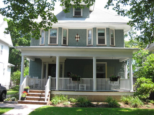
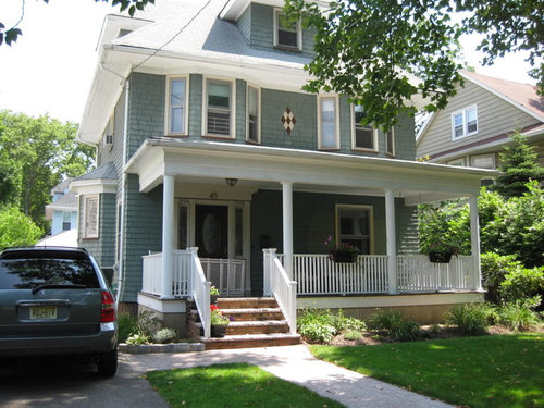
Curb Appeal Paint Help
danlan
14 years ago
Sort by:Oldest
Comments (14)
Related Stories

EXTERIORSHelp! What Color Should I Paint My House Exterior?
Real homeowners get real help in choosing paint palettes. Bonus: 3 tips for everyone on picking exterior colors
Full Story
ENTRYWAYSHelp! What Color Should I Paint My Front Door?
We come to the rescue of three Houzzers, offering color palette options for the front door, trim and siding
Full Story
EXTERIOR COLORThe Joyful Exterior: Perk Up Curb Appeal With a Splash of Green
You may not want to douse your whole house with it, but green can work wonders as an exterior accent color
Full Story
LANDSCAPE DESIGNHow to Help Your Home Fit Into the Landscape
Use color, texture and shape to create a smooth transition from home to garden
Full Story
CURB APPEAL7 Questions to Help You Pick the Right Front-Yard Fence
Get over the hurdle of choosing a fence design by considering your needs, your home’s architecture and more
Full Story
REMODELING GUIDESDesigner's Touch: Boost Your Home's Curb Appeal
From pavers to plantings, these professional tips can help your home make an instant impact on the street
Full Story
CURB APPEALNail Your Curb Appeal: Traditional Style
Timeless colors, a gussied-up garage and classic door jewelry combine for a good-looking exterior
Full Story
EXTERIORSCurb Appeal Feeling a Little Off? Some Questions to Consider
Color, scale, proportion, trim ... 14 things to think about if your exterior is bugging you
Full Story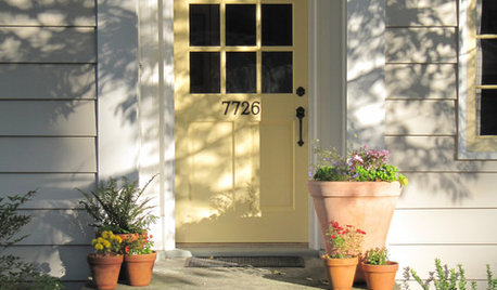
GARDENING AND LANDSCAPINGSpring Checklist: Freshen Up Your Home's Curb Appeal
Step outside and use these tips to show off your home to its best advantage this spring
Full Story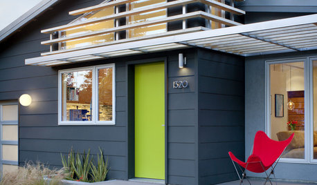
EXTERIORS17 Ways to Increase Your Home's Curb Appeal
The word on the street? Homes with appealing front views can sell faster, lift moods and convey a warm welcome
Full StoryMore Discussions


justgotabme
teedup1
Related Professionals
Mansfield Interior Designers & Decorators · Austin Furniture & Accessories · Houston Furniture & Accessories · Huntersville Furniture & Accessories · Manhattan Furniture & Accessories · Nashville Furniture & Accessories · Peachtree City Furniture & Accessories · Springdale Furniture & Accessories · Genova Furniture & Accessories · Murray Furniture & Accessories · Urbandale Furniture & Accessories · Wilmington Furniture & Accessories · Clive Furniture & Accessories · Walker Lighting · Warwick LightingDLM2000-GW
terezosa / terriks
mjlb
Lori A. Sawaya
Lori A. Sawaya
Lori A. Sawaya
squirrelheaven
stbonner
danlanOriginal Author
msrose
Lori A. Sawaya
melanie1121