


Need help with bedroom paint colors to go with this quilt.
jerzshoregirl
13 years ago
Sort by:Oldest
Comments (11)
Related Stories

COLORPick-a-Paint Help: How to Quit Procrastinating on Color Choice
If you're up to your ears in paint chips but no further to pinning down a hue, our new 3-part series is for you
Full Story
EXTERIORSHelp! What Color Should I Paint My House Exterior?
Real homeowners get real help in choosing paint palettes. Bonus: 3 tips for everyone on picking exterior colors
Full Story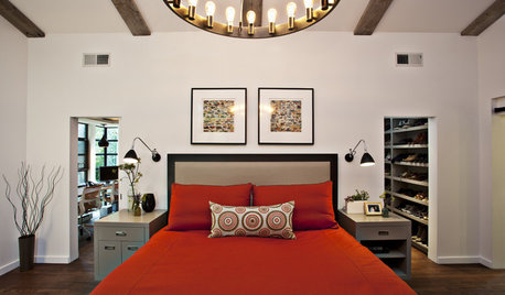
COLORColor Palette Extravaganza: Room-by-Room Help for Your Paint Picks
Take the guesswork out of choosing paint colors with these conveniently collected links to well-considered interior palettes
Full Story
COLORPick-a-Paint Help: How to Create a Whole-House Color Palette
Don't be daunted. With these strategies, building a cohesive palette for your entire home is less difficult than it seems
Full Story
COLORPaint-Picking Help and Secrets From a Color Expert
Advice for wall and trim colors, what to always do before committing and the one paint feature you should completely ignore
Full Story
HOUZZ TOURSMy Houzz: Saturated Colors Help a 1920s Fixer-Upper Flourish
Bright paint and cheerful patterns give this Spanish-style Los Angeles home a thriving new personality
Full Story
DECORATING GUIDESThose Built-Ins Are Going to Look Smashing in Color
Painting cabinetry in striking hues can bring focus and personality to a room
Full Story
COLORGoing Bold With Just Enough Color
Using color with restraint inside and outside can be far more effective than a less subtle approach
Full Story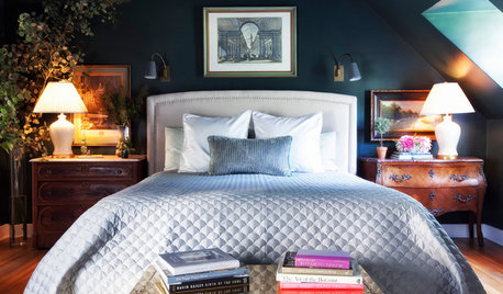
DECORATING GUIDESRoom of the Day: Going Moody in the Master Bedroom
Dark paint and antiques mix with newer pieces and light bedding for a sleeping space that appeals to him and her
Full Story
DECORATING GUIDESDownsizing Help: Color and Scale Ideas for Comfy Compact Spaces
White walls and bitsy furniture aren’t your only options for tight spaces. Let’s revisit some decorating ‘rules’
Full Story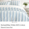


prairiedawnpam
jerzshoregirlOriginal Author
Related Professionals
Middle Island Interior Designers & Decorators · Mount Laurel Interior Designers & Decorators · Indianapolis Furniture & Accessories · Mansfield Furniture & Accessories · Milwaukee Furniture & Accessories · Owensboro Furniture & Accessories · Reston Furniture & Accessories · Shakopee Furniture & Accessories · Detroit Furniture & Accessories · Golden Glades Furniture & Accessories · Kingsburg Furniture & Accessories · Chapel Hill Custom Artists · Englewood Lighting · Richardson Window Treatments · San Jose Window Treatmentswhitdobe
spring-meadow
les917
sparklekitty
jerzshoregirlOriginal Author
User
oopsie913
dazzlemewithcolor
User