


Freaking out about my paint selection :(
sixkeys
9 years ago
Sort by:Oldest
Comments (40)
Related Stories
HOUSEKEEPING10 Things Neat Freaks Know to Be True
Do you err on the incredibly tidy side? Then you probably already live by these nuggets of neat wisdom
Full Story
PAINTINGWhat to Know About Milk Paint and Chalk Paint — and How to Use Them
Learn the pros, cons, cost and more for these two easy-to-use paints that are great for giving furniture a vintage look
Full Story
GREAT HOME PROJECTSWhat to Know About Adding a Reclaimed-Wood Wall
Here’s advice on where to put it, how to find and select wood, what it might cost and how to get it done
Full Story
KITCHEN DESIGNHouzz Call: Tell Us About Your First Kitchen
Great or godforsaken? Ragtag or refined? We want to hear about your younger self’s cooking space
Full Story
WORKING WITH PROS10 Things Decorators Want You to Know About What They Do
They do more than pick pretty colors. Here's what decorators can do for you — and how you can help them
Full Story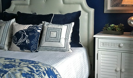
COLORHave You Heard the Hues? 15 Colors You May Not Know About
Name-drop these shades at holiday parties — or better, try one on your walls — and expand your palette possibilities
Full Story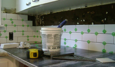
MOST POPULAR19 Kitchen Projects Every Homeowner Should Know About
Could your kitchen use a new sink, a backsplash, updated hardware, better organization, a good cleaning? Here's how to get started
Full Story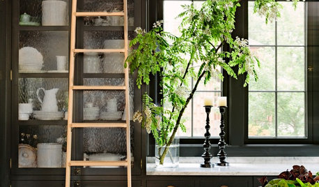
FURNITUREAim High: What to Know About Adding a Library Ladder
Have books or shelves out of reach? Here’s how to get a library ladder that works just right for your needs
Full Story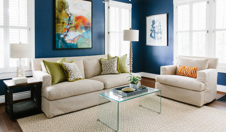
MOST POPULARThe Right Way to Test Paint Colors
Here are 5 key steps to take to ensure you're happy with your wall paint color
Full Story
DECORATING GUIDESCase Study: Wallpaper in Just About Every Room
Follow this Oregon home's lead to mix wallpaper patterns, colors and applications without chaos
Full Story


BeverlyFLADeziner
tibbrix
Related Professionals
Framingham Furniture & Accessories · San Diego Furniture & Accessories · Chino Hills Furniture & Accessories · Fillmore Furniture & Accessories · Golden Glades Furniture & Accessories · Clive Furniture & Accessories · Batavia Lighting · Florida City Lighting · Venice Lighting · East Setauket Window Treatments · Hanover Park Window Treatments · Mesa Window Treatments · Ojus Window Treatments · Rockledge Window Treatments · Stony Brook Window TreatmentsAGing
sixkeysOriginal Author
sixkeysOriginal Author
anele_gw
Lori A. Sawaya
amykath
tibbrix
busybee3
sixkeysOriginal Author
pps7
tibbrix
sixkeysOriginal Author
BeverlyFLADeziner
sixkeysOriginal Author
lascatx
tibbrix
amykath
nosoccermom
sixkeysOriginal Author
tibbrix
patricianat
sixkeysOriginal Author
sixkeysOriginal Author
pps7
nosoccermom
sixkeysOriginal Author
nini804
Bunny
mdln
sixkeysOriginal Author
mdln
jerseygirl_1
lascatx
sixkeysOriginal Author
patty_cakes
aprilmack
sixkeysOriginal Author
homedecorlover