Shop Products
Houzz Logo Print
beekeeperswife_gw

New Word: 'Gravender', Need help with paint colors:gray&lavender

beekeeperswife
13 years ago

I am getting ready to re-paint the kitchen/family room. Yes, the paint is barely dry, but the green hue that it gives off in the family room area is just plucking on my last nerve. (and the green chair isn't causing it, you can see it in the green hue in the kitchen but the wall space is smaller so it's not as ircking) So, this is going to give me an opportunity, but of course I have a problem--I am also having the living room which is open to the family room end also painted and the 2 story foyer too.

Here's the issue: I have always loved gray colors with that hint of lavender. (Because blue & purple hydrangeas look stunning in this space). But, I don't want the kitchen & family room to give the impression of teenager, but rather that Hollywood gray-lavender, maybe "gravender" I should call it. If I find the right shade, I don't know what to do with the other two areas, I don't want an entire gravender first floor, with the exception of the dining room which is chocolate and cream.

My couch is an ivory leather, the floors are dark cork, the area rug is an ivory, the curtains are a pewter/silvery shiny material, and the bamboo roman shades are dark chocolate brown, like some cabinets in the kitchen.

Last night I tested out a couple of colors on poster board, the BM 2116-60, Touch of Gray was too light, and too pink. The 2118-50, Excalibur Gray, is nice, purple undertones, certainly not the Hollywood "Gravender" look, but it certainly looks more "modern" and current. I also liked Sweatshirt Gray (2126-40), this one doesn't give me the gravender look but it does look nice and warm.

And oh yeah, one more issue, the wall behind the fireplace is painted darker, the same color as the wall behind the range hood. The range hood is stainless and the color is needed to be rich back there to make it pop, or else the hood is lost.

So if you have any ideas, or photos of the adult looking "gravender" I'm after I would appreciate it.

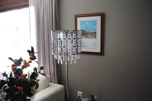
Here are some pics of the kitchen/family room. I don't have any of the foyer or living room.

{{!gwi}}

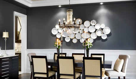
My dining room (which isn't being painted but I wanted you to see the color, and you can barely see a glimpse of the foyer)

{{!gwi}}

{{!gwi}}

{{!gwi}}

Comments (35)

  • graywings123
    13 years ago

    I'm drooling! Your house is beautiful! I look forward to seeing Gravender when you get it up on the walls.

  • cat_mom
    13 years ago

    bee--I've always loved your home/pics, incl the paint color (but I certainly understand individual preferences). No paint color advice, but I look forward to seeing what you've chosen when you find the right one for you.

  • ttodd
    13 years ago

    Absolutely a magazine worthy home!

    I have the BM fandecks and am familiar w/ colors that you've looked at. If your FR and Kitchen are BM colors may ask what they are so that I could hold the chips up side by side w/ potential colors?

  • hoosiergirl
    13 years ago

    I'm afraid I won't be any help at all since I *love* your home as is!

    I know some people are reticent to post pics of the exterior of their home, so ignore this if you're one, but I see your beautiful brackets peeking through the window in your DR, and I'd love to see your exterior if you're so inclined!

  • beekeeperswife
    Original Author
    13 years ago

    ttodd, not BM colors :( Valspar: Coastal Villa and Italian Leather. I was on BM's site, and I am wondering about one of the off white colors that goes towards gray...could that be used in the foyer? As much as I love the warm color I have in there now, it just doesn't work, with the grays. I was looking at gray owl, pale oak, collingwood, cedar key...any of those look warm?

    hoosiergirl, I'd post a pic if I had one! I'll look later to see if I have one, I know I must have one, just none on Photobucket. The house is called a Victorian Farmhouse. I guess the gingerbread makes it Victorian, and the teeny front porch qualifies it as "farmhouse".

    thanks for the nice words from everybody.

  • png4eva
    13 years ago

    Love, love, love your home!! Absolutely beautiful. Have you looked at BM - Wisteria? It's one of the Affinity colors. On my monitor it certainly gives off that "gravender" color you're talking about.

  • mellfiera
    13 years ago

    Well two things: first off your house is gorgeous! What is that tile on your backsplash? It looks lovely.

    Second, I painted my LR a *Gravender* (I'm stealing that term btw). It was Behr's new Premium Plus Ultra line, Smoked Mauve. It reads different colors depending on the light of day, and I haven't been able to take a picture that really captures it. That might be more due to my crappy camera than anything else, but ah well. Anyway HTH.

  • beekeeperswife
    Original Author
    13 years ago

    mellifera, ohhh, the backsplash....I won it in a contest. It is beveled arabesque tiles from Mission Stone and Tile. It's awesome and we love it. Sort of reminds me of a quilted chanel handbag. Each tile is an individual arabesque. Here's the link to two of the threads.

    Behind the scenes of the photoshoot:

    http://ths.gardenweb.com/forums/load/kitchbath/msg0619344021794.html

    Here is a link that might be useful: The pro photos

  • redroze
    13 years ago

    Doh! I just responded to your last post to my stairs post, pleading with you to do a charcoal grey and not a grey with a hint of lavendar. But here you are going with the latter and I'm forced to bite my tongue.

    Now, I know your instincts are usually spot on. So if gravendar is what you want, then gravendar is what you'll get. You know whose apartment instantly comes to mind when I think of grey and lavendar? Molly Sims. I have the In Style Home magazine at home which features her apartment. I could look up her wall paint colours if you're interested.

    Here's a few pics from Google. I love her pink polka dot stools...delish.


    {{!gwi}}

  • ttodd
    13 years ago

    Beekeeperswife - I'm going to take a look at those colors tonight. I vaguely remember Gray Owl and Pale Oak - may have been considerations for me at some point - def. memorable! Sort of remember Cedar Key but that may because it is close to one of the colors I chose.

    And I agree - I think blue/ purple hydrangea are amazing in grey rooms!

  • forhgtv
    13 years ago

    I just saw an episode of For Rent with gravender walls. The colors used were SW Quest Grey #7080 and SW Sensuous Grey #7081.

  • beekeeperswife
    Original Author
    13 years ago

    Hahah, Redroze, when I first read the Molly ____, I thought you were saying Molly Ringwold and referencing the 80's movies, Pretty in Pink, Sweet 16, etc. But I thought, man that Molly Ringwold's place looks goooood...oh, now I get it!

    Yes, what is that wall color in that top photo? It is quite yummy. I know I will never be able to do a gravender, it will always look purple, and I will always get dirty looks from my husband! Maybe the ceiling could be that "Touch of Gray" BM2116-60 color in the space....

    I did visit my BM store again at lunch today. I told him that the sweatshirt gray was nice, possibly too blue. So we looked for some grays with, well, more gray, but about the same "saturation of color" for lack of a better technical term.

    I'm struggling with finding something I like, which I can paint on the kitchen/fam room walls, and just continue it into my living room and let the light be what changes the color in there. But it's the foyer that's killing me. Too light, it will look like builder white, too light gray, it will look like a prison cell (not that I have any first hand experience), too dark and people will never want to come over and all of the neighborhood children will be frightened of the woman with the crazy house.

    So, let me know what that top paint color is.

  • texanjana
    13 years ago

    Just wanted to say I love your home!

  • forhgtv
    13 years ago

    Just in case you don't read responses that came before your latest post, I'll repeat...take a look at SW Quest Grey #7080 and SW Sensuous Grey #7081. If you like them, you could always have them color matched in a higher quality paint.

  • kayec28
    13 years ago

    How timely. I just got through an online tour of a lady's house(which is droolworthy inside and out) and it mentioned that her daughter wanted a purple bedroom and she wanted gray, so they compromised and used Pittsburgh Paints' Pewter Mug at half strength. This bedroom is to die for, and not just for a young girl.

    You might also check out Benjamin Moore's Dior Gray and Martha Stewart's Mercury Glass.

    Here is a link that might be useful: {{!gwi}}

  • Oakley
    13 years ago

    I'm lousy at paint colors, but looking at your kitchen made me go out and cut some Hydrangeas!

    Your kitchen is stunning. Perfect colors, IMO.

  • beekeeperswife
    Original Author
    13 years ago

    forhgtv-I will be at the SW store tomorrow, conveniently located next to the Dunkin Donuts and across the street from the BM dealer. Then I will weave my way past the store that sells MS paints to check out the Mercury glass, and I already have the Dior Gray, very chic, daring. I suppose if we can find another DD for more coffee we can locate a Pitts Paint dealer because that bedroom is totally Gravender.

    Thanks oak for the compliment, and hope you enjoy those hydrangeas. I think back to my childhood home, we had so many of those, and my mom never cut them to bring in the house!

  • newdawn1895
    13 years ago

    A girl after my own heart, a black wall!

  • ttodd
    13 years ago

    Beekeeperswife - I got up early to have time alone to look at paint colors.

    Here's a suggestion: Whne you go to the paint store take something green like your chairs along w/ you. I started sifting through paint colors and then thought how some of those grey colors take on a totally different hue when a contrasting color is put near it so I picked a green chip and held it up to the colors I was looking at. What a huge difference! Many of the colors that I thought were contenders in the Color Preview deck turned into candy hues of blue or purple so I put the CP deck away and went w/ the Classic Colors dech since those colors are a bit softer, dustier, I don't know what you call it.

    So this is what I came up w/.
    :

    Cedar Key - just didn't like.

    From the CP Deck: Pigeon Gray 2133-50 and the afore mentioned Dior Gray 2133-40 were very nice.

    From the CC Deck:

    Delray Gray 1614. Loked more purpley when I held it against the green chip. Warmer than my next suggestion but still has blue tones to it.

    Cobblestone Path 166: Cooler than Delray Gray.

    Timber Wolf 1600 - warmer - greyer.

    Check this out and tell me what you think:
    Baltic Gray 1467 & Willow Creek 1468. Grey shades def. leaning more towards the warm purple side over the other suggested shades. Still def. grey though - again I held the green chip next to them.

    Good luck!!!!!!

    mellifera - that color looks wonderful!!!!!!!

    Sorry about all of the typos - no time to proof - kids are coming down the stairs like gangbusters! Gotta go!

  • ttodd
    13 years ago

    Beekeepers wife - MS Mercury Glass is no longer made. It was from her 1st paint line in K-Mart & Sears. I have swatch pics of it somewhere in my files and I have the formula for it too. I just sent it to somebody the other day.

    Gorgeous color! Can unwittingly go purple when pairred w/ other bold colors. When I painted my hallway in the last house it had bright white trim and just the Mercury Glass walls. Beautiful! When I tried testing it in this house it was very purple. I may not have gone far enough w/ it though.

    Hmmmm - maybe my kids playroom? I still have some!

  • ttodd
    13 years ago

    Sorry - few more:

    From CP Deck
    Cement Gray 2112-60 (a poster here has this color in her bathroom)
    Stormy Monday 2115-50
    Stone 2112-40

  • beekeeperswife
    Original Author
    13 years ago

    ttodd--Thank you so much, for all your hard searching, and for getting up early too. I couldn't get the sample of the Pitt Paint, well, I could but I didn't want to pay $22 for a quart, well, not yet. I wanted to try the Dior and the Pigeon first. I am currently staring at 2 poster boards taped to the wall with those colors on it. I think they might both work. I'm waiting to see how they look tomorrow during the day. But both do have that hint of lavender that I wanted. Gravender!

    That MS color sounds great, but it's so hard without at least a photo. I mean just the name "mercury glass" sounds like it would go with my decor, but hey, Pigeon is taped to wall right now. ok, so is Dior, and that just sounds much classier than a flying rat (can you tell I live near Philadelphia--not too fond of pigeons).

    Thanks again, and I'll let you know if these look right or time to try some others, and get to the SW store too!

  • anntique
    13 years ago

    Here's a room with Pigeon Gray. It's beautiful isn't it?

    Here is a link that might be useful: Julianne Moores LR

  • happy2bme
    13 years ago

    Did you ever find a paint color you liked yet. I am looking for the a similiar color for my master bedroom....wondering what you have come up with. Some of the possibilities i have come across are from paint dealers too far away...

  • oopsie913
    13 years ago

    Have pale oak and white dove trim in living room and hallway. pale oak, depending on your lighting is a PUTTY color. I do not think of it as a cool color, but it is very pale. Gray owl is a greenish gray. There is a SHERWIN WILLIAMS OLDER COLOR CALLED VERSITILE GRAY AND i HAD IT IN MY OLD KITCHEN, MANY THOUGHT IT TO BE with a purple hue and the darker shades on the swatch I like even better.
    After seeing the wonderful contrast around your fireplace I was thinking of going darker just on that wall, but have no clue which color would be the darkest if the walls were pale oak. GL

  • oopsie913
    13 years ago

    Hate to take you off the path, but is your fireplace a facade?
    We want one so badly in our family room but are thinking that we might just buy and antique mantel and do a mirror similar. We have a nice fireplace already in the nearby living room anyway.
    If anyone lives in St. Louis, or nearby, there is a cool place called 'after the paint' where you can search through hundreds of old doors and windows and mantels etc. that have been yanked from houses in the area.
    I like that Pewter mug, bees, I have that fan deck. Its dark, but def has the undertone you want.

  • beekeeperswife
    Original Author
    13 years ago

    Here's the latest. I love the Dior Gray and Pigeon Gray. Thanks anntique for that photo of the room. I was leaning towards the darker of the two, the Dior Gray, but I'm worried it might be too dark (I want to use it on the walls that are now lighter gray in the photos) and put the pigeon gray on the fireplace wall. But after seeing that photo, I wonder if I should go with pigeon all over and dior on the fireplace wall, and then in the foyer. Too many decisions and not enough daylight time at home to decide.

    I'm worried that the darker walls will make the room(s) look too long and narrow. But I love the way the floor lamp next to the green chair shines with the Dior gray behind it. As you can tell, I'm not afraid of dark colors, but I don't want to turn the place into a cave either.

    I did investigate getting a sample of the pewter mug at 1/2 strength, but there are no samples in Pitts. Paint, so I would have to fork over $22 for a sample. I think that the 2 colors I'm working with are really nice. I just don't know how to use them.

    Regarding the fireplace, it's real. Although it is only gas and even though it has a blower, it has a label that does say "for decorative purposes only"....no wonder why it makes the room colder. We have actually turned out the pilot light on it and don't even use it. We might replace the insert with something that is more efficient. As we are approaching the empty nest stage, it would be nice to be able to just warm up that room after work and not the entire house. I have the mirror there because the fireplace is extremely hideous and I just can't look at the yellow brass one more second. I think we are going to paint it with high heat paint so it just "goes away", but we'll see, maybe it WILL just go away and be replaced!

    I posted yesterday in a separate thread about the fireplace wall--If I do the lighter color see that Julianna Moore link above, does anybody thnk I should then paint the fireplace a darker gray to contrast? Maybe the white would look good.

    I appreciate all the help you guys are giving me on this.

    Thanks

  • User
    13 years ago

    From the Behr fandeck, I found a color called SMOKED OYSTER.
    No. 780A-2....I did not realize it had a touch of lavender in it when I tried the sample bottle. I thought it would be a beigy gray, which it seemed to be, but when the light is on it, there is a touch of lavender that could be brought out.
    It is not a dark color, instead a definite statement on the wall.

    If you have an opportunity to look at it, please do. It is a chameleon in different lighting.

  • oopsie913
    13 years ago

    Bees, why not just get your samples from lowes for 2.99 a pop instead of getting them in the Benj moore store? You can take any color anywhere. It will hardly be any different? I found another color called 'gray violet' on my ppg fan deck. its really a neat color. In my city PPG which is called Porter paint here is considered the best place for deep based colors and painters love this paint too.

    Thanks for the fireplace inf. I'm going to look at a antique mantel today and pretend,

  • beekeeperswife
    Original Author
    13 years ago

    oopsie, I never thought about seeing if Lowe's could match the color. I don't have a paint chip, (I did see a fan deck) but do you think if I give them the number, AND ask them to mix the pewter mug at 50% in the sample can, they can do it? The BM store that sells the Pittsburgh paint said they couldn't do the 50% in the sample can. I'll check it out though.

    thanks for the idea.

  • redroze
    13 years ago

    Sorry for the lateness in responding bee...darn pregnancy brain!! I can't find the magazine despite reading it last week, and I have work to finish up tonight (no overtime of course...bleh).

    I thought we had lunch plans with friends this weekend but turns out it's the following week. Not used to being this ditsy!! I'll look again tomorrow...so sorry again!!

  • Kathleen McGuire
    13 years ago

    Here are a few, although I don't knopw how light or dark you want to go.
    {{!gwi}}{{!gwi}}
    {{!gwi}}{{!gwi}}
    {{!gwi}}{{!gwi}}
    {{!gwi}}

    Here is a link that might be useful: Grays

  • oopsie913
    13 years ago

    They can match any color anyway you want it, so I assume they can do it at half strength too?. I have so many samples from there that I could probably open my own sample store here. lol
    As long as you have the brand and color name they can look anything up and match it. of course any color in a small sample is going to be different than when it is mixed in a gallon, but it will give you an idea. good luck to you. Just love your house and am looking right now for a chandelier similar to yours in your breakfast area, as I speak.

  • Kathleen McGuire
    13 years ago

    Let us know what you decide. Love your home!

  • User
    13 years ago

    Since I read that you have an open mind about the manufacturer of your paint, I will throw in a color that I'm about to use. It is a Behr color, and must be a whole series of "smoked" colors.

    It is Behr's SMOKED OYSTER. I thought it was a fairly plain gray, with a touch of beige, but no, on the wall it can be quite lavenderish. My sample is painted on the wall in a room with a northern light and an eastern light. So it doesn't get a real warm feel.

    Love the look of your house as it is.