


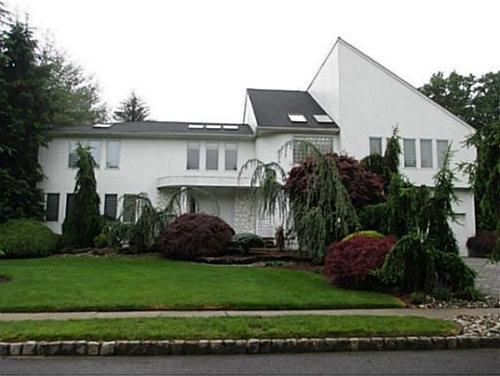
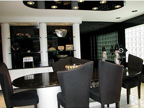
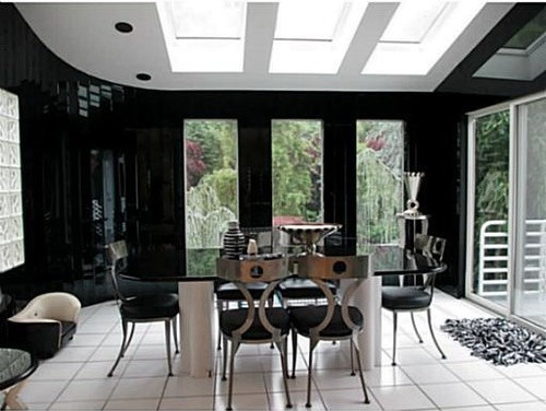
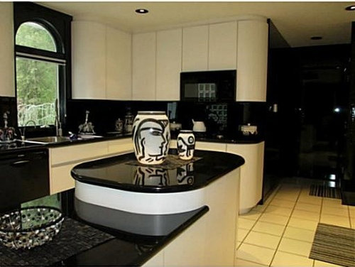
II. What's black, white & black all over?
palimpsest
9 years ago

Sort by:Oldest
Comments (14)
Related Stories
FALL AND THANKSGIVINGIt's Black and White and Fall All Over in a Holiday-Happy Home
Get inspired for budget-friendly fall decorating by a resourceful stylist's thrifty but sophisticated adornments
Full Story
Guest Picks: Black and White and Dramatic All Over
Get a chic and sophisticated look with graphic finds for the home
Full Story0
COLORBlack and White and Found All Over: Zebra Print
Don't Forget, Zebra Pattern is Made With Neutrals — Add it Anywhere!
Full Story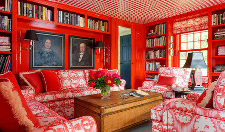
DECORATING GUIDESRoom of the Day: Black, White and Red All Over
Custom fabric, heirlooms, bold color and a beloved collection of books cozy up this farmhouse library
Full Story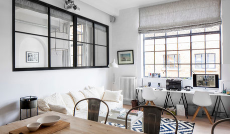
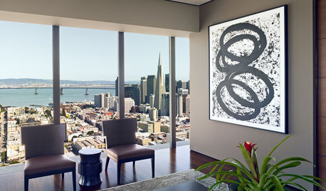
CONTEMPORARY HOMESHouzz Tour: Black, White and Scandinavian-Industrial All Over
A penthouse apartment in a converted schoolhouse gets reconfigured and redecorated to became a restful city sanctuary
Full Story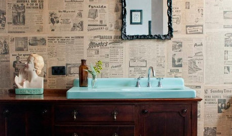
DECORATING GUIDESSo Your Style Is: Black, White and Read All Over
Make headlines at home with newsworthy decor
Full Story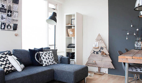
HOUZZ TOURSMy Houzz: Black and White Make a Dutch Apartment All Right
Graphic and creative touches give a 600-square-foot city rental chic style on a modest budget
Full Story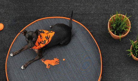
SHOP HOUZZHouzz Products: Treat Your Rooms to Orange and Black All Year
It’s no trick. Furnishings and accessories in this bold color pairing keep spaces lively even after Halloween is over
Full Story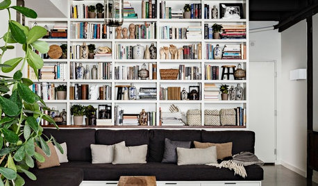
SHOP HOUZZShop Houzz: 3 Ways to Style a Black and White Room
Go black and white all over with traditional, farmhouse and modern pieces
Full Story0
BLACKTwo Sides to Black and White Art
Graphic and bold or subtle and sophisticated? A mother and daughter share their picks on both ends of the spectrum
Full Story


Annie Deighnaugh
robo (z6a)
Related Professionals
Rockland Interior Designers & Decorators · Athens Furniture & Accessories · Spartanburg Furniture & Accessories · Davidson Furniture & Accessories · Eureka Furniture & Accessories · Miami Beach Furniture & Accessories · Mundelein Furniture & Accessories · Potomac Furniture & Accessories · Clive Furniture & Accessories · Diamond Bar Lighting · Lawrence Lighting · Miami Lighting · South Miami Lighting · La Vista Window Treatments · Phoenix Window TreatmentspalimpsestOriginal Author
Fun2BHere
palimpsestOriginal Author
robo (z6a)
Gooster
palimpsestOriginal Author
Fun2BHere
palimpsestOriginal Author
Gooster
lascatx
Fun2BHere
User